
Creating multidimensional pivot tables
Cross tabulations allow you to view multiple metrics across two dimensions, which is similar to a pivot table in Excel.
Difficulty
Objective
You would like to aggregate different types of data across multiple dimensions. For instance, you might want to view summaries for each hour of every day. In this analogue, we use weather data to complete a tabulation of the average temperature and humidity across these dimensions. Another example would be viewing sales and units sold across day and store. You know how to do this by creating a pivot table in Excel, but you want to recreate this operation using 1010data.
Excel solution
Pivot tables in Excel are useful because they allow you to summarize large amounts of data and view it across multiple metrics. Additionally, their user-friendly GUI allows you to easily manipulate the data to properly fit your desired table.
After selecting a cell inside your data set, you can insert a pivot table based on the data associated with that cell.
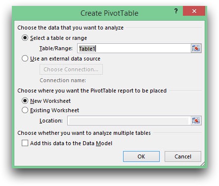
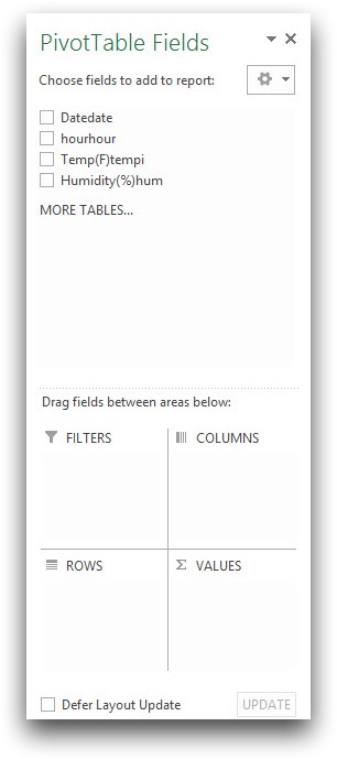
Your pivot table will be created in a new worksheet, or the existing worksheet, based on your selection. You can then use the GUI to drag which data you want to be displayed as columns and rows, and which data you want to be summarized.
Your completed pivot table should look like the sample below.
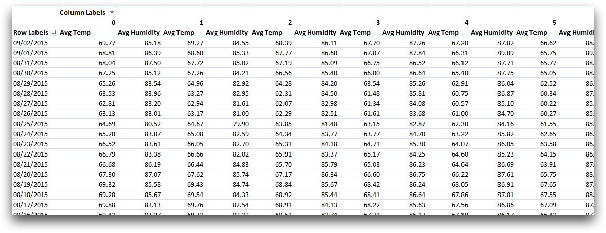
Although the process to create a pivot table in Excel is relatively simple, it has its limitations. In order to create the desired table for this example, the data that was loaded into Excel had to have the pre-calculated averages for each date instead of the multiple entries for each data point. Since the original data set consists of 1,841,200,126 rows, it is too large for Excel. Therefore, the daily averages are calculated before loading the data into Excel and the number of rows is reduced to 25,824.
Instead, if you use 1010data's platform to perform the same operation, there is a much larger limit to the size of your data. The following solution shows how to create a "pivot table" using 1010data.
1010data Macro Language solution
<base table="pub.demo.weather.wunderground.observed_hourly"/>
<willbe name="hour" value="hour(time)"/>
<sel value="tempi<>NA"/>
<tabu xtab="0" breaks="date" cbreaks="hour" label="Cross Tabulation">
  <tcol source="tempi" fun="avg"/>
  <tcol source="hum" fun="avg"/>
</tabu>
<sel value="2" expand="1"/>
<willbe name="ii" value="ii_(1)"/>
<willbe name="meas" value="if(ii=1;'Temp';'Hum')" label="Measure"/>
<willbe name="value" value="if(ii=1;t0;t1)"/>
<tabu breaks="date" cbreaks="hour,meas" label="Cross Tabulation">
  <tcol source="value" fun="first" format="dec:2"/>
</tabu>
Creating a worksheet in 1010data which mimics a pivot table requires some additional thinking beyond simply using the Excel GUI. Multiple cross tabulations are done to produce a table with multi-metric tabs.
The first cross tabulation calculates the desired information, both averages for every hour of every day, but does not display it in a way that's easy to view. A row is created for each hour of each day and the averages are in two separate columns in their respective rows.
In order to transform this to a more user friendly view, you first use
expand="1" to duplicate every row in the table. Then a reference column
is created to flag whether it is the first or second entry. Two additional columns are
created, one containing 'Temp' if the reference column contains a '1' and 'Hum' otherwise,
and the second containing the corresponding average values.
Performing a second cross tabulation where hour and the reference column,
meas, are used as column breaks, you obtain a table that resembles a
pivot table.
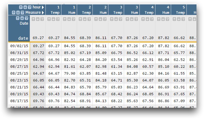
Below is an image of your resulting worksheet.
Further reading
If you would like to learn more about the functions and operations discussed in this recipe, click on the links below: