Given a model score and target variable, you can produce a cumulative gains chart
and calculate the Area Under the Curve (AUC).
You must have already generated a model using g_logreg(G;S;Y;XX;Z) and
obtained the predicted probability using score(XX;M;Z). This
example also assumes that the query has defined a set of testing data denoted by the
column test.
To chart the cumulative gains and calculate the AUC:
-
Add the following
<library> to your
query.
Note: You can insert the following Macro Language code anywhere within your
query, though it is best practice to include libraries at the top of
queries. Alternatively, you can save the library to an external file and
then use the
<import> operation to import the
library into your current query. See the section on
Macro Language: Blocks in the
1010data Reference Manual for more information about libraries and
blocks.
<library name="cum_gains">
  <block name="cum_gains" score="" target="">
    <note>*****************************************************************************************</note>
    <note>*** Given a model score and target variable, this block will produce the data for a  ****</note>
    <note>*** cumulative gains chart and calculate the Area Under the Curve (AUC).             ****</note>
    <note>***                                                                                  ****</note>
    <note>*** In this implementation, AUC is defined to be between -1 and 1, where 0 indicates ****</note>
    <note>*** the model performs the same as a `model` which randomly assigns the probability  ****</note>
    <note>*** of observing a target event. An AUC of 1 indicates perfect performance in the    ****</note>
    <note>*** sense that ranking by the model score perfectly separates the `1` target events  ****</note>
    <note>*** from `0` target events. A negative AUC indicates that the model is               ****</note>
    <note>*** `anti-predictive` in the sense that `0` events are assigned a higher score than  ****</note>
    <note>*** `1` events.                                                                      ****</note>
    <note>***                                                                                  ****</note>
    <note>*** Specifically, here the AUC is defined by integrating the area under the          ****</note>
    <note>*** cumulative gains chart and normalizing by subtracting the area under the         ****</note>
    <note>*** diagonal (which is the area of a random model) and dividing by the area that     ****</note>
    <note>*** would be found for a model that perfectly separates `1`s and `0`s in the target  ****</note>
    <note>*****************************************************************************************</note>
    <sel value="{@score}<>na"/>
    <willbe name="score_population" value="g_cnt({@score};)"/>
    <willbe name="score_num_true" value="g_sum({@score};;{@target})"/>
    <willbe name="tot_population" value="g_cnt(;)"/>
    <willbe name="tot_num_true" value="g_sum(;;{@target})"/>
    <sel value="g_first1({@score};;)"/>
    <willbe name="score_rank" value="g_rank(;;;{@score})"/>
    <willbe name="cum_pop" value="g_cumsum(;;score_rank;score_population)"/>
    <willbe name="cum_true" value="g_cumsum(;;score_rank;score_num_true)"/>
    <willbe name="cum_pop_pct" value="100*(cum_pop/tot_population)" format="dec:5" label="% of Population"/>
    <willbe name="cum_true_pct" value="100*(cum_true/tot_num_true)" format="dec:5" label="% of Target"/>
    <note>**** AUC by integration   ****</note>
    <willbe name="true_pct_of_pop" value="100*(tot_num_true/tot_population)" format="dec:3"/>
    <willbe name="perfect_auc" value="0.5*(true_pct_of_pop*100)+100*(100-true_pct_of_pop)-0.5*(100^2)"/>
    <willbe name="prev_cum_pop_pct" value="ifnull(g_rshift(;;score_rank;cum_pop_pct;-1);0)"/>
    <willbe name="prev_cum_true_pct" value="ifnull(g_rshift(;;score_rank;cum_true_pct;-1);0)"/>
    <willbe name="bucket_width" value="cum_pop_pct-prev_cum_pop_pct"/>
    <willbe name="bucket_auc" value="0.5*bucket_width*(prev_cum_true_pct+cum_true_pct-prev_cum_pop_pct-cum_pop_pct)"/>
    <willbe name="model_raw_auc" value="g_sum(;;bucket_auc)"/>
    <willbe name="auc" value="model_raw_auc/perfect_auc" format="dec:5" label="AUC"/>
    <colord cols="auc,{@score},cum_pop_pct,cum_true_pct"/>
    <note>*** For charting purposes, insert a row for the (0, 0) intercept      ****</note>
    <willbe name="row_num" value="g_cumcnt(;;score_rank)"/>
    <sel value="if(row_num=1;2;1)" expand="1"/>
    <willbe name="origin_row" value="(row_num=1)*(ii_(0)=0)"/>
    <sort col="cum_pop_pct" dir="up"/>
    <willbe name="chart_score" value="if(origin_row=1;1;{@score})" label="Score"/>
    <willbe name="chart_pop_pct" value="if(origin_row=1;0;cum_pop_pct)" format="dec:5" label="Pct of Population"/>
    <willbe name="chart_true_pct" value="if(origin_row=1;0;cum_true_pct)" format="dec:5" label="Model Pct of Target"/>
    <willbe name="chart_random_model" value="chart_pop_pct" label="Random Model"/>
    <willbe name="chart_perfect_model" value="100*min(1;cum_pop/tot_num_true)" format="dec:5" label="Perfect Model"/>
    <colord cols="auc,chart_score,chart_pop_pct,chart_true_pct,chart_random_model,chart_perfect_model"/>
  </block>
</library>
-
Select the testing data.
-
Insert the
cum_gains
<block> in your
query.
The value for the score variable should be the name of the
column containing the results from score(XX;M;Z), which in
our case is prob_score. The value for
target should be the column name denoting the dependent
variable specified to g_logreg(G;S;Y;XX;Z), which is the
Y parameter. In our example, this is the column
yy.
<insert block="cum_gains" score="prob_score" target="yy"/>
Note: If you have saved the
<library> in an external
file, you must also do an
<import>
before you do the
<insert>.
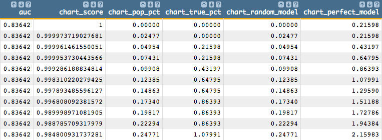
You should see results similar to the
following:
-
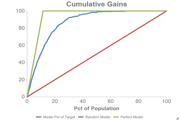
We can chart the cumulative gains using the 1010data Chart Builder.
-
Click .
-
Drag the Pct of Population
(
chart_pop_pct) column to the DATA
(X-AXIS) area.
-
Drag the Model Pct of Target
(
chart_true_pct), Random
Model (chart_random_model), and
Perfect Model
(chart_perfect_model) columns to the
DATA (Y-AXIS) area.
-
Click Update.
You should see a chart that looks like the
one below: