Visualize data
After connecting to your data source, you can filter and create visualizations from the data.
Once you connect to a 1010data table, you can use the full capacity of Power BI to discover and visualize insights from the data. The following is a simple example using a demo table. Refer to the Microsoft Power BI documentation for the full set of Power BI features.
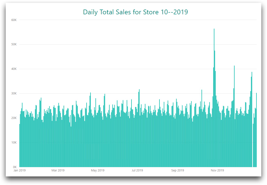
The following steps show how to create a simple bar graph showing total sales by day for a single store for the year 2019.
To create a simple data visualization:
-
Connect to 1010data from Power
BI.
If you have already connected to 1010data, click Recent Sources from the Home ribbon. Then click 1010 as the data source.
-
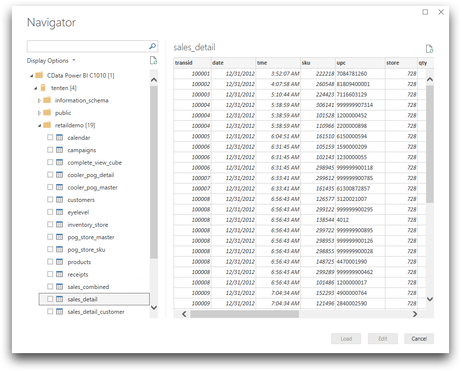
In the Navigator, select
retaildemo.sales_detail.
You will see a sales_detail preview pane.
- Click the check box next to sales_detail and click Load.
-
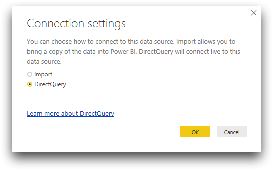
In the Connection settings dialog, select
DirectQuery.
-
Click OK.
The Power BI Desktop Report (
 ) view displays a blank
canvas. The Fields pane to the right displays the fields in
the sales_detail table.
) view displays a blank
canvas. The Fields pane to the right displays the fields in
the sales_detail table. 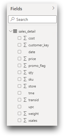
-
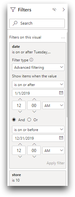
The following steps limit the sales data to store 10 for the year 2019.
-
Click Apply filter.
The filter pane should look like the following:
-
Click Apply filter.
-
Click the Table (
 ) visualization.
A table visualization appears on the Power BI canvas.
) visualization.
A table visualization appears on the Power BI canvas. -
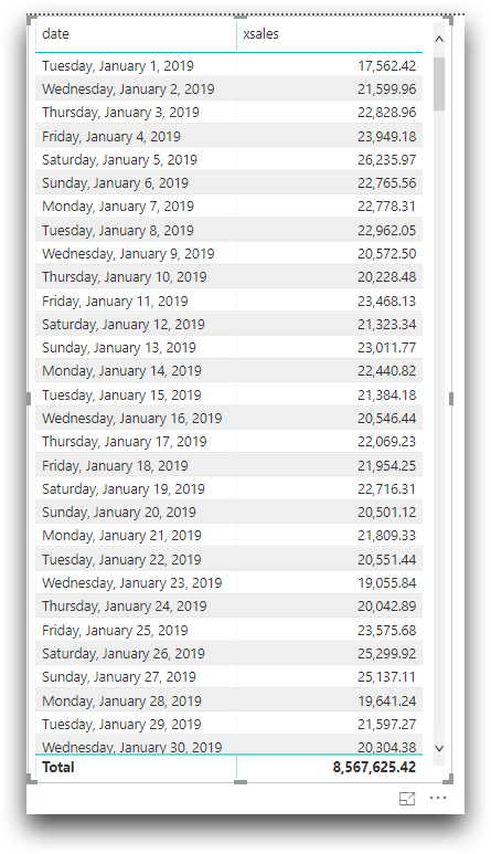
With the table visualization highlighted, select date and
xsales from Fields.
The table displays the total sales for store 10 for each day in 2019.
 Note: Creating a table is a good way to check the accuracy of your data before you create a visualization.
 -
With the table highlighted, click Stacked column chart
(
 ) to see a
visual representation of this data.
) to see a
visual representation of this data.
-
Change the chart formatting as desired.