
Create a widget
A QuickApp is essentially one or more widgets within a dynamically managed environment. A widget is used to visually represent a block of Macro Language code.
A <dynamic> element contains the Macro Language code related to
the visual aspects of your QuickApp as well as the query logic that drives both the
widget behavior and underlying analyses. The presentational aspect is handled
through the use of <widget> and <layout>
elements. The query logic behind the widgets and the analyses are handled via block
code and the 1010data data transformation operations, such as
<link>, <willbe>, and
<sel>.
The simplest QuickApp, therefore, would be a single <widget>
within a <dynamic>.
To create a widget:
In order to see the QuickApp in its intended form, it must be rendered to some output target, which may be for the web, as a PDF, or as an Excel workbook.
-
Click .
This will open the code in a Macro Language Workshop window. Finally click which will show the QuickApp in the results pane.
This action renders the QuickApp for the web, generating the necessary HTML and JavaScript that a browser uses to display each widget in the QuickApp.
Note that because no attributes were specified in the
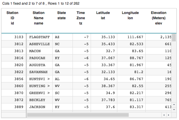
<widget>tag, a grid widget is used by default. The grid widget displays its data in tabular form.A widget can have a query inside its opening and closing
<widget>tags, which determines the information the widget displays. Since this widget has no query associated with it, and instead uses a self-closing<widget>tag, it displays all of the data from the current table, which in this case is pub.demo.weather.stations.
By default, widgets operate on the current table, but you can specify the
table a widget operates on using the base_ attribute.
-
Click Apply.
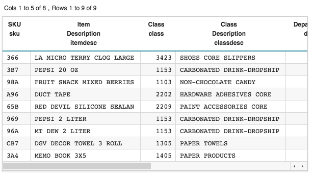
Now the grid widget displays the contents of pub.demo.retail.prod even though the current table is still pub.demo.weather.stations.
The class_ attribute allows you to specify the form in
which the widget data or query results are displayed. As mentioned earlier, since no
attributes were specified in the <widget> tag, a grid widget was
used by default. If you wanted, you could explicitly specify this using the
class_ attribute.
-
Click Apply.
You can see that explicitly specifying
class_="grid"produces the same results as omitting theclass_attribute.
The class_ attribute allows you to display the data in a
number of different forms. For example, you might want to display the information in
this table as a drop-down list.
-
Click Apply.
The QuickApp displays the contents of the table as a drop-down menu.
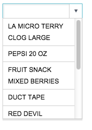
If the table has more than one column, the column second from the left supplies the labels for the items in the drop-down menu. You can see that the items in this drop-down menu correspond to the Item Description column, which is the second column of the table specified by the
base_attribute, pub.demo.retail.prod.
You can control the visual aspects or behavior of the widget using
attributes specific to the widget class as well as attributes that apply to all
widget classes. For instance, you can specify the width of the input field and
associated drop-down menu for this widget using the inputwidth_
attribute.
-
Click Apply.
The input width of the drop-down widget is increased to 250 pixels.
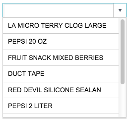 Note: The unit of measurement depends on the target to which the QuickApp is rendered. Since this QuickApp is rendered for the web, the unit of measurement is pixels.
When you select an item from the drop-down menu, the value associated with that
selection can be saved in a dynamic variable. The value of a dynamic variable
can be shared with other widgets or queries in the QuickApp and can affect their
behavior or results. Dynamic variables are declared and given initial values in
the opening <dynamic> tag.
As previously mentioned, in a drop-down menu, the second column of the table associated with it provides the labels that are displayed in the drop-down list. The first column provides the values. (If the table or query associated with the drop-down widget has only one column, that column provides both the labels and the values for the drop-down menu.)
In this example, the drop-down widget displays all the items in the Item Description column. When a user selects an item from the drop-down menu, the value associated with that selection comes from the corresponding row in the SKU column, the first column in pub.demo.retail.prod.
The value_ attribute is used to specify the dynamic variable
where that value can be saved.
-
Click Apply.
You can see the new text widget to the right of the drop-down widget. (By default, widgets are arranged horizontally.) Since the value of the dynamic variable
selectionis set to the empty string, nothing appears after the Current selection: text.
-
Select an item from the drop-down menu (e.g., PEPSI 2
LITER).
The selection appears in the drop-down input field, and its associated value appears in the text widget.

In this example, the item description PEPSI 2 LITER has been selected and appears in the drop-down input field. The value 969, which comes from the SKU column associated with the selected item description, has been assigned to the dynamic variable
selectionand is displayed by the text widget.
Widgets not only allow the user to view the results of a query, but they also allow the user to make selections and provide input to the QuickApp. The grid, drop-down, and text widgets are just a few of the many classes of widgets that the QuickApp framework provides.
As you'll see in the following topics, through the use of dynamic variables, the selections you make in one widget can affect the behavior of other widgets in the QuickApp, allowing for a truly interactive experience.
Combining the relative ease of building QuickApps with the power and speed of the 1010data platform creates an unparalleled combination that will take the insights you gain from the analysis of your data to a whole new level.
Cumulative QuickApp code
The Macro Language code for the QuickApp up to this point is:
<dynamic selection="">
  <widget class_="dropdown" base_="pub.demo.retail.prod"
   inputwidth_="250" value_="@selection"/>
  <widget class_="text" text_="Current selection: {@selection}"/>
</dynamic>