
Display data in a graphics widget
The same data that is displayed in a grid widget can also be displayed graphically.
The class_ attribute determines the form in which the data is
displayed.
Up to this point, the grid widget has been used to display the results of its
associated query in tabular form. If you wanted to also display the same results as a line
chart, all you need to do is make a copy of the grid widget and change the value of the
class_ attribute to graphics.
To display data in a graphics widget:
-
Click Apply.
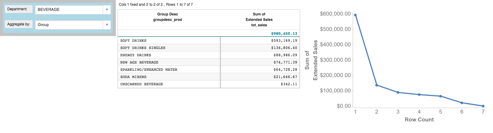
The graphics widget is added to the right of the grid widget.
You may want to display the results as a bar chart instead of a line chart,
which is the default, and you might also want to change the x-axis to show the name of the
group related to the sum of sales for each data point instead of the row number from the
tabulation. You can make these customizations to the graphics widget using the
<graphspec> element.
-
Add a
<graphspec>element to customize the appearance of the graphics widget.Note: The<graphspec>element is inserted between the opening and closing tags of the<widget>and may be placed before or after any query code associated with the widget. In this example, it is inserted after the query.... <widget class_="graphics" base_="{@sales_detail}"> <link table2="{@product_master}" col="sku" col2="sku" suffix="_prod" type="select"> <sel value="dept={@selection}"/> </link> <tabu label="Tabulation on Sales Detail" breaks="{@aggregate_by}"> <tcol source="xsales" fun="sum" name="tot_sales" label="Sum of`Extended Sales" format="type:currency"/> </tabu> <sort col="tot_sales" dir="down"/> <sel value="({@aggregate_by} <> '')"/> <graphspec> <chart type="bar"> <data x="{@aggregate_by}" y="tot_sales"/> <ticks xrot="45"/> <style xaxissize="10" yaxissize="10"/> </chart> </graphspec> </widget> </dynamic>The
<graphspec>element allows you to customize the graphics widget. It has a child element,<chart>, which allows you to specify the type of chart, among other attributes such as the title.The
<chart>element in turn has a number of children:<axes>,<data>,<legend>,<ticks>, and<style>, which allow you to control various aspects of the chart.The elements used in this example specify that the graph should be displayed as a line chart; the data for the x-axis should come from the column associated with the
aggregate_bydynamic variable; the data for the y-axis should come from thetot_salescolumn created by the tabulation; the ticks on the x-axis should be rotated 45 degrees; and the font size for the values on both the x-axis and y-axis should be 10px.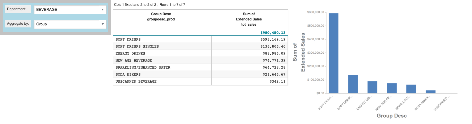
Like all the other widgets, you can modify the display-control attributes for the graphics widget. For instance, you might want to make the graphics widget a little wider.
-
Click Apply.
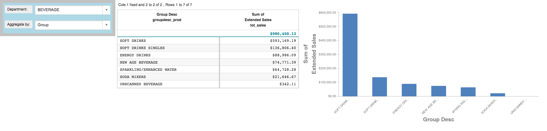
The width of the graphics widget is increased.
-
Select DAIRY DELI from the Department
drop-down menu.
When a selection is made in the Department drop-down, the
selectiondynamic variable is changed. Since both the grid and graphics widgets reference theselectiondynamic variable, both widgets are automatically updated.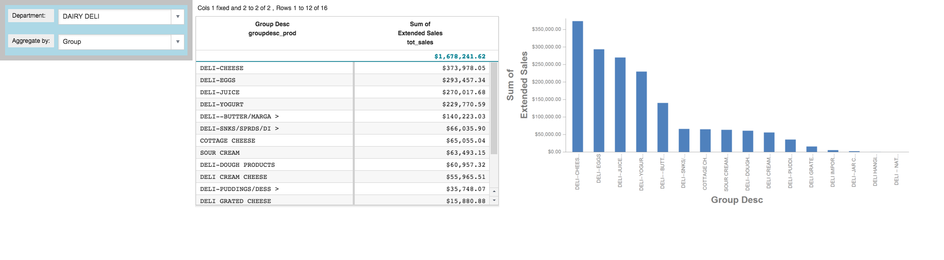
-
Select Brand from the Aggregate by
drop-down menu.
When a selection is made in the Aggregate by drop-down, the
aggregate_bydynamic variable is changed. Since both the grid and graphics widgets reference theaggregate_bydynamic variable, both widgets are automatically updated.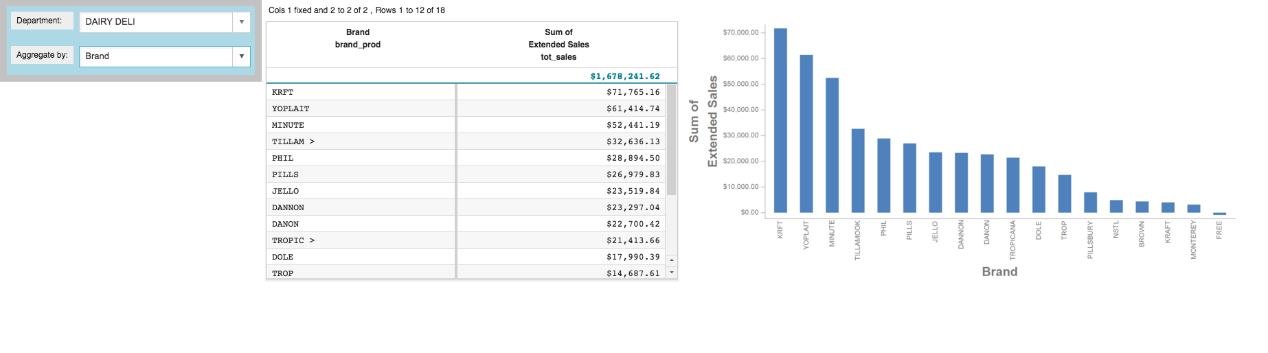
Cumulative QuickApp code
The Macro Language code for the QuickApp up to this point is:
<dynamic selection="19" product_master="pub.doc.retail.product"
 sales_detail="pub.doc.retail.salesdetail" aggregate_by="groupdesc_prod">
  <layout background_="lightblue" border_="10">
    <widget class_="dropdown" base_="{@product_master}"
     inputwidth_="250" value_="@selection" label_="Department:" labelwidth_="75">
      <tabu label="Tabulation on Product Master" breaks="deptdesc">
        <break col="deptdesc" sort="up"/>
        <tcol source="dept" name="dept" fun="first" label="First`Department"/>
      </tabu>
      <colord cols="dept,deptdesc"/>
    </widget>
    <widget class_="dropdown" value_="@aggregate_by"
     label_="Aggregate by:" labelwidth_="75" inputwidth_="250">
      <table>groupdesc_prod,Group;brand_prod,Brand
      </table>
    </widget>
    <ignore>
      <widget class_="text" text_="Current selection: {@selection}"/>
    </ignore>
  </layout>
  <widget class_="grid" base_="{@sales_detail}">
    <link table2="{@product_master}" col="sku" col2="sku"
     suffix="_prod" type="select">
      <sel value="dept={@selection}"/>
    </link>
    <tabu label="Tabulation on Sales Detail" breaks="{@aggregate_by}">
      <tcol source="xsales" fun="sum" name="tot_sales"
       label="Sum of`Extended Sales" format="type:currency"/>
    </tabu>
    <sort col="tot_sales" dir="down"/>
    <sel value="({@aggregate_by} <> '')"/>
  </widget>
  <widget class_="graphics" base_="{@sales_detail}" width_="800">
    <link table2="{@product_master}" col="sku" col2="sku"
     suffix="_prod" type="select">
      <sel value="dept={@selection}"/>
    </link>
    <tabu label="Tabulation on Sales Detail" breaks="{@aggregate_by}">
      <tcol source="xsales" fun="sum" name="tot_sales"
       label="Sum of`Extended Sales" format="type:currency"/>
    </tabu>
    <sort col="tot_sales" dir="down"/>
    <sel value="({@aggregate_by} <> '')"/>
    <graphspec>
      <chart type="bar">
        <data x="{@aggregate_by}" y="tot_sales"/>
        <ticks xrot="45"/>
        <style xaxissize="10" yaxissize="10"/>
      </chart>
    </graphspec>
  </widget>
</dynamic>