
Create a bar chart
You can create a bar chart to show comparisons among categories in your data.
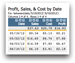
The first step to creating a chart in 1010data is to prepare your data. For this tutorial, this step has already been done so you can focus on creating the chart itself. The sample data provided compares the total sales, cost, and profit for stores in a fictitious retail chain. Use this data to create a bar chart comparing the total profit, sales, and cost of all stores combined for each day in the fiscal month of May. Once you have created your chart, you will save it for use in a later tutorial.
To create a bar chart:
-
Open the Bar Chart Sample Data Quick Query
(pub.doc.retail.barchartex).
1010data displays the Profit, Sales, & Cost by Date tabulation.
-
Click .
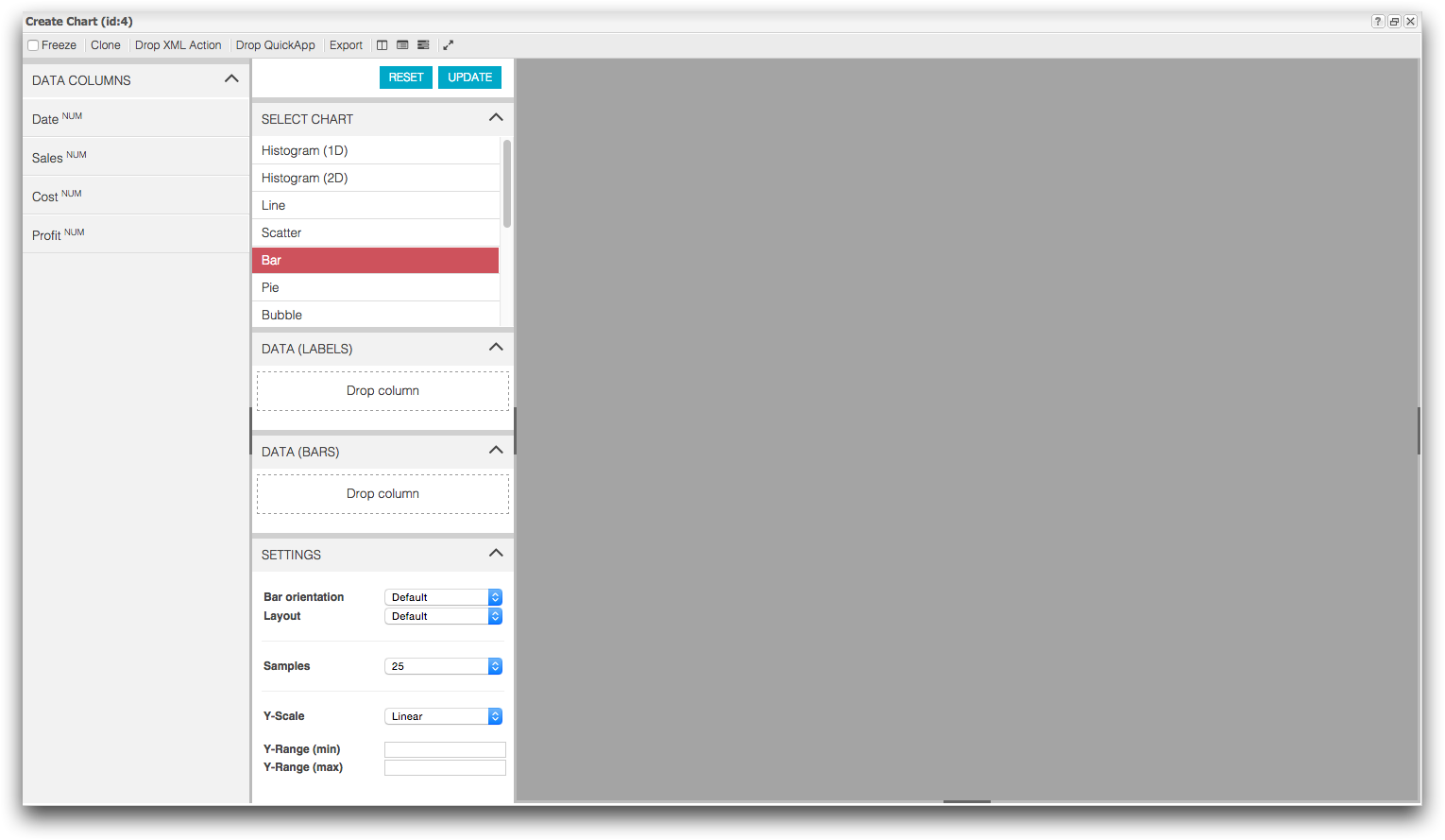
1010data displays the Chart Builder in the Create Chart window.
-
Create a bar chart showing the total sales and profit by day.
- From the Data Columns panel, drag Date into the Data (Labels) section of the Chart Parameters panel.
- From the Data Columns panel, drag Sales and Profit into the Data (Bars) section of the Chart Parameters panel.
- Click Update.
1010data displays a bar chart of your data.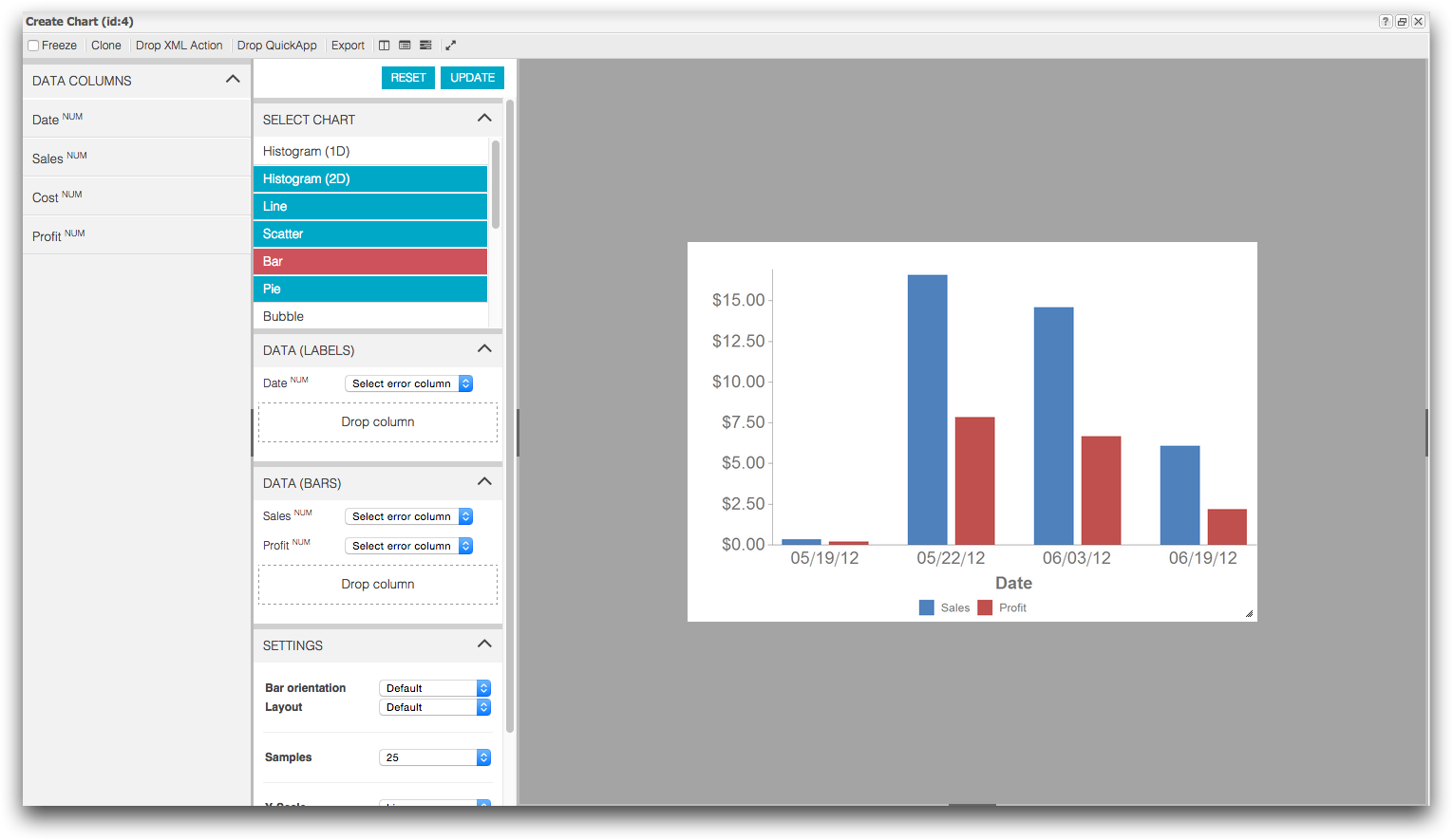
1010data provides a number of customizable settings that control the way a chart is displayed, including the size of the chart, background color, appearance of the title and the axes, and placement of the legend. You can also add titles and labels.
-
Add a title to your chart.
-
Click the Toggle right settings panel (
 ) icon.
The Customization Panel appears.
) icon.
The Customization Panel appears.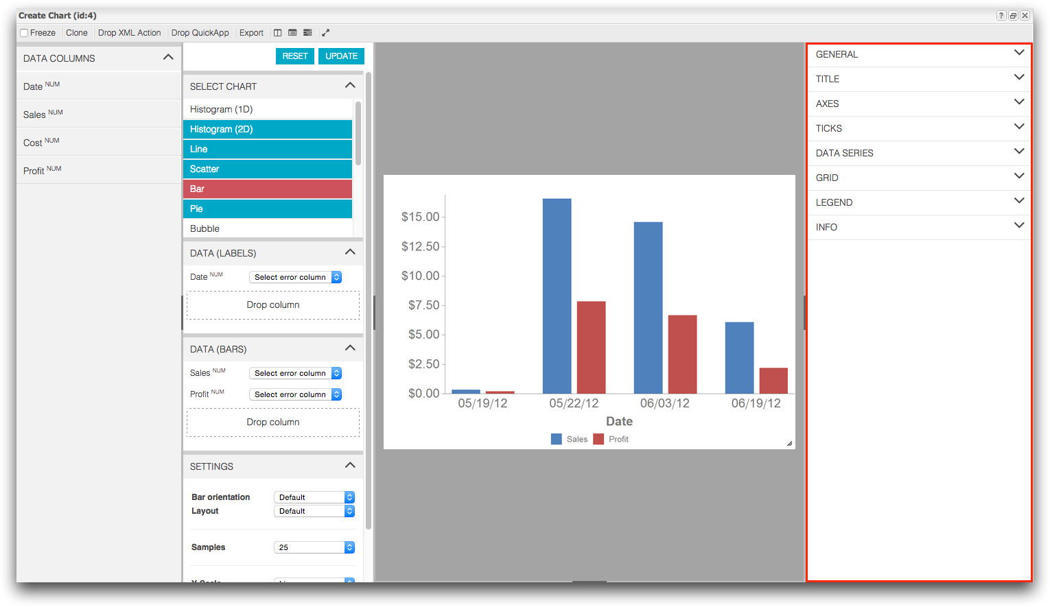
-
In the Customization Panel, click
Title.
The Title customization settings appear.
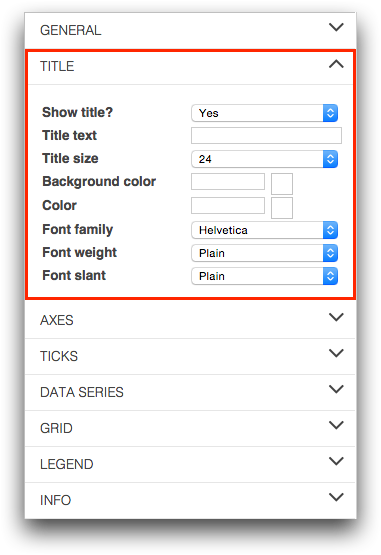
1010data adds the title to your chart.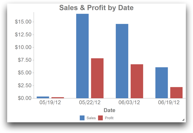
-
Click the Toggle right settings panel (
-
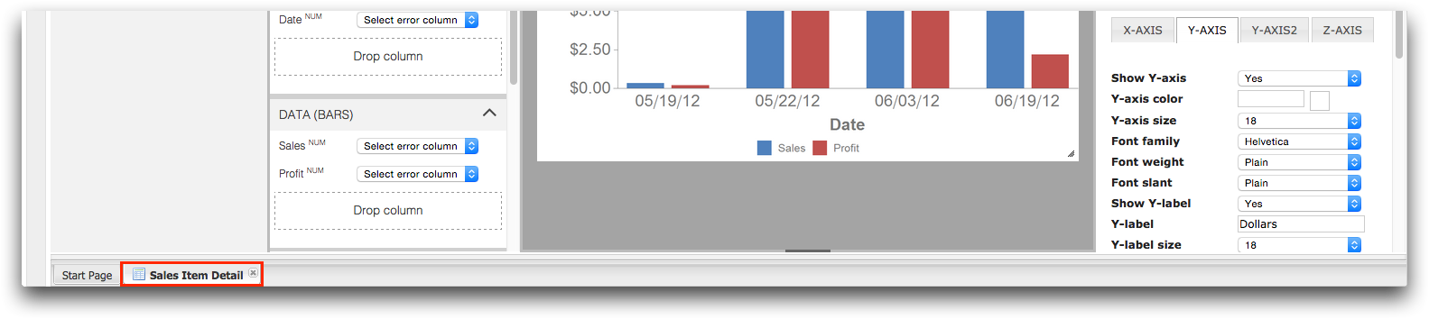
Add a text label to the y-axis.
-
In the Customization Panel, click
Axes.
The Axes customization settings appear.
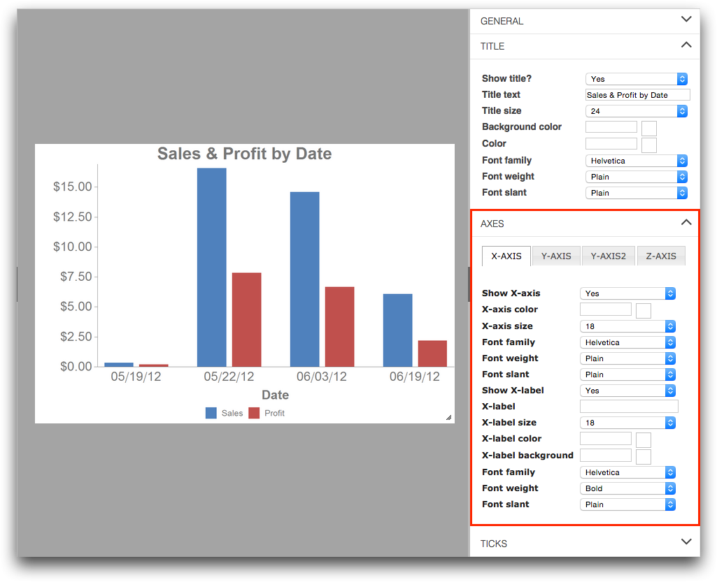
1010data adds the new text label to the y-axis your chart.
-
In the Customization Panel, click
Axes.
Once your chart is created, you can save it so you can access and update it at a later date. To save your chart, save the worksheet as a Quick Query and select the option to save open charts.
-
Save your worksheet and chart as a Quick Query.
-
On the File menu, click Save as Quick
Query.
1010data displays the Save As a Quick Query dialog.
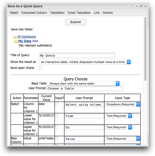
-
On the File menu, click Save as Quick
Query.
-
Close the Sales Item Detail tab.
The Sales Item Detail tab is located at the bottom of the screen.
 1010data closes the Sales Item Detail tab.
In this tutorial, you created a simple bar chart from your data and saved it as a Quick Query for future use. While the data for this tutorial was small and easy to understand, the data you work with each day will undoubtedly be much more complex. Using the charting options provided in 1010data can help you gain insight to your data in ways that would be quite difficult to see otherwise.