You can create a pie chart to show the proportional relationship of segments in your
data to the whole.
You might want to know how individual stores contributed to the overall profit of
your chain. For this tutorial, you can use a sample Quick Query that calculates
these metrics. Use the data from this Quick Query to create a pie chart that shows
this information. Once you have created your chart, you will save it for use in a
later tutorial.
To create a pie chart:
-
Open the Pie Chart Sample Data Quick Query
(pub.doc.retail.piechartex).
1010data displays the
Profit by Store
tabulation.
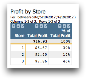
You can create a pie chart of this information to visually show how much
each store contributed to the total profit.
-
Click .
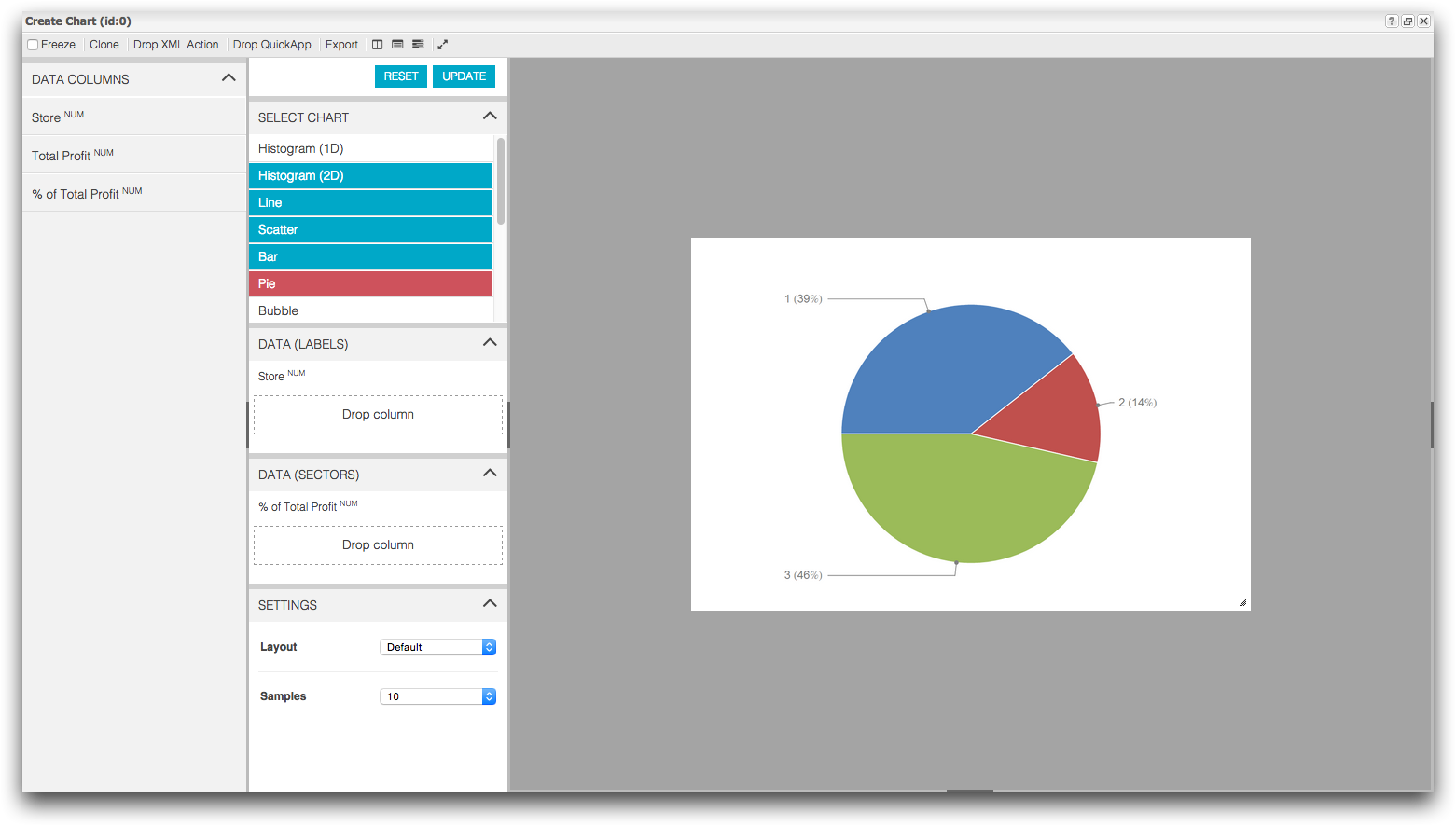
1010data displays the Chart Builder in the Create
Chart window.
-
Create a pie chart showing the percent of profit each store contributed to the
chain.
-
From the Data Columns panel, drag the
Store column into the Data
(Labels) section in the Chart
Parameters panel.
-
From the Data Columns panel, drag the
% of Total Profit column into the
Data (Sectors) section in the
Chart Parameters panel.
-
Click Update.
1010data displays a pie chart of your data.
-
Add a title to your chart.
-
Click the Toggle right settings panel (
 ) icon.
-
In the Customization Panel, click
Title.
-
In the Title text field, enter Profit
Contribution by Store: May 2012.
-
Press Enter.
1010data adds the title to your chart.

-
Save your worksheet and chart as a Quick Query.
-
On the File menu, click Save as Quick
Query.
1010data displays the Save As a Quick Query
dialog.
-
In the Title of Query field, enter
Profit Contribution by Store.
-
Select the Save open charts checkbox.
-
Click Submit.
1010data saves the Quick Query in the My
Data folder.
-
Close the Save As a Quick Query dialog.
-
Close the Sales Item Detail tab.
1010data closes the Sales Item Detail
tab.
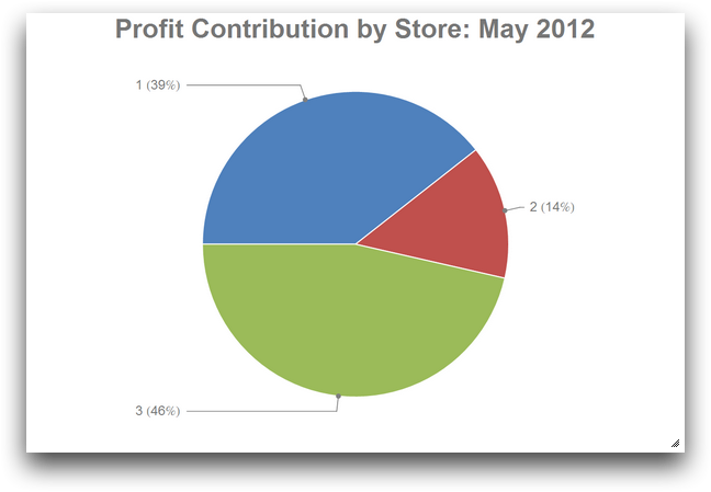
In this tutorial, you created a pie chart from your data to visually see the percent
of total profit each store contributed to the retail chain for the fiscal month of May.
In chart form, it is easy to see that stores 1 and 3 are contributing quite a bit more
to the bottom line.


 ) icon.