
Charting the Query Results
Now that we've analyzed the data and produced a helpful tabulation, it would be nice to view our results in a more graphical way. In this section, we'll use the 1010data Chart Builder to create a visualization of our data summary.
Before we actually jump into the Chart Builder, let's plan the steps we'll take to produce the chart:
- Plot a simple line chart of average snowfall vs. temperature bucket.
- Use temperature groups as the x-axis.
- Use average snowfall amounts as the y-axis.
To start, go to Chart menu in the 1010data web interface and click Line to create a line chart. This will launch the Chart Builder:
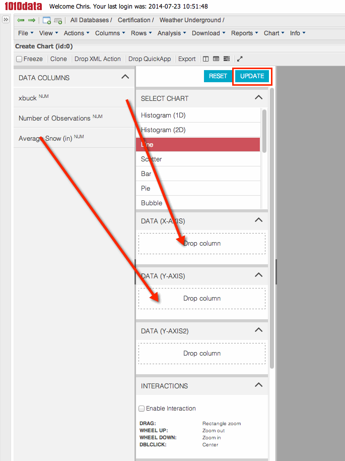
Now, drag the xbuck column from the DATA COLUMNS panel and drop it in the DATA (X-AXIS) section. Then, drag the Average Snow (in) column and drop it in the DATA (Y-AXIS) section. Then click the Update button at the top of the Chart Parameters panel. The new chart appears quickly.
The system automatically generates Macro Language code that produces the chart. To see the Macro Language, click the splitter toggle at the bottom of the Chart Builder.
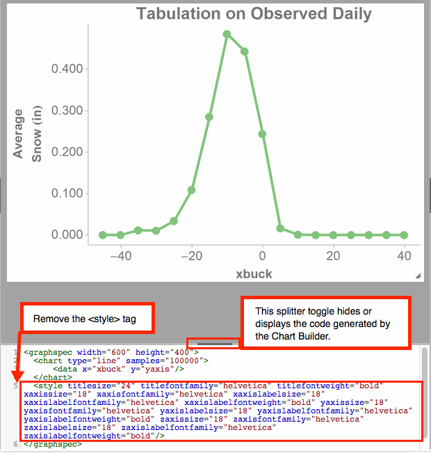
Notice that the Chart Editor will automatically insert a <style> tag with
numerous attributes that tell the system how to display the chart. All these attributes are
editable, but for the purposes of this tutorial, we will not need to style the chart in any
specific way. Therefore, it is recommended that you remove the <style> tag
from your Macro Language code. The code throughout the rest of this tutorial will not contain
this tag or any of its attributes and values.
Now that we have the Macro Language code for our chart, head over to the next section of this guide, where we will go through the process of using the QuickApp Editor to build an interactive version of our initial query.