
Auto-triggering Events with <do>
Now that we have given our QuickApp the ability to use different measures for the x and y
axes, we have created a small problem to solve. We limited our temperature ranges to
reasonable values... for temperatures. However, if we were to use different metrics for the x
and y axes, we would most likely want to use different values for x-min,
x-max, y-min, and y-max. The solution to
our problem is the <do> construct, a vital piece of logic for building
more dynamic and responsive QuickApps.
The <do> construct provides a way to run a query any time a variable is
changed. This is done by utilizing the onchange_ attribute. The
onchange_ attribute accepts a parameterized variable or list of variables.
When a variable changes, the query in between the <do> tags will be
executed. <do> also provides functionality for changing variables in the
QuickApp by providing variable names to the value[n]_
attributes, where [n] is an arbitrary number.
<do> is exactly the tool for the
job.<do onchange_="@xaxis" value1_="xmin" row1_="1" col1_="1" value2_="xmax" row2_="1" col2_="2">
<tabu>
<tcol source="{@xaxis}" fun="lo"/>
<tcol source="{@xaxis}" fun="hi"/>
</tabu>
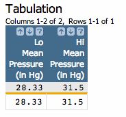
</do>First, let's take a quick look at what the query does. We need <do> to
provide us with new high and low values depending on the column we want to use for our axis.
This tabulation does exactly that, by returning a table with only one row and two columns. The
first column contains the lowest value in the xaxis column of the original
table, and the second column returned by the query provides the highest value for the
xaxis column. Here's what the table resulting from the above tabulation
looks like if the parameterized variable, @xaxis, is set to
meanpressurei:
In the above code, we are providing <do> with several pieces of
information. First, onchange_="@xaxis" tells <do> to
execute the tabulation whenever the @xaxis variable is changed.
value1_="xmin" row1_="1" col1_="1" tells <do> that it
will set the xmin variable to the value found in the first row and first
column of the query results. value2_="xmax" row2_="1" col2_="2" specifies
that xmax will be set to the value of the second.
Now that we have the logic down for providing new high and low values depending on the
measures the end-user selects, we can do the exact same thing for the yaxis
as well. Here's the full QuickApp code with the <do> clauses worked
in:
<dynamic bucksize="5" xaxis="meantempi" xmin="-50" xmax="50" yaxis="snowfalli" ymin="0" ymax="120">
<do onchange_="@xaxis" value1_="xmin" row1_="1" col1_="1" value2_="xmax" row2_="1" col2_="2">
  <tabu>
    <tcol source="{@xaxis}" fun="lo"/>
    <tcol source="{@xaxis}" fun="hi"/>
  </tabu>
</do>
<do onchange_="@yaxis" value1_="ymin" row1_="1" col1_="1" value2_="ymax" row2_="1" col2_="2">
<tabu>
<tcol source="{@yaxis}" fun="lo"/>
<tcol source="{@yaxis}" fun="hi"/>
</tabu>
</do>
<widget class_="graphics" height_="400" name="hmnonce__1" width_="600" update_="manual">
<sel value="between({@xaxis};{@xmin};{@xmax})"/>
<sel value="between({@yaxis};{@ymin};{@ymax})"/>
<willbe name="xbuck" value="round({@xaxis};{@bucksize})"/>
<tabu label="Tabulation on Observed Daily" breaks="xbuck">
<break col="xbuck" sort="up"/>
<tcol source="xbuck" fun="cnt" name="num" label="Number of`Observations"/>
<tcol source="{@yaxis}" fun="avg" name="yaxis" label="Average`Snow (in)"/>
</tabu>
<graphspec width="600" height="400">
<chart type="line" samples="100000">
<data x="xbuck" y="yaxis"/>
</chart>
</graphspec>
</widget>
<layout>
<layout>
<widget class_="field" label_="X Bucket Size" name="hmadded__1" value_="@bucksize"/>
</layout>
<layout>
<widget base_="pub.demo.weather.wunderground.observed_daily" class_="dropdown" label_="X Variable" name="hmadded__2" value_="@xaxis">
<columns full="0"/>
<sel value="(type='f''i')"/>
<colord cols="name,label"/>
</widget>
<widget class_="field" label_="X Min:" value_="@xmin"/>
<widget class_="field" label_="X Max:" value_="@xmax"/>
</layout>
<layout>
<widget base_="pub.demo.weather.wunderground.observed_daily" class_="dropdown" label_="Y Variable" name="hmadded__3" value_="@yaxis">
<columns full="0"/>
<sel value="(type='f''i')"/>
<colord cols="name,label"/>
</widget>
<widget class_="field" label_="Y Min:" value_="@ymin"/>
<widget class_="field" label_="Y Max:" value_="@ymax"/>
</layout>
<widget class_="button" name="hmadded__4" text_="Submit Changes" type_="submit"/>
</layout>
</dynamic>
Now if we change the metric for either axis, the min and max values for each will be changed
automatically. For instance, if we change our x-axis to the date, <do>
lends a helping hand:

We're almost finished with our first QuickApp. We only have a couple small finishing touches to add. The next section will help us really make it shine.