
Start with a 1010data Query
Before you can build an interface for a QuickApp in 1010data, you must have a plan for what the QuickApp will do. The best QuickApps provide a way to interact with a specific analysis or several related analyses. A good QuickApp is focused on completing a task or lending flexibility to a way of looking at a data set or related data sets.
Every QuickApp first starts with a standard 1010data query. In this tutorial, we will build a QuickApp that allows us to interact with weather data. The sample QuickApp in this tutorial will be built on a data set that consists of a series of daily weather observations by zip code. 1010data has a collection of weather data that is available to most users, which can be found at pub.demo.weather.wunderground.observed_daily. The sample QuickApp in this tutorial will be built on this data. First, let's take a look at the data:
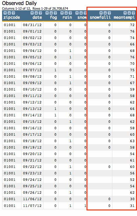
This table has many interesting data points, but for our example, we will primarily work with
Snow Fall (in) (snowfalli) and Mean Temp
(in) (meantempi) columns. The analysis will consist of creating
a summary of the average snowfall, in inches, by temperature ranges in increments of 5. Before
we look at the code, let's list out the steps we need to accomplish this analysis:
- Select only the rows that fall into a reasonable temperature range.
For this analysis, we will select rows whose average temperature is between 50 degrees and -50 degrees Fahrenheit.
- Select only the rows that fall into a reasonable range over average snowfall values.
For this example, we will select rows containing between 0 and 120 inches of snowfall on any given day.
- Create a new column to use for grouping the average temperature in 5 degree increments.
- Create a tabulation that displays the average snowfall for every 5 degree temperature group and shows the number of total observations taken for each group.
Now, let's look at the above steps in Macro Language code:
-
<sel value="between(meantempi;-50;50)"/> -
<sel value="between(snowfalli;0;120)"/> -
<willbe name="xbuck" value="round(meantempi;5)"/> -
<tabu label="Tabulation on Observed Daily" breaks="xbuck">
  <break col="xbuck" sort="up"/>
  <tcol source="xbuck" fun="cnt" name="num" label="Number of `Observations"/>
  <tcol source="snowfalli" fun="avg" name="yaxis" label="Average`Snow (in)"/>
</tabu>
Below is the full macro:
<note type="base">Applied to table: pub.demo.weather.wunderground.observed_daily</note>
<sel value="between(meantempi;-50;50)"/>
<sel value="between(snowfalli;0;120)"/>
<willbe name="xbuck" value="round(meantempi;5)"/>
<tabu label="Tabulation on Observed Daily" breaks="xbuck">
  <break col="xbuck" sort="up"/>
  <tcol source="xbuck" fun="cnt" name="num" label="Number of `Observations"/>
  <tcol source="snowfalli" fun="avg" name="yaxis" label="Average`Snow (in)"/>
</tabu>
And here is the resultant worksheet:
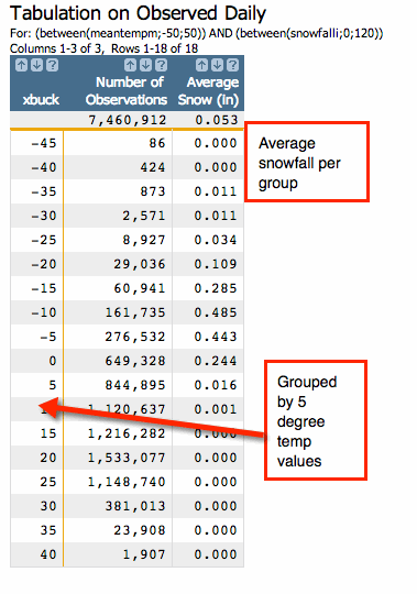
While the tabular form of the data is interesting, it would be even more interesting if it were in the form of a graph or chart. The next section will use the Chart Builder to turn our tabulation into an easy-to-read graphic.