
Finishing Touches
<data> elements inside
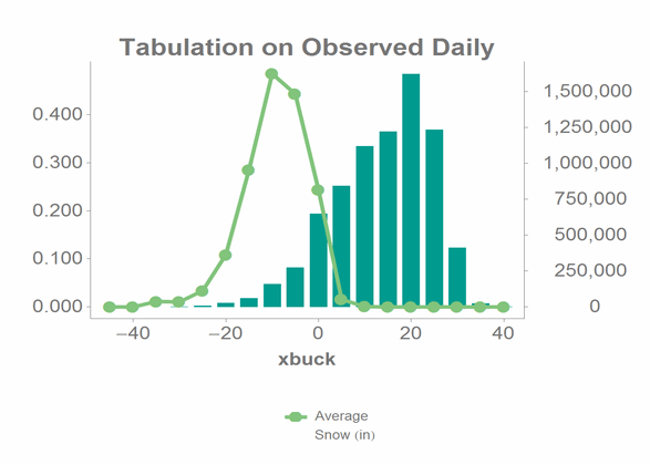
the chart. In our original tabulation, we created a column that simply contains the total
number of observations for each bucket. We can include this information in the same chart by
adding a <data> element inside the <chart> element, as
follows:<data x="xbuck" y="num" as="bar" yaxis="s">
<axes ymin="0"/>
</data>Note that we're using the num column in the original tabulation to get the
information for the graph. If we add this to the chart, the results come out as follows:
And the whole QuickApp up to this point, with the new <data> element in
bold, looks like this:
<dynamic bucksize="5" xaxis="meantempi" xmin="-50" xmax="50" yaxis="snowfalli" ymin="0" ymax="120">
<do onchange_="@xaxis" value1_="xmin" row1_="1" col1_="1" value2_="xmax" row2_="1" col2_="2">
<tabu>
<tcol source="{@xaxis}" fun="lo"/>
<tcol source="{@xaxis}" fun="hi"/>
</tabu>
</do>
<do onchange_="@yaxis" value1_="ymin" row1_="1" col1_="1" value2_="ymax" row2_="1" col2_="2">
<tabu>
<tcol source="{@yaxis}" fun="lo"/>
<tcol source="{@yaxis}" fun="hi"/>
</tabu>
</do>
<widget class_="graphics" height_="400" name="hmnonce__1" width_="600" update_="manual">
<sel value="between({@xaxis};{@xmin};{@xmax})"/>
<sel value="between({@yaxis};{@ymin};{@ymax})"/>
<willbe name="xbuck" value="round({@xaxis};{@bucksize})"/>
<tabu label="Tabulation on Observed Daily" breaks="xbuck">
<break col="xbuck" sort="up"/>
<tcol source="xbuck" fun="cnt" name="num" label="Number of`Observations"/>
<tcol source="{@yaxis}" fun="avg" name="yaxis" label="Average`Snow (in)"/>
</tabu>
<graphspec width="600" height="400">
<chart type="line" samples="100000">
<data x="xbuck" y="yaxis"/>
<data x="xbuck" y="num" as="bar" yaxis="s">
    <axes ymin="0"/>
</data>
</chart>
</graphspec>
</widget>
<layout>
<layout>
<widget class_="field" label_="X Bucket Size" name="hmadded__1" value_="@bucksize"/>
</layout>
<layout>
<widget base_="pub.demo.weather.wunderground.observed_daily" class_="dropdown" label_="X Variable" name="hmadded__2" value_="@xaxis">
<columns full="0"/>
<sel value="(type='f''i')"/>
<colord cols="name,label"/>
</widget>
<widget class_="field" label_="X Min:" value_="@xmin"/>
<widget class_="field" label_="X Max:" value_="@xmax"/>
</layout>
<layout>
<widget base_="pub.demo.weather.wunderground.observed_daily" class_="dropdown" label_="Y Variable" name="hmadded__3" value_="@yaxis">
<columns full="0"/>
<sel value="(type='f''i')"/>
<colord cols="name,label"/>
</widget>
<widget class_="field" label_="Y Min:" value_="@ymin"/>
<widget class_="field" label_="Y Max:" value_="@ymax"/>
</layout>
<widget class_="button" name="hmadded__4" text_="Submit Changes" type_="submit"/>
</layout>
</dynamic>
There's still one cool trick we can add to make the QuickApp more useful. We can parameterize the table that the QuickApp uses, so we can make our QuickApp work on any table. We'll do this with a folder browser widget. Go back to the QuickApp Editor and add a new widget. From the Class drop-down, click Folder browser. Then set the following options:
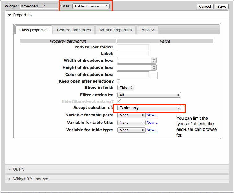
Click the Save button and then commit the changes to the QuickApp.
Next, we'll need a variable to hold the base value so we can include it in all our widgets
and <do> loops. Our full opening <dynamic> tag now
looks like this:
<dynamic bucksize="5" xaxis="meantempi" xmin="-50" xmax="50" yaxis="snowfalli" ymin="0" ymax="120"
base="pub.demo.weather.wunderground.observed_daily">
For the <do> clauses, we will use the <base> element,
as follows:
<base table="{@base}"/>
For widgets, we'll call the base variable using the base_ attribute, as
follows (from our chart widget):
widget base_="{@base}" class_="graphics" invmsg_="Click Submit" name="chart" update_="manual">
<note type="base">Applied to table: pub.demo.weather.wunderground.observed_daily</note>
<dynamic bucksize="5" xaxis="meantempi" xmin="-50" xmax="50" yaxis="snowfalli" ymin="0" ymax="120" base="pub.demo.weather.wunderground.observed_daily">
  <do onchange_="@xaxis" value1_="xmin" row1_="1" col1_="1" value2_="xmax" row2_="1" col2_="2">
    <base table="{@base}"/>
    <tabu>
      <tcol source="{@xaxis}" fun="lo"/>
      <tcol source="{@xaxis}" fun="hi"/>
    </tabu>
  </do>
  <do onchange_="@yaxis" value1_="ymin" row1_="1" col1_="1" value2_="ymax" row2_="1" col2_="2">
    <tabu>
      <tcol source="{@yaxis}" fun="lo"/>
      <tcol source="{@yaxis}" fun="hi"/>
    </tabu>
  </do>
  <widget class_="graphics" height_="400" name="hmnonce__1" width_="600" update_="manual">
    <sel value="between({@xaxis};{@xmin};{@xmax})"/>
    <sel value="between({@yaxis};{@ymin};{@ymax})"/>
    <willbe name="xbuck" value="round({@xaxis};{@bucksize})"/>
    <tabu label="Tabulation on Observed Daily" breaks="xbuck">
      <break col="xbuck" sort="up"/>
      <tcol source="xbuck" fun="cnt" name="num" label="Number of`Observations"/>
      <tcol source="{@yaxis}" fun="avg" name="yaxis" label="Average`Snow (in)"/>
    </tabu>
    <graphspec width="600" height="400">
      <chart type="line" samples="100000">
        <data x="xbuck" y="yaxis"/>
        <data x="xbuck" y="num" as="bar" yaxis="s">
            <axes ymin="0"/>
          </data>
      </chart>
    </graphspec>
  </widget>
  <layout>
    <layout>
      <widget class_="field" label_="X Bucket Size" name="hmadded__1" value_="@bucksize"/>
    </layout>
    <layout>
      <widget base_="{@base}" class_="dropdown" label_="X Variable" name="hmadded__2" value_="@xaxis">
        <columns full="0"/>
        <sel value="(type='f''i')"/>
        <colord cols="name,label"/>
      </widget>
      <widget class_="field" label_="X Min:" value_="@xmin"/>
      <widget class_="field" label_="X Max:" value_="@xmax"/>
    </layout>
    <layout>
      <widget base_="{@base}" class_="dropdown" label_="Y Variable" name="hmadded__3" value_="@yaxis">
        <columns full="0"/>
        <sel value="(type='f''i')"/>
        <colord cols="name,label"/>
      </widget>
      <widget class_="field" label_="Y Min:" value_="@ymin"/>
      <widget class_="field" label_="Y Max:" value_="@ymax"/>
    </layout>
    <widget class_="button" name="hmadded__4" text_="Submit Changes" type_="submit"/>
  </layout>
</dynamic>
Go through and replace all references to the base table with the parameterized variable, and presto, a completely parameterized QuickApp that will run on any table and plot any metric.
Of course, there's tons more you can do with QuickApps, and we've only scratched the surface.