<layout>
The <layout> element is a nestable pseudo-operation that can be
used to organize <widget> elements and other <layout>
elements.
Description
The <layout> element may contain <widget> elements,
<layout> elements, and <block> code that expands
to either <layout> or <widget>. There must be at
least one widget within a layout and all layouts nested within it.
Syntax
<dynamic>
      <layout>
    [WIDGET]
      </layout>
</dynamic>
Attributes
name_- Specifies a name to identify the layout within the QuickApp.
For example, you can specify the name of the layout to the
include_attribute of a<widget class_="button" type_="render" target_="[TARGET]">to indicate that you want a particular layout rendered in the specified target. For more information, seetype_="render". label_- Accepts text that provides a label for a given content area.
As of version 11.06, when the
label_attribute is supplied to a plain<layout>(i.e., one that does not have atype_specified), and that layout is scrollable, the label is shown in a static bar across the top that does not move even if the rest of the layout is scrolled. Prior to version 11.06, the label was rendered as part of the regular contents of the layout and could be scrolled out of view. labelheight_- Specifies the amount of space reserved for the label of a plain layout (i.e., one that
does not have a
type_specified).See the description of
label_above for details.The default is
25. type_- The
type_attribute accepts values that specify predefined content layouts.Valid values are:
accordion- Creates a series of divided content areas that expand to show content or
collapse to hide content based on user interactions.
Unlike the
collapsiblecontent construct, only one panel in an accordion layout can be open at one time. collapsible- Creates a series of divided content areas that expand to show content or
collapse to hide content based on user interactions.
Unlike the
accordioncontent construct, all panels in a collapsible layout can be closed. dropzone- Creates an area where draggable widgets can be dropped.
flexible- A layout that handles automatic sizing and layout of widgets.
For
<layout type_="flexible">, includeweight_to determine the relative size of the layout inside the flexible layout type andanchor_to determine the area the layout is placed in. Possible anchor values arecenter,left,right,top, andbottom. flip- Creates a content layout that consists of two panels, only one of which is
displayed at a time.
A
<layout type_="flip">must contain exactly two<layout>elements. When rendered, the panel associated with the first layout is displayed and the other is hidden.A toggle button is provided, which flips the panels around vertically or horizontally, depending on the value of the required
arrange_attribute. A particular panel can be displayed by clicking the toggle button or by setting the value of the dynamic variable associated with theopenvalue_attribute.If
width_is not specified, the default is100%.If
height_is not specified, the default is100%.If
halign_is not specified, the default isleft.(Available as of version 12.18)
sheaf- Creates a content layout that consists of multiple panels. Only one panel can be
displayed at a time.
This layout is essentially identical to
type_="tabpanel"but without the tabs.Each content panel must be defined by its own
<layout>between the opening and closing tags of the<layout type_="sheaf">.Since there is no built-in control to change the content area displayed in this panel, this layout type is useful primarily with the
openvalue_attribute.(Available as of version 10.34)
slidebottom- Creates an area at the bottom of the window.
slideright- Creates an area at the right of the window.
splitter- Creates a split layout so multiple content areas can be displayed
simultaneously.
A single
<layout type_="splitter">will generate multiple content areas equal to the number of<layout>elements nested inside the splitter layout (e.g., three<layout>elements inside asplitterlayout will create three content areas).Nesting another
<layout type_="splitter">inside a<layout>element already contained by asplitterlayout can be used to further sub-divide a single content pane into additional sub-content-panes.Content areas in a
splittercan be arranged horizontally or vertically using thearrange_="v|h"attribute of the<layout>element.(Available as of prod-9)
tabpanel- Creates a tabbed content area that consists of multiple panels.
Each content panel must be defined by its own
<layout>between the opening and closing tags of the<layout type_="tabpanel">.A particular content panel can be displayed by clicking its tab or by setting the value of the dynamic variable associated with the
openvalue_attribute. window- Creates a moveable, resizable window for the contents of the layout.Note: This type of layout should only be used in standalone QuickApps, not in integrated QuickApps that are intended to run within the Insights Platform workspace.
(Available as of version 10.01)
arrange_- Sets the alignment for the current
<layout>relative to the preceding<layout>.Valid values are:
h- Horizontal alignment
v- Vertical alignment
This attribute is required for
<layout type_="flip">. overflow_- Specifies the behavior when the contents exceeds the bounds of the layout.
Valid values are:
visible- The overflow is rendered outside of the layout.
auto- Scroll bars are added to the layout if and only if the contents exceeds the bounds of the layout.
hidden- The overflow is not visible.
scroll- The overflow is not visible, but a scroll bar is added to see the rest of the content.
The default is
visible.The
overflow_attribute is only valid whentype_is not specified.(Available as of version 11.06)
openvalue_- Specify a dynamic variable whose value indicates which panel should be displayed in a
<layout>. This applies to layouts where thetype_attribute is set toflip,accordion,collapsible,tabpanel.When the value of the dynamic variable changes, the panel corresponding to the value of the dynamic variable will be displayed.
For example, setting the value of the dynamic variable associated with the
openvalue_attribute to 2 will open the second tab in a<layout>oftype_="tabpanel".For
<layout
                type_="collapsible">
, setting the value of the dynamic variable associated with theopenvalue_attribute to the empty string ("") closes all the panels. Also, the value of the dynamic variable can be set to a comma-separated list that contains the indices of the panels to open. (Available as of version 10.07) showvalue_- Specify a dynamic variable whose value determines whether the associated layout should
be hidden or displayed.
When the value of this dynamic variable is set to 0, the layout associated with this attribute is hidden; when the dynamic variable is set to 1, the layout is visible.
width_- Accepts an integer value describing the fixed width of the container.
height_- Accepts an integer value describing the fixed height of the container.
fixpos_- Fixes the position of the upper left corner of the widget container relative to the
browser window. Accepts two values,
X, Ywhere the default value ispx. However, any CSS unit valid for relative position can be specified.Note: This attribute does not work with windowed widgets or layouts. relpos_- Fixes the position of the upper left corner of the widget container relative to the
containing layout. Accepts two values,
X, Ywhere the default value ispx. However, any CSS unit valid for relative position can be specified. abspos_- Fixes the position of the upper left corner of the widget container relative to the
main window. Accepts two values,
X, Ywhere the default value ispx. However, any CSS unit valid for absolute position can be specified. tooltip_- Displays a tooltip when someone moves the mouse over the widget. Accepts text.
tooltipdelay_- An optional delay, in seconds, before the tooltip appears.
tooltipdelay_takes a non-negative floating point number. (Available as of version 14.12) background_- Specifies the background color of the container.
The color can be specified as any valid HTML color name, an RGB value, or a hex value.
border_- Sets the width of the border of the container.
padding_- Sets the width of the padding of the container.
margin_- Sets the width of the margin of the container.
exclusion_- Specifies whether or not to define an exclusion zone for the container. Accepts a
1or0.When
exclusion_="1", windows cannot be moved within the bounds of the container. If a window is dragged into the exclusion zone, its position will be adjusted so that it is outside the zone. A windowed widget withwindowexcluded_="0"overrides this, allowing that window to be moved into the exclusion zone.The default is
0.(Available as of version 10.44)
halign_- Sets the horizontal alignment of the container.
Accepts one of three values:
leftrightcenter
Attributes when type_="splitter"
The following attributes may be applied to the sub-layouts within a <layout
type_="splitter">.
heightvalue_- The height of the splitter sub-layout is stored in the dynamic variable associated
with the
heightvalue_attribute. The value is automatically updated whenever the height of the sub-layout changes.The variable must be declared in the opening
<dynamic>tag of the QuickApp (e.g.,<dynamic var_name="">). widthvalue_- The width of the splitter sub-layout is stored in the dynamic variable associated with
the
widthvalue_attribute. The value is automatically updated whenever the width of the sub-layout changes.The variable must be declared in the opening
<dynamic>tag of the QuickApp (e.g.,<dynamic var_name="">). flexible_- Specifies whether or not a splitter sub-layout is resizable. Accepts a
1or0.If a sub-layout specifies
flexible_="0", the resize handle between it and its adjacent sub-layout is not available.The default is
1. collapsible_- Specifies whether or not a splitter sub-layout can be collapsed. Accepts a
1or0.If a sub-layout specifies
collapsible_="0", the expand/collapse icons between it and its adjacent sub-layout are not available.The default is
1.
Attributes when type_="window"
initopen_- Determines whether to show or hide the window initially. Accepts a
1or0.The default is
0. modal_- Determines whether or not to force the user to interact with the window before
returning to the QuickApp in which it is contained. Accepts a
1or0.The default is
0. center_- Determines whether or not the window is centered within the frame containing the
QuickApp. Accepts a
1or0.As of version 11.07, the default is
1whenmodal_="1"; otherwise, the default is0.When
modal_="0", the default is0. titlebar_- Determines whether or not to display the window with a title bar. Accepts a
1or0.Eliminating the title bar may be desirable when creating modal dialogs with
modal_="1".The default is
1.(Available as of version 11.07)
minimizable_- Determines whether or not to display a Minimize icon in the
upper-right corner of the window that minimizes the window when clicked. Accepts a
1or0.The default is
1.(Available as of version 10.01)
maximizable_- Determines whether or not to display a Maximize icon in the
upper-right corner of the window that maximizes the window when clicked. Accepts a
1or0.The default is
1.(Available as of version 10.01)
closable_- Determines whether or not to display a Close icon in the
upper-right corner of the window that closes the window when clicked. Accepts a
1or0.The default is
1. windowresizable_- Determines whether or not the window can be resized. Accepts a
1or0.The default is
1.(Available as of version 10.01.)
managed_- Determines whether or not the window manager should handle the window when it is in
its minimized state. Accepts a
1or0.The default is
0.(Available as of version 10.10)
pinned_- Determines whether the window remains stationary when the page content is scrolled.
Accepts a
1or0.The default is
0.(Available as of version 10.12.)
pinnable_- Determines whether or not to display a Pin icon in the
upper-right corner of the window that pins the window in a stationary position when
clicked. Accepts a
1or0.The default is
0.(Available as of version 10.12)
maxwidth_- Specifies the maximum width of the window.
minwidth_- Specifies the minimum width of the window.
maxheight_- Specifies the maximum height of the window.
minheight_- Specifies the minimum height of the window.
Attributes when type_="collapsible"
maxopen_- Accepts an integer value that specifies the maximum number of panels that can be
opened.
(Available as of version 10.07)
Attributes when type_="flexible"
weight_- Accepts an integer value that determines the relative size of the layout inside the flexible layout.
anchor_- Determines the area the layout is placed in. Possible values are
center,left,right,top, andbottom.
Example: arrange_="v"
In this example, we use the <layout> tag to present two
dropdown widgets in a vertical arrangement:
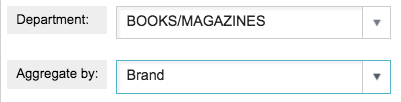
<dynamic selection="" aggregate_by="">
  <layout arrange_="v">
    <widget class_="dropdown" base_="pub.doc.retail.product"
     inputwidth_="250" value_="@selection"
     label_="Department:" labelwidth_="75">
      <tabu breaks="deptdesc">
        <break col="deptdesc" sort="up"/>
        <tcol source="dept" name="dept" fun="first"/>
      </tabu>
      <colord cols="dept,deptdesc"/>
    </widget>
    <widget class_="dropdown" value_="@aggregate_by"
     label_="Aggregate by:" labelwidth_="75" inputwidth_="250">
      <table>groupdesc_prod,Group;brand_prod,Brand
      </table>
    </widget>
  </layout>
</dynamic>
This results in the following:
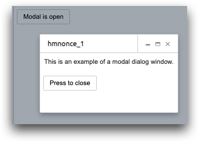
Example: Modal dialog window
<dynamic v="0" msg="Press to open modal">
  <do onchange_="@v">
    <set msg="{if(@v;'Modal is open';'Modal closed, press to open again')}"/>
  </do>
  <layout type_="window" modal_="1" showvalue_="@v">
    <widget class_="text" text_="This is an example of a modal dialog window."/>
    <widget class_="button" type_="set"  text_="Press to close" value_="@v" newvalue_="0"/>
  </layout>
  <widget class_="button" type_="set" text_="{@msg}" value_="@v" newvalue_="1"/>
</dynamic>
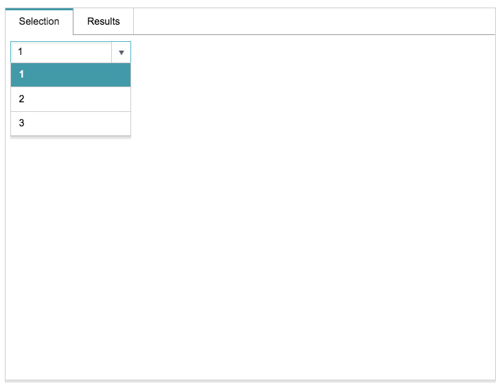
Example: type_="tabpanel"
This example demonstrates how to nest <layout> elements to create
content separators. The example shows a tabpanel; however, the same syntax
also applies to accordion and collapsible content areas.
Note that the top-level <layout> tag contains the
tabpanel type, as follows: <layout type_="tabpanel">.
However, there are additional <layout> tags nested within the highest
level <layout>. Each of these nested <layout>
elements produces the actual content pane and contains the content.
<dynamic selection="1">
  <layout type_="tabpanel" width_="700" height_="500">
    <layout label_="Selection">
      <widget class_="dropdown" base_="pub.demo.retail.item"
       value_="@selection">
        <willbe name="storeselect" value="g_first1(store;;)"/>
        <sel value="storeselect=1"/>
        <colord cols="store"/>
      </widget>
    </layout>
    <layout label_="Results" name="sample">
      <widget class_="grid" base_="pub.demo.retail.item">
        <sel value="store={@selection}"/>
      </widget>
    </layout>
  </layout>
</dynamic>
The example above produces the following tabpanel layout:
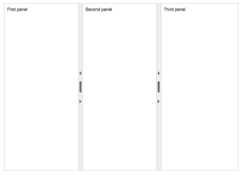
Example: type_="splitter"
The following code demonstrates how to use <layout
type_="splitter">:
<dynamic>
  <layout width_="700" height_="500" arrange_="h" type_="splitter">
    <layout width_="33%">
      <widget class_="text" text_="First panel"/>
    </layout>
    <layout width_="33%">
      <widget class_="text" text_="Second panel"/>
    </layout>
    <layout width_="34%">
      <widget class_="text" text_="Third panel"/>
    </layout>
  </layout>
</dynamic>
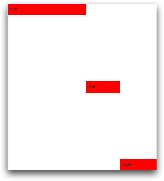
Example: type_="flexible"
<dynamic>
  <layout type_="flexible" arrange_="h" height_="100%">
    <layout weight_="3" anchor_="left">
      <widget class_="text" background_="red" text_="one"/>
    </layout>
    <layout weight_="1" anchor_="center">
      <widget class_="text" background_="red" text_="two"/>
    </layout>
    <layout weight_="1" anchor_="bottom">
      <widget class_="text" background_="red" text_="three"/>
    </layout>
  </layout>
</dynamic>