<render>
The <render> element provides the ability to configure certain
QuickApp widgets when rendered to available output targets. A single
<render> element contains one or more elements that specify output targets
and settings for the final output.
Description
<render> element can contain one or more of the following child
elements, each of which may contain attributes that control rendering of the respective target:<web>- Specifies attributes used when rendering the QuickApp to a web target (e.g., iframe,
browser tab, window).
For more information, see <web>.
<xlsx>- Specifies attributes used when rendering the QuickApp to an Excel workbook.
For more information, see <xlsx>.
<data>- Specifies attributes used when rendering the QuickApp as a text file.
For more information, see <data>.
<pdf>- Specifies attributes used when rendering the QuickApp to a PDF.
For more information, see <pdf>.
<static>- Specifies attributes used when rendering the QuickApp as a static HTML page.
For more information, see <static>.
The <render> element and its child elements work in conjunction with
<widget class_="nest" target_="[TARGET]">. For
instance, <widget class_="nest" target_="pdf"> will use the attributes
specified in the <pdf> child element of <render> to
render the associated QuickApp to a PDF when the nest widget is
instantiated.
The <render> element and its child elements work in conjunction with
<widget class_="button" type_="render"
          target_="[TARGET]">
for xlsx,
pdf, and data targets. For instance, <widget
class_="button" type_="render" target_="xlsx"> will use the attributes specified
in the <xlsx> child element of <render> to render
the associated QuickApp to an Excel workbook when the user clicks the
render button. For more information on the render
button, see type_="render".
Attributes that specify settings for supported widgets can be added as child elements of
the <render> element, as attributes in the <layout>
element, or as attributes of the <widget> element. When settings are
specified as attributes to child elements of <render> or as attributes
to <layout> elements, those settings propagate to widgets contained at
each level respectively. When settings are applied to a specific widget, they are only
applied to that widget.
Syntax
<dynamic>
  <render theme_="[THEME_VALUE]"
          into_="iframe|window|browsertab"
          warnbeforeleave_="0|1"
          favicon_="[URL]"
          xlsx_render_text_="1|0">
    <web [WEB_RENDER_ATTRS]/>
    <xlsx [XLSX_RENDER_ATTRS]/>
    <data [DATA_RENDER_ATTRS]/>
    <pdf [PDF_RENDER_ATTRS]/>
    <static [STATIC_HTML_RENDER_ATTRS]/>
  </render>
</dynamic>
Attributes
theme_- When rendering to a web target, the
theme_attribute changes certain style elements in a QuickApp based on predefined palettes.Valid values are:
blackblueopalbootstrapkendoflathighcontrastmaterialmaterialblackmetrometroblackmoonlightsilveruniform
As of version 10.15, the value of this attribute can be an expression that can be evaluated in the
<dynamic>context. If the value of the expression changes, this render property is changed dynamically in the QuickApp. background_- When rendering to a web target, this attribute specifies the
background color for the QuickApp.
The color can be specified as any valid HTML color name, an RGB value, or a hex value.
As of version 10.15, the value of this attribute can be an expression that can be evaluated in the
<dynamic>context. If the value of the expression changes, this render property is changed dynamically in the QuickApp.(Available as of version 10.06)
into_- When rendering to a web target, this attribute specifies whether the
QuickApp should be rendered into an iframe, a new window, or a new browser tab.
Valid values are:
iframe- Render into an iframe.
window- Render into a new browser window.
browsertab- Render into a new browser tab.
warnbeforeleave_- For standalone QuickApps, this attribute specifies
whether or not to show a dialog that asks for confirmation when the user tries to close
the page. Accepts a
1or0.On certain browsers (e.g., Chrome), when the user tries to close the page, a confirmation dialog is displayed only if the user has interacted with the QuickApp, regardless of the value of this attribute. If the user tries to close the page but has not interacted with the QuickApp, the confirmation dialog will not be displayed.
As of version 10.15, the value of this attribute can be an expression that can be evaluated in the
<dynamic>context. If the value of the expression changes, this render property is changed dynamically in the QuickApp; however, setting it to0when it was1will not disable an already enabled warning. favicon_- Specifies the URL of a favicon that can be used for the page when
rendering the QuickApp for the web.
(Available as of version 11.03)
workfavicons_- Accepts a list of URIs of animation frames to display as a favicon when a query is
running in a standalone QuickApp.
You can also use
data:URIs to embed images directly in the macro code. (Available as of version 14.11)Note: We strongly advise against using third-party image hosts for QuickApp resources. xlsx_render_text_- When rendering to an Excel workbook, this attribute specifies whether or not to render
textwidgets into Excel TextBox objects. Accepts a1or0.This can be selectively enabled by including this attribute on the widget or containing layout.
Example: Batch populate widgets with an attribute
The following example demonstrates how a<widget> tag within <render> can
batch populate all the widgets of a particular class with a certain attribute.Instead of defining widget attributes individually, as follows:
<dynamic>
  <widget class_="grid" rowcol_="0"/>
  <widget class_="grid" rowcol_="0"/>
  <widget class_="grid" rowcol_="0"/>
  <widget class_="grid" rowcol_="0"/>
</dynamic>
You
can define them once in <render>, as
follows:
<dynamic>
<render>
<widget class_="grid" rowcol_="0"/>
</render>
<widget class_="grid"/>
<widget class_="grid"/>
<widget class_="grid"/>
<widget class_="grid"/>
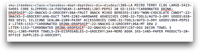
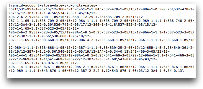
</dynamic>Example: Specify options for data target
The following example demonstrates how render options can be specified for the data target.
The <data> child element of <render> specifies that
the character used to delimit columns is a dash character (-) and the
character used as a delimiter for rows is a backslash (\).
<dynamic>
  <render>
    <data field_del_="-" record_del_="backslash"/>
  </render>
  <widget class_="button" type_="render" target_="data"
   include_="tab1,tab2"/>
  <layout type_="tabpanel">
    <layout label_="Sales Detail Table">
      <widget class_="grid" base_="pub.demo.retail.item"
       name="tab1" data_filename_="salesdetail"/>
    </layout>
    <layout label_="Product Table">
      <widget class_="grid" base_="pub.demo.retail.prod"
       name="tab2" data_filename_="product"/>
    </layout>
  </layout>
</dynamic>
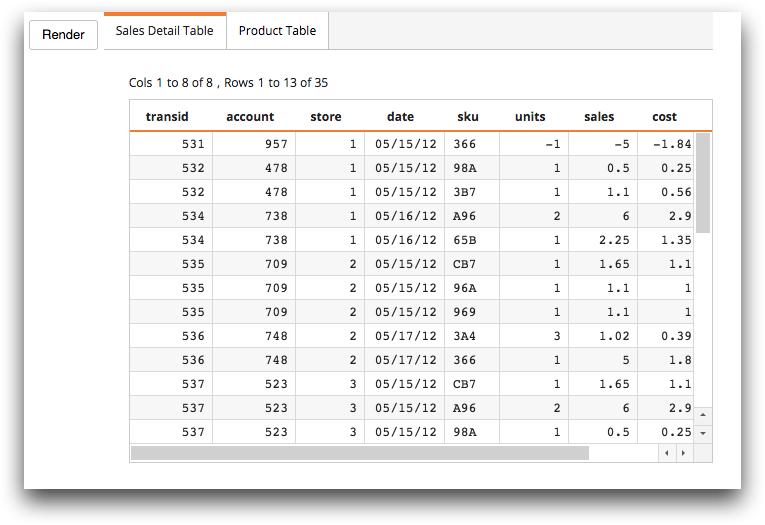
When the user clicks the Render button, the grid
widgets named tab1 and tab2 are rendered to a data target
(as specified by the include_ and target_ attributes).
The grid widget named tab1 is rendered to a text file
named salesdetail.txt (as specified by the
data_filename_ attribute). The default extension is used.
The grid widget named tab2 is rendered to a text file
named product.txt (as specified by the data_filename_
attribute). The default extension is used.