<widget>
<widget> is used to define all visual components of a QuickApp,
including drop-downs, text boxes, tables, and calendars. The form a widget takes is controlled
by the class_ attribute.
Description
The <widget> element is the basic building block for all QuickApps.
Simply stated, a widget is a visual component within a browser that allows a user to
interact with data, launch a query, or perform any number of other tasks in 1010data. We
refer to <widget> as "polymorphous" because it can take many forms
depending on how it is implemented. Common things a widget can represent are everyday web
interface items such as drop-down lists, checkboxes, date selection calendars, general text
boxes, and tables.
Regardless of what form the widget takes at any given time, what's important to remember is
that it is intended to interact with 1010data. Most widgets require at least one
input value or variable, and produce an output based on the query contained by the
<widget>. In fact, most of the time, a <widget> is
either a direct manifestation of a 1010data query, or a control mechanism for launching
one.
For example, one may create a <widget> that acts as a drop-down menu
for a selection in a report. In actuality, the <widget> is a query run
against a 1010data table, and the values in the query results can be used to populate the
values available in the drop-down. When a value is selected in the drop-down, the
<widget> then passes the value to another <widget>
or another query, which uses the new value.
There are two kinds of queries that can be contained inside a <widget>.
Any normal 1010data query can be contained within a <widget>. In this
instance, the query will execute when the <widget> is rendered.
A <widget> may also contain a <block> statement. In
this instance, the <block> must expand to a normal 1010data query.
Certain <widget> types completely ignore any contents contained within
them. These widgets are for creating specific kinds of web interface objects, such as a
hyperlink or a checkbox. In cases where the <widget> does not require
any contents, the <widget> element can be self-closing (e.g.,
<widget/>).
This reference topic is sufficiently large that each value available for the
class_ attribute will have its own article. For understanding the overall
structure of <widget>, you may use this article. For specific use-cases
of each class_=[value], see the appropriate sub-article
contained under this general topic.
<widget> must be contained within a
<dynamic> element.Syntax
<widget class_="[CLASS_VALUE]" base_="[BASE_TABLE]"
  insert_="[NAME_OF_BLOCK]">
</widget>
Global attributes
The following attributes and values are available for all
<widget> entities, regardless of the value of the
class_ attribute. The following attributes and values are all interpreted
by the <dynamic> tag.
name- The name of the widget.
class_- Tells the rendering target how to display and interact with a
<widget>. See sub-articles of this<widget>article for more detailed information on available values forclass_.If the
class_attribute is not specified, the default isgrid. base_- The base table to which the query contained within the
<widget>will be applied. insert_- The name of the
<block>which contains a query. This query will produce values that are useful to the<widget>. insertxml_- Inserts XML (or a list of XML values) into the body of the widget. If the widget is
not empty, the
insertxml_value is prepended to the body of the widget. If present,insert_andbase_attributes are prepended beforeinsertxml_. (Available as of version 18.00) update_- Indicates when a
<widget>refreshes its view to reflect changes in values within the<widget>. This setting is local to the<widget>and overrides themode_attribute of the<dynamic>tag containing the<widget>.Valid Values for
update_auto- Update the view of the
<widget>whenever a value contained by the<widget>is changed. manual- The
<widget>will wait for a specific instruction from the user (i.e., the author of the QuickApp) to update its view.
holdfor_- Acceptable values are a
@list, @of, @vars. If any of the variables specified inholdfor_are changed, it will cause the<widget>to wait for a manual instruction before updating its view. require_- Accepts a boolean value or expression. If the expression evaluates to false, the
<widget>will wait for a manual instruction before updating its view.Note:require_only controls whether the MDB query resulting from the expansion of the widget is executed or not. It does not prevent the widget from being expanded. refreshon_- Accepts a boolean value or expression. If the expression evaluates to
truethe<widget>will always update, whether it appears to have changed or not. errmsg_- Accepts a text string that will be relayed to the end-user if the query associated
with the
<widget>generates an error. This attribute also accepts@original_error, which will relay the system-generated error message to the end-user. invmsg_- Accepts text to provide a message to the end-user in case the
<widget>is invalidated (i.e., the<widget>is waiting for a manual update). invmode_- Tells a rendering target what action to take when rendering an invalidated
<widget>.<dynamic>is indifferent to this attribute.Valid values for
invmode_:hide- Tells the rendering target to hide the
<widget>until it is no longer invalidated. none- Tells the rendering target to take no action when it encounters an invalidated
<widget>. block- Prevents any interaction with the
<widget>by the end-user, and displays the error message specified in theinvmsg_attribute.
Note: It is not recommended usinginvmode_="hide"withvisible_="0", because they will compete to control the visibility of the widget.
Display-control attributes
<widget> classes.<widget>. If you are familiar with CSS, you
may wonder how to add left padding or right padding, or increase the top or bottom margin.
In QuickApps, all values provided to these display-control attributes apply to all top,
bottom, left, and right sides.width_- Accepts an integer value describing the fixed width of the container.
height_- Accepts an integer value describing the fixed height of the container.
fixpos_- Fixes the position of the upper left corner of the widget container relative to the
browser window. Accepts two values,
X, Ywhere the default value ispx. However, any CSS unit valid for relative position can be specified.Note: This attribute does not work with windowed widgets or layouts. relpos_- Fixes the position of the upper left corner of the widget container relative to the
containing layout. Accepts two values,
X, Ywhere the default value ispx. However, any CSS unit valid for relative position can be specified. abspos_- Fixes the position of the upper left corner of the widget container relative to the
main window. Accepts two values,
X, Ywhere the default value ispx. However, any CSS unit valid for absolute position can be specified. tooltip_- Displays a tooltip when someone moves the mouse over the widget. Accepts text.
tooltipdelay_- An optional delay, in seconds, before the tooltip appears.
tooltipdelay_takes a non-negative floating point number. (Available as of version 14.12) background_- Specifies the background color of the container.
The color can be specified as any valid HTML color name, an RGB value, or a hex value.
border_- Sets the width of the border of the container.
padding_- Sets the width of the padding of the container.
margin_- Sets the width of the margin of the container.
exclusion_- Specifies whether or not to define an exclusion zone for the container. Accepts a
1or0.When
exclusion_="1", windows cannot be moved within the bounds of the container. If a window is dragged into the exclusion zone, its position will be adjusted so that it is outside the zone. A windowed widget withwindowexcluded_="0"overrides this, allowing that window to be moved into the exclusion zone.The default is
0.(Available as of version 10.44)
halign_- Sets the horizontal alignment of the container.
Accepts one of three values:
leftrightcenter
visible_- Specifies whether or not to display the widget. Accepts a
1or0.visible_can be applied to any given widget whether or not the widget is invalidated.The default is
1.Note: It is not recommended usingvisible_="0"withinvmode_="hide", because they will compete to control the visibility of the widget. flip_- Specifies whether or not to invert the widget across its y-axis. Accepts a
1or0. rotate_- Specifies the number of degrees to rotate a widget. Accepts a positive or negative integer.
disabled_- Specifies whether or not the widget is disabled. Accepts a
1or0.When
disabled_="1", the widget appears dimmed and is unavailable.The default is
0. windowed_- Determines whether or not to display the widget in a separate window. Accepts a
1or0.The default is
0.(Available as of version 10.01)
The following attributes only apply to widgets that have
windowed_="1":
windowlabel_- Specifies a label that appears in the title bar of the window. Accepts text.
The default is the name of the widget (i.e., the value of the
nameattribute).(Available as of version 10.01)
stripwindow_- Determines whether or not to hide the window's title bar. Accepts a
1or0.When
stripwindow_="1", the title bar is hidden until the user points to the window.When
stripwindow_="0", the title bar is always displayed.The default is
0.(Available as of version 10.15)
wintitlebar_- Specifies whether or not the window is created with a title bar and other structural
elements of a window, such as a window frame or window controls. Accepts a
1or0.The default is
1.Note: A window created withwintitlebar_="0"cannot be manually moved or resized.(Available as of version 12.02)
renamable_- Specifies whether the title of the window can be changed. Accepts a
1or0.When
renamable_="1", a Settings icon appears in the title bar. The title of the window can be changed by clicking on the Settings icon and entering a new title for the window. When the window is renamed, the value of thewindowlabel_attribute for the widget is reset in the<dynamic>. The new title is displayed in the title bar and appears in the dock when the window is minimized.When
renamable_="0", the window cannot be renamed.The default is
0.(Available as of version 10.42)
minimizable_- Determines whether or not to display a Minimize icon in the
upper-right corner of the window that minimizes the window when clicked. Accepts a
1or0.The default is
1.(Available as of version 10.01)
maximizable_- Determines whether or not to display a Maximize icon in the
upper-right corner of the window that maximizes the window when clicked. Accepts a
1or0.The default is
1.(Available as of version 10.01)
removable_- Determines whether or not to display a Close icon in the
upper-right corner of the window that
closes
the window when clicked. Accepts a
1or0.The default is
1.Note: Prior to version 12.04, the default version of this attribute was0.(Available as of version 10.01)
windowresizable_- Determines whether or not the window can be resized. Accepts a
1or0.The default is
1.(Available as of version 10.01)
windowexcluded_- Specifies whether or not the window is prohibited from the exclusion zones of other
widgets or layouts. Accepts a
1or0.A widget or layout can define an exclusion zone via the
exclusion_attribute. A windowed widget withwindowexcluded_="0"overrides this and allows that window to be moved into the exclusion zones of other widgets or layouts.The default is
1.(Available as of version 10.44)
windowwidth_- Specifies the width of the window in which the widget is contained. Accepts an integer value.Note: The width of the widget is specified using the
width_attribute.If
windowwidth_is not specified, thewidth_attribute is used to determine the initial width of the window as well as the enclosed widget.(Available as of version 10.19)
windowheight_- Specifies the height of the window in which the widget is contained. Accepts an
integer value.Note: The height of the widget is specified using the
height_attribute.If
windowheight_is not specified, theheight_attribute is used to determine the initial height of the window as well as the enclosed widget.(Available as of version 10.19)
managed_- Determines whether or not the window manager should handle this widget when it is in
its minimized state. Accepts a
1or0.The default is
0.(Available as of version 10.00)
pinned_- Determines whether the window remains stationary when the page content is scrolled.
Accepts a
1or0.The default is
0.(Available as of version 10.12)
pinnable_- Determines whether or not to display a Pin icon in the
upper-right corner of the window that pins the window in a stationary position when
clicked. Accepts a
1or0.The default is
0.(Available as of version 10.12)
initzindex_- Specifies where the window is stacked when it is first rendered. Accepts an integer
value.
This works the same way as the CSS z-index property. Windows that have a higher value for
initzindex_are rendered in front of windows with lower values.(Available as of version 11.09)
Example
This simple example shows how to create a <widget> that is a button
which displays a dialog stating that my_button works when it is
pressed.
<dynamic>
    <widget class_="button" type_="dummy" name="my_button" text_="Press me!"/>
</dynamic>
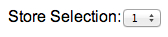
Example: Dropdown widget
This basic example shows how to create a <widget>, designate it as a
drop-down list, and populate the drop-down list with values. In this example, the drop-down
list will be populated with store numbers from a very small store master table.
<dynamic store_sel="1">
    <widget base_="pub.doc.retail.store" class_="dropdown"
     label_="Store Selection:" name="store" value_="@store_sel">
        <colord cols="store"/>
        <sort col="store" dir="up"/>
    </widget>
</dynamic>
The above example first creates a <dynamic> environment with the
line:
<dynamic store_sel="1">In this case, the segment store_sel="1" creates a variable and a value
that we will use as the drop-down's default value in the query. The type of web object the
<widget> will become is designated in the line:
class_="dropdown". The query to populate the drop-down with values is a
mere two lines of code:
<colord cols="store"/>
<sort col="store" dir="up"/>
This line simply tells the drop-down to use all the values in the store
column and sort them in ascending order. Finally, the <widget> and
<dynamic> elements are closed.
The result is the following web object: