Charting the results dynamically on the dashboard
Use more advanced charting techniques in Excel to show the details in the results returned by our 1010data queries.
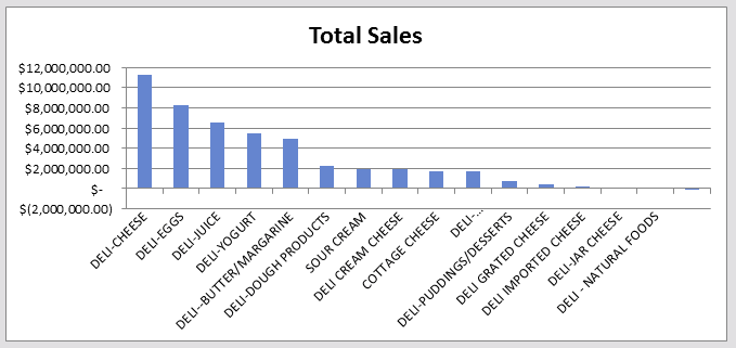
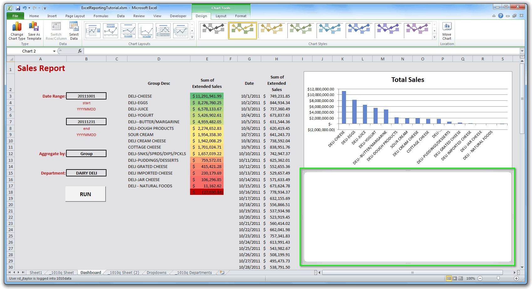
Here's what our dashboard looks like up to this point:
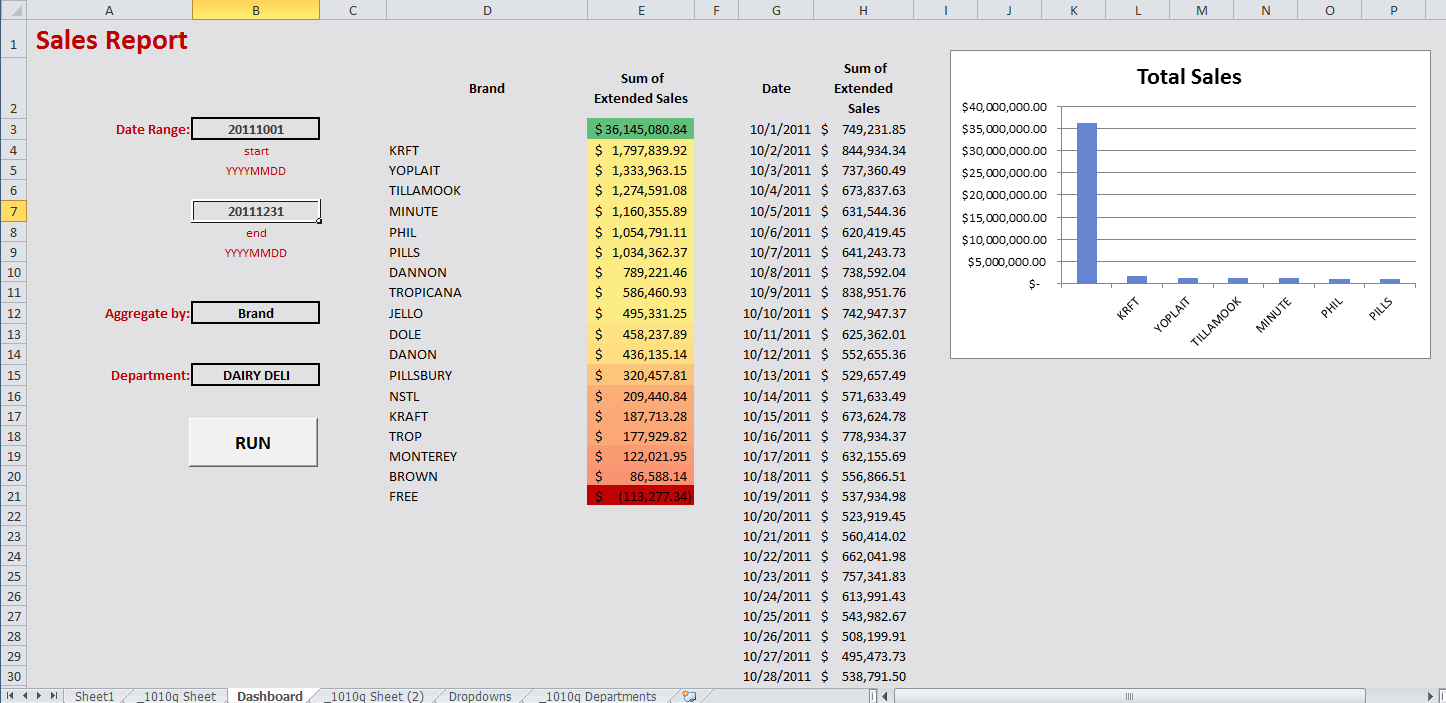
Our chart only shows the top seven items returned from our first query. Let's modify the chart so that it will dynamically include all of the items returned from the first query. We'll also add a line chart for the results of the second query to show the total sales by date for the same department.
Making the bar chart more dynamic
Our first query returns the total sales for each group or brand in a specific department. The bar chart we created earlier only shows the top seven items returned by the query, because we hard-coded a range of values for the x-axis and y-axis variables. Let's modify those variables, so that our chart will dynamically display all of the items returned by the query.
OFFSET function. In the
Refers to field in the Edit Name dialog, we'll
enter the
following:=OFFSET(query_results,1,0,COUNTA(Dashboard!$D:$D),1)COUNTA function to calculate the
number of non-empty cells in column D, because all information
charted has to correspond to a value along the x-axis, and those values are in column
D. The last parameter tells the OFFSET function
that we just want one column of data from the results.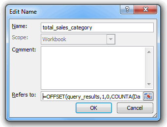
Click OK to modify the variable.
=OFFSET(query_results,1,1,COUNTA(Dashboard!$D:$D),1)COUNTA function again to calculate
the number of non-empty cells in column D, because all information
charted has to correspond to a value along the x-axis, and those values are in column
D. The last parameter tells the OFFSET function
that we just want one column of data from the results.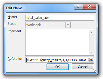
Click OK to modify the variable.
In the Name Manager dialog, click Close.
The chart will automatically update to show all of the items returned from our query:
Creating a line chart
We can also create a line chart that shows the results from our second query, so that we can see total sales by date for the department we have selected.
Once again, we need to create variables that will represent the x-axis and y-axis values for the chart. For the x-axis, we will specify the list of dates returned by our query. The determination of their values follows the same logic as the variables we created for the bar chart in the previous section, so we won't go into as detailed an explanation here.
=OFFSET(query_2_results,1,0,COUNTA(Dashboard!$G:$G),1)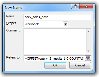
Click OK to create the variable.
=OFFSET(query_2_results,1,1,COUNTA(Dashboard!$G:$G),1)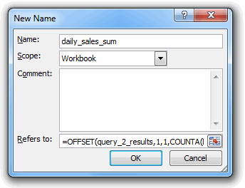
Click OK to create the variable.
Now that we've created our variables, we can create our chart. Click in any empty cell in the dashboard. Then, on the Insert tab, click Line and select the first 2-D Line chart (Line):
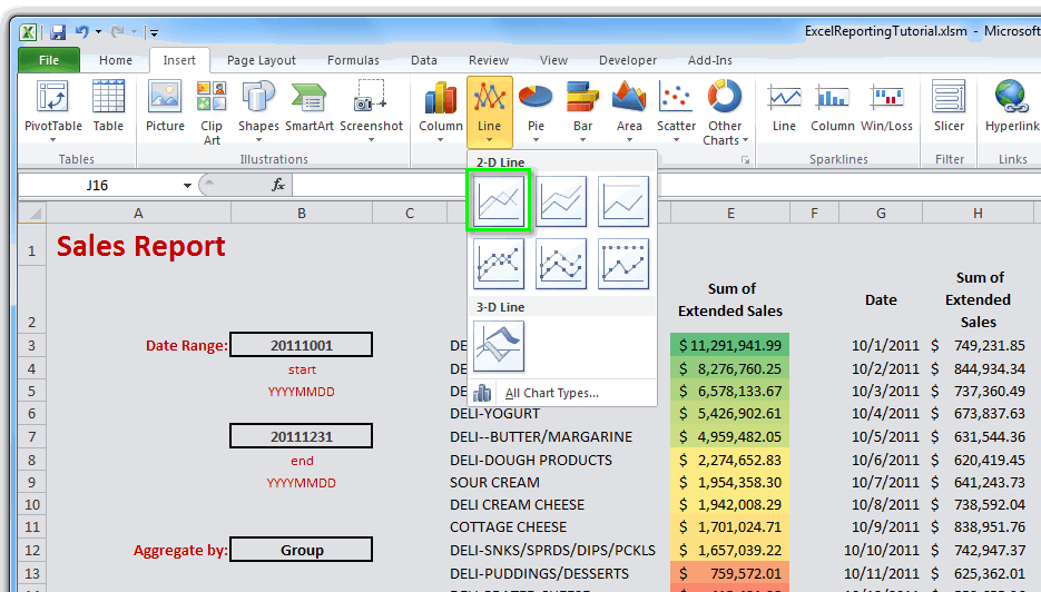
Position the chart where you want it to appear in the dashboard and resize it as desired:
Now let's incorporate the x-axis and y-axis variables we created earlier.
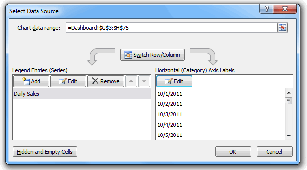
- Right-click anywhere on the new line chart and click Select Data... from the context menu.
- In the Select Data Source dialog, click the Add button under Legend Entries (Series).
- In the Edit Series dialog, enter Daily Sales for the Series name.
- In the Series values field, enter Dashboard!daily_sales_sum, which is the name of the y-axis variable we just created.
- Click OK.
And now, for the x-axis:
- In the Select Data Source dialog, click the Edit button under Horizontal (Category) Axis Labels.
- In the Axis Labels dialog, enter Dashboard!daily_sales_date, which is the name of the x-axis variable we just created.
- Click OK.
The Select Data Source dialog should look similar to the following:
Click OK.
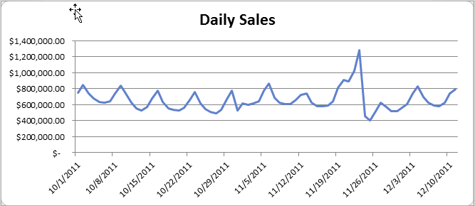
We now have a line chart showing the total sales by date for the department we've selected:
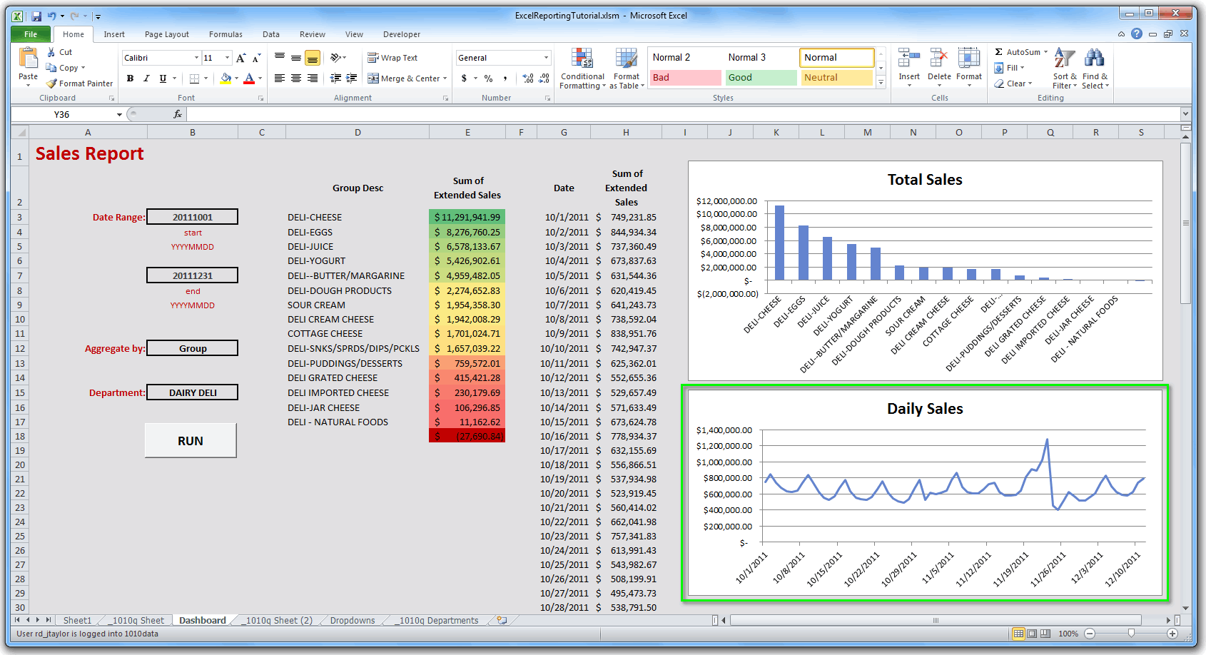
which appears on our dashboard:
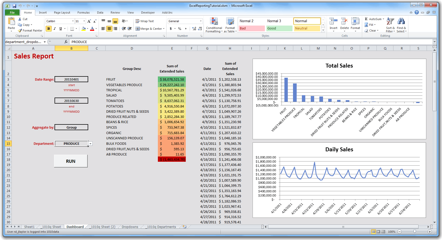
The chart will dynamically update when the query is run with different parameters. For instance if we enter 20110401 for the start date and 20110630 for the end date, and we select Group from the Aggregate by drop-down and PRODUCE from the Department drop-down, and then click RUN, the dashboard will update with the results, including the chart we just created: