
Adding a simple chart to the dashboard
Leverage Excel's charting capabilities to visually represent the results from your query.
Let's combine Excel's easy-to-use charting functionality with the power and speed of running queries on 1010data. Let's create a simple bar chart that shows the total sales for each group returned by our query.
We'll start by creating variables that will represent the x-axis and y-axis values for the chart.
=Dashboard!$D$3:$D$9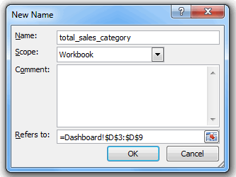
Click OK to create the variable.
=Dashboard!$E$3:$E$9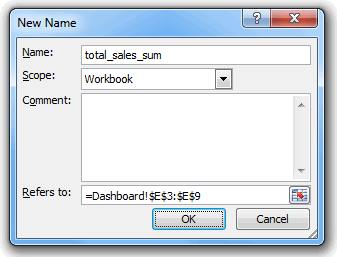
Click OK to create the variable.
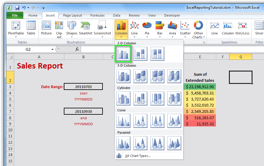
Now that we've created our variables, we can create our chart. Click in any empty cell in the dashboard. Then, on the Insert tab, click Column and select the first 2-D Column chart (Clustered Column):
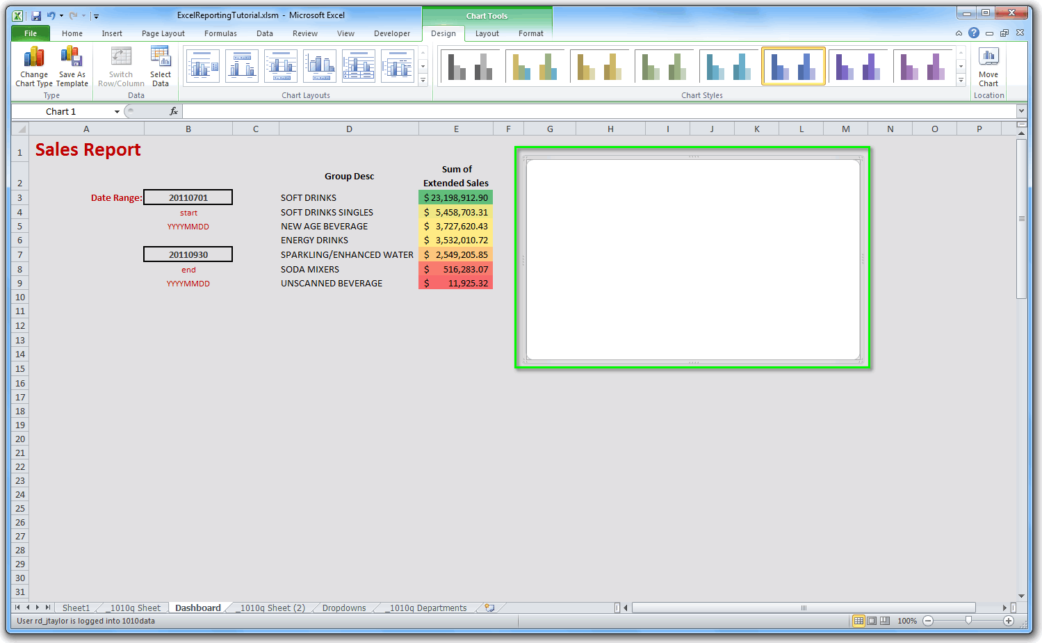
Position the chart where you want it to appear in the dashboard and resize it as desired:
Now let's incorporate the x-axis and y-axis variables we created earlier.
Let's start with the y-axis:
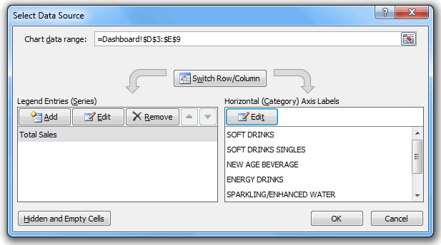
- Right-click anywhere on the chart and click Select Data... from the context menu.
- In the Select Data Source dialog, click the Add button under Legend Entries (Series).
- In the Edit Series dialog, enter Total Sales for the Series name.
- In the Series values field, enter Dashboard!total_sales_sum, which is the name of the y-axis variable we created earlier.
- Click OK.
And now, for the x-axis:
- In the Select Data Source dialog, under Horizontal (Category) Axis Labels, click the Edit button.
- In the Axis Labels dialog, enter Dashboard!total_sales_category, which is the name of the x-axis variable we created earlier.
- Click OK.
The Select Data Source dialog should look similar to the following:
Click OK.
We now have a bar chart showing the total sales for each group:
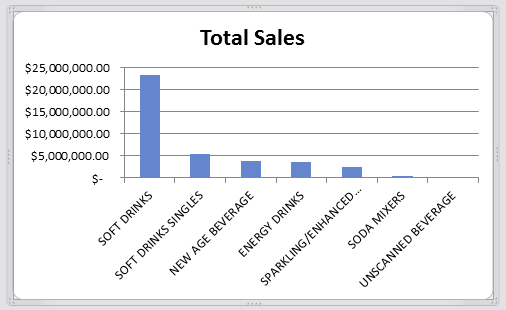
which appears on our dashboard:
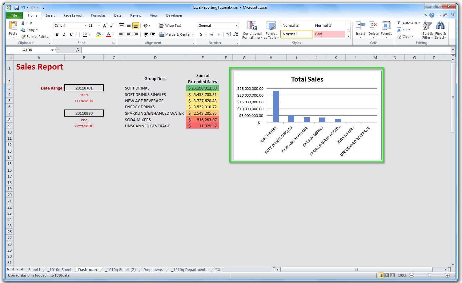
The chart will dynamically update when the query is run with different parameters. For instance, if we change the start date and the end date and then run the q-sheet, the dashboard (including the chart we just created) will update with the results.