
Analysis Timeline
The Analysis Timeline displays a visual representation of your data analysis in the Trillion-Row Spreadsheet.
The Analysis Timeline in the Trillion-Row Spreadsheet (TRS) provides an easy, yet powerful way to visually manipulate a query and the operations it contains.
The operations that define a data analysis query in the TRS are displayed as a sequence of individual panels in the Analysis Timeline. Panels appear in the order that the associated operations are performed on the data. The functionality of each panel varies, and is based on the selected operation. For example, the Select rows panel narrows down the data in a table by creating a select operation.
Since each panel represents a separate operation, in a sequence of operations, you can select any panel in the timeline and immediately view the results of the analysis up to that point of the query. This allows you to easily see the state of the data at each step of an analysis.
An operation can be added to, or removed from, the timeline at any point in the query. Furthermore, the individual actions within each operation are editable. Changes to the actions of an operation are tracked in the panel allowing you to undo and redo changes at will. As operations in the timeline are added, removed, or edited, the results of the changes are immediately displayed. This flexibility makes it easy to explore and discover new insights in your data.
After opening a table or query in the TRS, the Analysis Timeline is displayed in, and is accessed from, the Analyze tab.
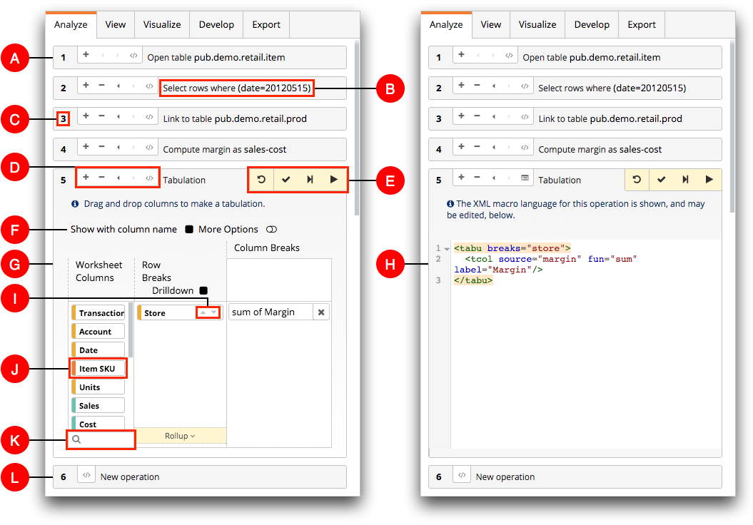
- A. Panel
- Each operation in the timeline is contained within a separate panel. The look and functionality of each panel varies and is based on the selected operation. However, the first panel in the timeline always lists the table or query on which the analysis is based.
- B. Description
- The description provides high-level information about the operation in the panel. This can help you see, at a glace, what each operation in the analysis is doing.
- C. Operation number
- Each panel in the timeline is assigned an operation number. The operation number helps with keeping track of the panels in the timeline and indicates the order in which operations are performed. In the image above, the link operation is the third operation performed in the analysis.
- D. Operation controls
- Operation controls allow you to add, remove, and view the history of changes made to an operation. You can also choose to interact with an operation in either the edit panel view or the Macro Language view. For more information, see Operation controls.
- E. Submit controls
- You can submit an operation or cancel any changes made to an operation. When submitting an operation, you have the choice to remain on the same panel, go to the next operation, or run the query to the end. For more information, see Submit controls.
- F. Show with column name
- This option controls whether the column name or column label is displayed in the
column biscuits. This option is available in all panels except for the Select
rows and Computed column panels.
When this option is selected, the column name is displayed. When the option is cleared, the column label is displayed. By default, this option is cleared in a new panel. For a description about the differences between the column name and column label, see Columns.
- G. Edit panel view
- In the timeline image above on the left, the Tabulation operation is open in the edit panel view. Use the edit panel view to configure a new operation or make changes to an existing operation using the web interface.
- H. Macro Language view
- In the timeline image above on the right, the same analysis is shown with the Tabulation operation open in the Macro Language view. Use the Macro Language view to configure a new operation or make changes to an existing operation using Macro Language XML code.
- I. Sort controls
- The sort control icons in column biscuits set the sort order of column data in the
results. This option is available in the Sort columns and
Computed column panels.
Click the Sort Up (
 ) icon to sort the results in the column up. Click the
Sort Down (
) icon to sort the results in the column up. Click the
Sort Down ( ) icon to sort the results in the column down. When a column
sort is set, the selected direction arrow is colored orange (
) icon to sort the results in the column down. When a column
sort is set, the selected direction arrow is colored orange ( ). To remove a set
sort order, click the orange direction arrow icon. If no sort order is selected, data
in the result columns are sorted up.
). To remove a set
sort order, click the orange direction arrow icon. If no sort order is selected, data
in the result columns are sorted up. - J. Column biscuits
- In certain panels in the timeline, columns are displayed as biscuits. Drag a column biscuit within a panel to perform tasks such as sorting and linking. Each column biscuit is color coded so that you can quickly determine its data type. For more information about determining the data type of a column, see Column information.
- K. Column filter
- The column filter field limits the number of column biscuits that are displayed in a panel section. This is particularly useful in locating a specific column in a table that has many columns. The column filter field is available in the Sort columns, Arrange columns, Link tables, and Tabulation timeline panels. For instructions, see Filter a list of columns.
- L. New operation panel
- The last panel in the timeline is always the New operation panel. This panel allows you to add a new operation to your analysis at the end of the timeline. For more information, see New operation.