class_="dropdownlist"
Using <widget class_="dropdownlist"> creates a drop-down menu with
multi-select capabilities that preserve the order of items clicked. (Available as
of prod-9)
Description
The class_="dropdownlist" widget creates a drop-down menu for
multi-selection use-cases. Items appear in the input field in the order they were clicked in
the list. The contents of the <widget> should be a 1010data query that
resolves to one or two columns. These columns either provide values by themselves, or values
with labels.
Syntax
<dynamic selectvar="">
    <widget class_="dropdownlist" label_="[LABEL_FOR_DROPDOWNLIST]"
     value_="@selectvar">
      [1010data_QUERY]
    </widget>
</dynamic>
The [1010data_QUERY] may be specified between the
opening and closing tags of the <widget>. The results of the query
provide data for the <widget> to display.
Attributes
The attributes in this list are specific to widgets with
class_="dropdownlist".
label_- Accepts text that is used as a label for the widget.
labelpos_- Accepts a string that specifies the position of the label for the widget.
Valid values are:
leftrighttopbottom
The default is
left. labelwidth_- Accepts an integer that specifies the width of the label for the widget.
If the length of the string specified by the
label_attribute is greater than the value specified forlabelwidth_, the text will wrap over multiple lines.If the
labelwidth_attribute is not specified, the default width is the length of the string specified by thelabel_attribute. inputwidth_- Accepts an integer value that specifies the width of the input field.
The unit represented by the value provided is the smallest unit for the given render target.
The default is 200.
inputmaxheight_- Accepts an integer value that specifies the maximum height of the input field when
multiple items are selected from the drop-down list.
As multiple items are selected from the drop-down list, they are added to the input field. If the number of selected items cannot fit in the specified height, a vertical scroll bar is added to the input field.
The default is 200.
dropdownheight_- Accepts an integer value that specifies the maximum height of the drop-down menu.
If the number of items cannot fit in the specified height, a vertical scroll bar is added to the drop-down menu.
The default is 200.
dropdownwidth_- Accepts an integer value that specifies the width of the drop-down menu.
If an item cannot fit in the specified width, the text will wrap over multiple lines.
If
dropdownwidth_is not specified, the drop-down menu is the same width as the input field (as specified by theinputwidth_attribute). breaks_- Accepts a column name. Items that have the same value in the specified column are
grouped together in the drop-down list.
(Available as of 11.13)
defval_- Accepts any "value." Sets the default value for the drop-down menu.
deflabel_- Specifies the default label for the default value (where applicable).
emptytext_- Accepts a string. Specify the placeholder text that should appear for empty values in the drop-down.
value_- Accepts a dynamic variable that stores the items selected from the drop-down list
widget as a comma-separated list.
The variable specified to the
value_attribute must be declared in the opening<dynamic>tag. listvalue_- Accepts a dynamic variable that stores the selected items from the drop-down list
widget into a list-value.
The variable specified to the
listvalue_attribute must be declared in the opening<dynamic>tag as a list-value. rowvalue_- Accepts a dynamic variable that packs all the values for a given row into a package
using the column names as the package keys.
The variable specified to the
rowvalue_attribute must be declared in the opening<dynamic>tag as a package. immediate_- Accepts an integer value of
1or0that specifies whether to immediately send dynamic variable changes to the server or to delay for a certain amount of time. This can be used to help control when other widgets update after the user interacts with this widget.When
immediate_is set to1, changes to any dynamic variables associated with this widget will be sent to the server immediately.When
immediate_is set to0, the update is delayed by the amount of time specified by thedelay_attribute.For
<widget class_="dropdown" multi_="1">and<widget class_="dropdownlist">, ifimmediate="0"is specified anddelay_is not specified, changes are not sent to the server until the widget's drop-down menu has been closed. (Available as of version 17.19) delay_- Accepts a decimal value between 0 and 10 that specifies the number of seconds to delay
between user interaction and sending the change to the server.
This attribute is only valid when
immediate_="0".The default value is
0. color_- Accepts a string that specifies the background color of the widget.
The color can be specified as any valid HTML color name, an RGB value, or a hex value.
textcolor_- Accepts a string that specifies the color of the text in the widget.
The color can be specified as any valid HTML color name, an RGB value, or a hex value.
textstyle_- Accepts a string that specifies the styling of the text for the widget.
Consists of a set of CSS key/value pairs (e.g.,
font-family:arial;font-weight:bold;font-size:14pt;). hints_- Specifies whether to provide additional information via a tooltip when the mouse
points to a particular item in the widget.
Accepts
0,1, or a column name.If
hints_is set to1, the third column from the results of the query associated with the widget is used as the text for the tooltips. Ifhints_is set to a column name from the query results, the text from that column is used for the tooltips. Ifhints_is set to0, no tooltips are displayed.The default value is
0. hintdelay_- Accepts a decimal value that specifies the number of seconds to wait before displaying
the tooltip (as provided by the
hints_attribute).The default value is 0.5 seconds.
hintheight_- Accepts an integer value that specifies the maximum height of the pop-up window used
to display the tooltip.
If the amount of text for the tooltip does not fit in the specified space, a vertical scroll bar is added to the pop-up window.
The default value is 355.
(Available as of version 10.03)
hinticon_- Specifies whether or not to display an information icon when the mouse points to a
particular item in the widget.
Accepts a 0 or 1 (or an expression that evaluates to one of those values).
When
hinticon_is set to 1, the Info icon ( ) is displayed in the widget when the mouse points to an
item. When the mouse points to the icon, the tooltip (as specified by the
) is displayed in the widget when the mouse points to an
item. When the mouse points to the icon, the tooltip (as specified by the
hints_attribute) is displayed in a pop-up window.The default value is
0.(Available as of version 10.03)
hintpos_- Specifies the position of the pop-up window that displays the tooltip when the mouse
points to a particular item in the widget.
Valid values are:
leftrighttopbottom
The default is
bottom.(Available as of version 10.03)
hintwidth_- Accepts an integer value that specifies the maximum width of the pop-up window used to
display the tooltip.
The default value is 300.
(Available as of version 10.03)
initlist_- Accepts a list-value that is used to initialize the widget. This has the same effect,
but can often be more convenient, than using
<table>to initialize the drop-down list.When the
initlist_attribute is specified, the widget is populated with the items in the list-value, not the query associated with the widget.The list-value specified to
initlist_is a list of elements.Each element can be any of the following:- a scalar value, which is used for the value in the widget and the corresponding
label that is displayed (no tooltip)
1 - a one-element list, which is used for the value in the widget and the
corresponding label that is displayed (no tooltip)
{2} - a two-element list, which consists of the value of the item in the widget and
the label that is displayed (no tooltip)
{3 'Three'} - a three-element list, which consists of the value of the item in the widget, the
label that is displayed, and the corresponding
tooltip
{4 'Four' 'This is the fourth item'} - a package with any combination of the following keys:
'value','label'and'hint'pkg('value' 'label' 'hint'; 5 'Five' 'This is the fifth item')
- a scalar value, which is used for the value in the widget and the corresponding
label that is displayed (no tooltip)
filter_- Accepts a string that specifies how to filter values in the drop-down list with
respect to the text that is entered in the input field of the widget.
Valid values are:
beginswith- Populates the drop-down list with values that begin with the text specified in the input field of the widget.
contains- Populates the drop-down list with values that contain the text specified in the input field of the widget.
The default value is
beginswith. serverfilter_- Accepts an integer value of
0or1that specifies whether the drop-down list is populated before or after the user enters text into the input field of the widget.When
serverfilter_="1", the drop-down list is populated with matching items only after the user enters text into the input field of the drop-down list. When text is entered in the input field, the widget sends a request to the server to determine the matching items (as specified by thefilter_attribute) and displays only those items.When
serverfilter_="0", all items resulting from the query associated with the widget are displayed in the drop-down list when the input field gets focus. As the user enters text in the input field, the list displays only those items that match the input.The default value is
0. reorder_- Accepts an integer value of
0or1that specifies whether selected items from the drop-down list may be reordered after they have been added to the input field of the widget.When
reorder_="1", selected items that appear in the input field of the widget may be reordered. This changes the order of the items in the comma-separated list saved in the dynamic variable specified by thevalue_attribute.When
reorder_="0", selected items in the drop-down list may not be reordered in the input field. The selected items are saved to the dynamic variable specified by thevalue_attribute in the order in which they were selected.Note: Items cannot be reordered ifserverfilter_is set to1.The default value is
0. casesensitive_- Accepts
0or1(or an expression that evaluates to those values) that specifies whether or not the input field is case sensitive.If
casesensitive_is set to1, the text entered in the input field must match the items in the drop-down list with respect to case. Ifcasesensitive_is set to0, case is not taken into account when providing matching items in the drop-down list.This only applies when
serverfilter_is set to1.The default is
1. numhints_- Accepts an integer value that specifies the maximum number of items that can match the
text entered by the user before the drop-down list associated with the widget displays
the results.
If the number of results that match the text entered is greater than the value of
numhints_, the drop-down list associated with the widget will remain unpopulated. Once enough text has been entered into the input field that the matching results are less than or equal to the value ofnumhints_, the drop-down list will display those matching items.The default value s
200. maxrows_- Accepts an integer value that specifies the maximum number of rows in which the query
associated with the widget can result.
If the query associated with the widget results in a number of rows that exceeds the value specified to
maxrows_, then the widget produces an error.The default value is
1000. maxselected_- Accepts an integer value that specifies the maximum number of items that may be selected at one time in the widget.
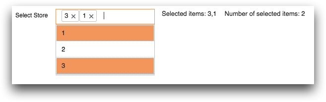
Example: Basic multi-select dropdown list
The code below creates a drop-down list that provides the user with a multi-selectable list
of values and preserves the order in which each value is selected. The selections are stored
in the list-value variable specified by the listvalue_ attribute. The first
text widget displays the list, and the second text
widget uses the lst_len(L) function on the variable to display the number
of selected items.
<dynamic selectvar="{lst()}">
  <widget class_="dropdownlist" base_="pub.demo.retail.item"
   label_="Select Store" listvalue_="@selectvar">
    <willbe name="selection" value="g_first1(store;;)"/>
    <sel value="selection=1"/>
    <colord cols="store"/>
  </widget>
  <widget class_="text" text_="Selected items: {@selectvar}"/>
  <widget class_="text"
   text_="Number of selected items: {lst_len(@selectvar)}"/>
</dynamic>
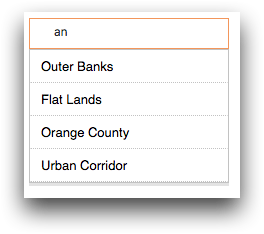
Example: Filtering
This example uses the serverfilter_ attribute to control when data is
retrieved from the server in order to populate the drop-down list. Since
serverfilter_="1", the drop-down list is populated with matching items
only after the user enters text into the input field of the drop-down list. Since
filter_="contains", the drop-down list is populated only with values that
contain the text specified in the input field of the widget.
<dynamic sub_region="">
  <layout>
    <widget class_="dropdownlist" base_="pub.doc.retail.store"
     serverfilter_="1" filter_="contains" casesensitive_="0"
     numhints_="6" value_="@sub_region">
      <colord cols="subdivisiondesc"/>
      <sel value="g_first1(subdivisiondesc ;;)"/>
    </widget>
    <widget class_="grid" base_="pub.doc.retail.store"
     type_="scroll" invmode_="hide" require_="@sub_region">
      <sel value="subdivisiondesc='{@sub_region}'"/>
    </widget>
  </layout>
</dynamic>
For example, if the user typed in the characters an, the drop-down list would display only the items that contain those characters.
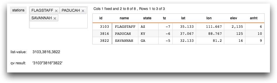
Example: Specifying a selection expression from a list-value in a QuickApp
The following example is a QuickApp that demonstrates how the qv(X)
function can be used to take items in a list-value and use them in a selection
expression.
<dynamic stations="{pkg(;)}">
  <layout arrange_="v">
    <layout arrange_="h">
      <widget class_="dropdownlist" serverfilter_="0" casesensitive_="0"
       filter_="beginswith" numhints_="50" rowvalue_="@stations"
       label_="stations" base_="pub.demo.weather.stations">
        <tabu breaks="id,name">
          <tcol name="count" source="name" fun="cnt"/>
        </tabu>
        <colord cols="id,name"/>
      </widget>
      <widget class_="grid" type_="scroll" base_="pub.demo.weather.stations">
        <if test="{@stations.id._defined}">
          <sel value="id={qv(@stations.id)}"/>
        </if>
      </widget>
    </layout>
    <layout arrange_="v">
      <layout arrange_="h">
        <widget class_="text" text_="list-value:" width_="75"
         require_="{@stations.id._defined}" invmode_="hide"/>
        <widget class_="text" text_="{@stations.id}"
         require_="{@stations.id._defined}" invmode_="hide"/>
      </layout>
      <layout arrange_="h">
        <widget class_="text" text_="qv result:" width_="75"
         require_="{@stations.id._defined}" invmode_="hide"/>
        <widget class_="text" text_="{qv(@stations.id)}"
         require_="{@stations.id._defined}" invmode_="hide"/>
      </layout>
    </layout>
  </layout>
</dynamic>
The values selected in the dropdownlist widget are stored as a package in
the dynamic variable stations (as specified by the
rowvalue_ attribute). The package consists of list-values of the IDs
(stations.id) and names (stations.name). The query
associated with the grid widget passes the stations.id
list-value to the qv(X) function, the results of which are used in the
selection expression to display only those rows whose IDs are selected.
For illustrative purposes, text widgets display the list-value associated
with stations.id and the result of the qv(X) function.
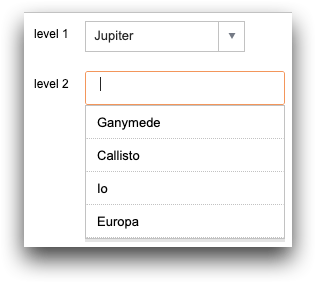
Example: Creating a list that filters another list
In the following
example, the user selects a planet from the level 1 drop-down list. Then,
the level 2 drop-down list filters its list based on the selection in
level 1. For example, if the user selects Jupiter from the first
drop-down list, the second drop-down list filters the list to contain only the moons of
Jupiter. Select one or more values from the second drop-down
list.
<base table="default.test.solar"/>

<dynamic l1="" r1="" l2="{lst()}" r2="">

  <do onchange_="l1">
    <set l2="{lst()}"/>
  </do>

  <layout arrange_="v">

    <widget class_="dropdown" label_="level 1"
            value_="@l1" rowvalue_="@r1">
      <colord cols="name"/>
    </widget>

    <widget class_="dropdownlist" label_="level 2"
            listvalue_="@l2" rowvalue_="@r2">
      <if test="{~(@l1='')}">
        <sel value="orbits='{@l1}'"/>
      </if>
      <colord cols="name"/>
    </widget>

  </layout>
  <widget class_="scope" refreshon_="1"/>
</dynamic>