
class_="grid"
Using <widget class_="grid">, the results from a 1010data query can
be displayed in a tabular format.
Syntax
<dynamic>
    <widget class_="grid">
        [1010data_QUERY]
    </widget>
</dynamic>
The [1010data_QUERY] may be specified between the
opening and closing tags of the <widget>. The results of the query
provide data for the <widget> to display.
Attributes
The attributes in this list are specific to widgets with class_="grid".
type_- Specifies the type of
gridwidget.Valid values are:
scroll- Produces a grid widget that can scroll smoothly through the rows of data in a
table.
See type_="scroll" for a list of attributes specific to this type of grid widget.
native- Produces a grid widget that traverses through the rows of data in discrete
increments.
See type_="native" for a list of attributes specific to this type of grid widget.
The default is
scroll. label_- Accepts text that is used as a label for the widget.
rowcol_- Accepts a boolean value to show a line describing the columns and rows currently
displayed in the grid (
1to display,0not to display), as shown here: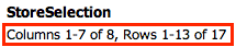
colhead_- Tells the widget what information to display in the column header.
Valid values are:
namelabelboth
The value of this attribute overrides the setting for the user preference related to the column header. See Data Preferences in the 1010data User's Guide for more information.
total_- Accepts an integer value of
1or0that specifies whether or not to show totals when the query results displayed in the grid are from a tabulation. regionfmt_- Determines what format the widget uses for dates, numbers, etc.
Valid values are:
USEUUK
Note: For more information on these formats, see Localization in the 1010data User's Guide. ditto_- Tells the system what to display in the widget when a row is repeated.
Valid values are:
value- Show the repeated row.
mark- Indicate which rows repeated with a double-quote character.
markfx- Indicate which values in a row repeated from the previous row, but only for fixed columns. Cells in rows under a column that is not fixed with display the repeated value.
blank- Leave repeating rows blank.
blankfx- Leave cells blank when in a fixed column. In a column that is not fixed, the value will be displayed.
fillwidth_- Accepts a
0to deactivate. Default is1. If deactivated, column widths will not be stretched to fill the available width of the table if scrolling is not turned on and the width of all columns does not utilize the full width available to the grid widget. reorderable_- Accepts an integer value of
1or0to specify whether columns in the grid can be rearranged by clicking on a column header and dragging it to the desired location.When
reorderable="1"andtype_="scroll", the dynamic variable associated with the attributereordercols_is assigned the order of the columns after they have been rearranged. sortable_- Accepts a comma-separated list of column names which can be used to sort the data in
the grid. Once specified, only columns specified to the
sortable_attribute can be used for sorting in the grid widget. If no columns are specified, all columns may be used to sort. oneclicksort_- Accepts a
1to activate. Default is0. When active, allows user to click on a column header once to sort the table by that column in ascending order. Clicking again will sort by the same column in descending order.(Available as of prod-9)
sortcols_- Each time the table is sorted, the column name of the sort column is appended to the
list-value associated with this attribute.
The variable must be declared as a list-value in the opening
<dynamic>tag of the QuickApp (e.g.,<dynamic var_name="{lst()}">). sortdirs_- Each time the table is sorted, the direction (
upordown) of the sort operation is appended to the list-value associated with this attribute.The variable must be declared as a list-value in the opening
<dynamic>tag of the QuickApp (e.g.,<dynamic var_name="{lst()}">). startrow_- Accepts an integer value that specifies the number of the row to position at the top
of the grid.
The value of
startrow_must be greater than0. startcol_- Accepts an integer value that specifies the number of the column to occupy the
left-most position in the grid.
The value corresponds to the index of the column relative to all the scrollable columns in the grid.
The value of
startcol_must be greater than0. startrowvalue_-
The variable must be declared in the opening
<dynamic>tag of the QuickApp (e.g.,<dynamic var_name="">).The dynamic variable associated with
startrowvalue_is automatically set to the number of the row that is at the top of the grid after it has been scrolled vertically.This dynamic variable can also be set to a particular value to position the grid widget to a particular row number.
startcolvalue_-
The variable must be declared in the opening
<dynamic>tag of the QuickApp (e.g.,<dynamic var_name="">).The dynamic variable associated with
startcolvalue_is automatically set to the index of the column that is at the left-most position in the grid after it has been scrolled horizontally. The value corresponds to the index of the column relative to all the scrollable columns in the grid.This dynamic variable can also be set to a particular value to position the grid widget to a particular column.
colstwtbgcolor_- Accepts a comma-separated list of column names.
Columns passed to
colstwtbgcolor_will take on the background color held in the columns specified in thebgcolorforcol_attribute. bgcolorforcol_- Accepts a comma-separated list of column names.
Columns passed to
bgcolorforcol_must contain the colors to be used as background colors for the columns named incolstwtbgcolor_. colstwtfgcolor_- Accepts a comma-separated list of column names.
Columns passed to
colstwtfgcolor_will take on the foreground color held in the columns specified infgcolorforcol_attribute. fgcolorforcol_- Accepts a comma-separated list of column names.
The columns specified to
fgcolorforcol_should contain the colors that will be used as foreground/font colors in the columns referenced bycolstwtfgcolor_. bgcolorforrow_- Accepts either a comma-separated list of column names, or an expression.
Columns passed to
bgcolorforrow_should contain a color that will be used as the background color for every row. fgcolorforrow_- Accepts a comma-separated list of column names.
Columns passed to
fgcolorforrow_should contain a color that will be used as the font color for every row. showstylecols_- Accepts a
1or0that specifies whether or not to display the columns that contain the background and font color information in the grid widget.The default is
0.
In addition to the attributes listed above, there are numerous output
configuration options available via the <render> element. For a full
list of configurable output attributes and values, see <render>.
Interactive Attributes
clickable_- Accepts a comma-separated list of columns. Any data elements from those columns are
clickable in the widget.
See the
value_andselector_attributes for additional information. value_- When a cell in a clickable column is clicked, its value is stored in the dynamic
variable associated with this attribute.
The variable must be declared in the opening
<dynamic>tag of the QuickApp (e.g.,<dynamic var_name="">). indexvalue_- When a cell in a clickable column is clicked, the row number of that cell is stored in
the dynamic variable associated with this attribute.
The variable must be declared in the opening
<dynamic>tag of the QuickApp (e.g.,<dynamic var_name="">). rowvalue_- When a cell in a clickable column is clicked, the entire row of data is placed as a
package in the dynamic variable associated with this attribute.
The variable must be declared in the opening
<dynamic>tag of the QuickApp (e.g.,<dynamic var_name="">). selector_- When a data element in a clickable column is clicked, the name of that column is
stored in the dynamic variable associated with this attribute.
The variable must be declared in the opening
<dynamic>tag of the QuickApp (e.g.,<dynamic var_name="">). submit_- Accepts a comma-separated list of text values. When a cell in a clickable column is
clicked,
<do>clauses with anonsubmit_attribute whose value matches any of the values in the list specified tosubmit_are executed.Clickable columns are specified by the
clickable_attribute.
drillable_- Accepts a comma-separated list of column names. Any data elements from those columns
are drillable in the widget.
This attribute is typically used to allow the user to drill down into hierarchies defined by the specified columns.
See the
drillvalue_,drillselector_, andpkgdrillvalue_attributes for additional information. drillvalue_- When a data element in a drillable column is clicked, the value of the data element is
appended to a comma-separated string stored in the dynamic variable associated with this
attribute.
The variable must be declared in the opening
<dynamic>tag of the QuickApp (e.g.,<dynamic var_name="">). drillselector_- When a data element in a drillable column is clicked, the name of the column is
appended to a comma-separated string stored in the dynamic variable associated with this
attribute.
The variable must be declared in the opening
<dynamic>tag of the QuickApp (e.g.,<dynamic var_name="">). pkgdrillvalue_- Accepts a dynamic variable that stores drillable-related information for the widget as
key/value pairs in a package. If you use
pkgdrillvalue_, you do not need to usedrillselector_ordrillvalue_.The variable must be declared as a package in the opening
<dynamic>tag of the QuickApp in which the widget exists. It should be initialized as<dynamic var_name="{pkg('sel' 'val';lst() lst())}">.The package contains the following keys and their associated values:sel- A list-value consisting of the drillable columns that have been
clicked.
When a data element in a drillable column is clicked, the name of the column is appended to this list-value.
val- A list-value consisting of the values in the drillable columns that have been
clicked.
When a data element in a drillable column is clicked, the value of the data element is appended to this list-value.
Note: It is highly encouraged to usepkgdrillvalue_instead ofdrillvalue_when cells in drillable columns contain commas. Otherwise, errors will occur when the item containing the comma is added to the comma-separated string stored indrillvalue_.
Example: Conditional styling attributes
<dynamic>
  <widget class_="grid" base_="pub.demo.retail.item" type_="scroll"
   colstwtbgcolor_="store,transid" bgcolorforcol_="colorone,colortwo"
   fgcolorforrow_="colorthree">
    <willbe name="colorone" value="'darkgray'"/>
    <willbe name="colortwo" value="'midnightblue'"/>
    <willbe name="colorthree" value="'#F26F21'"/>
    <colord hide="colorone,colortwo,colorthree"/>
  </widget>
</dynamic>
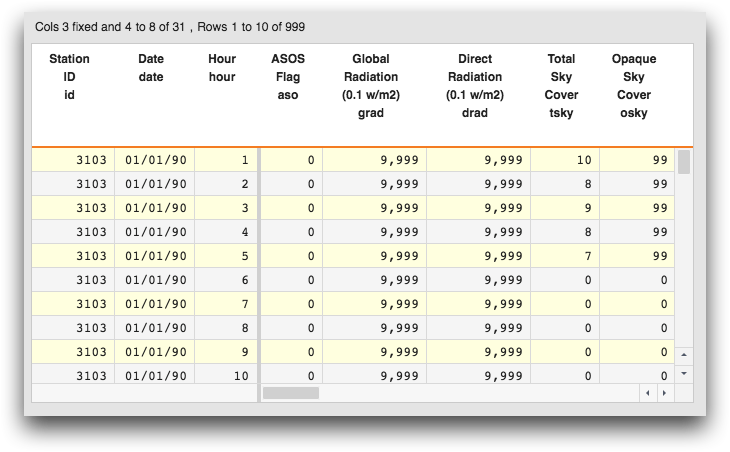
Example: Drillable grid
In the following example, you can click a station ID in the grid to "drill down" to see further information about that station. You can drill down further to see the hourly results for a particular date.
This example uses the variable @drillpkg that stores drillable-related
information as key/value pairs.
<dynamic drillpkg="{pkg('sel' 'val';lst() lst())}" reset="0" hierarchy="id,date,hour">
  <note>Make Reset button appear after drill</note>
  <do onchange_="@drillpkg">
    <if test="{'{@drillpkg.sel}'<>''}">
      <set reset="1"/>
    </if>
  </do>
  <note>clear pkg containing selector & value variables on reset</note>
  <do onchange_="@reset">
    <if test="{'@drillpkg.val'<>''}">
      <set drillpkg="{pkg('sel' 'val';lst() lst())}"/>
    </if>
  </do>
  <layout arrange="v">
    <layout arrange_="h">
      <widget class_="text" text_="{pkg_names(@drillpkg)}"/>
      <widget class_="text" text_="{lst_len(@drillpkg.sel)}"/>
      <widget class_="text" text_="{@drillpkg.sel}"/>
      <widget class_="text" text_="{@drillpkg.val}"/>
    </layout>
    <widget class_="grid" type_="scroll" base_="pub.demo.weather.hourly90"
        width_="480" height_="320" hierarchy="{@hierarchy}" pkgdrillvalue_="@drillpkg"
           drillable_="{csl_pick(csl_take(@hierarchy;csl_len(@hierarchy)-1);lst_len(@drillpkg.sel)+1)}">
      <let levels="{lst_len(@drillpkg.sel)}">
        <for i="1" to="{@levels}">
          <sel value="{@drillpkg.sel[@i]}='{@drillpkg.val[@i]}'"/>
        </for>
        <let breaks="{csl_take(@hierarchy;@levels+1)}">
          <tabu breaks="{@breaks}">
            <foreach break="{@breaks}">
              <break col="{@break}" sort="up"/>
            </foreach>
            <tcol source="hum" fun="avg"/>
          </tabu>
        </let>
      </let>
    </widget>
    <widget class_="button" text_="Reset" invmode_="hide" require_="{@reset}" type_="set"
       value_="@reset" newvalue_="0"/>
  </layout>
</dynamic>
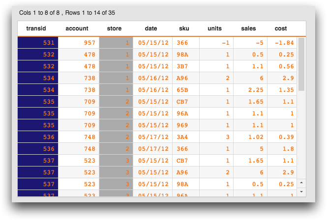
When you render the code, the grid looks like the following:
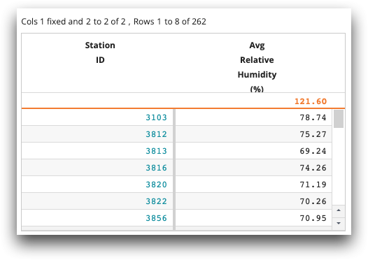
You can then click a station ID to drill down into daily average relative humidity:
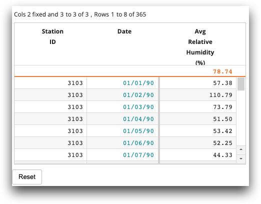
For each station ID, you can drill down further to see the average relative humidity at each hour:
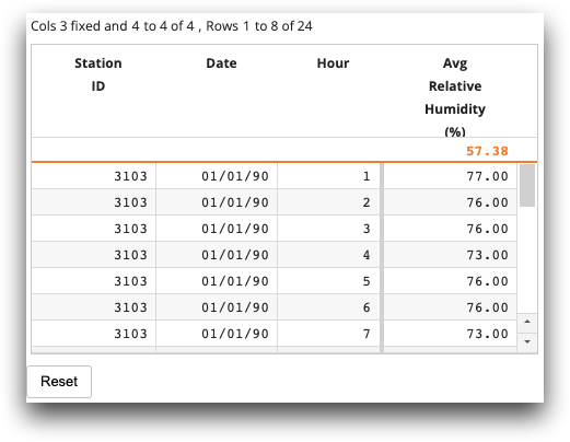
Click the Reset button to return to the original list of station IDs.
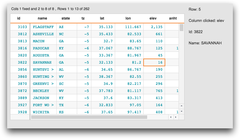
Example: Clickable grid
The following example illustrates how to retrieve information using the
indexvalue_, rowvalue_, and selector_
attributes when a cell in a clickable column is clicked.
<dynamic col_name="" row_index="" row_info="">
  <layout arrange_="h">
    <widget class_="grid" clickable_="*" indexvalue_="@row_index"
     selector_="@col_name" rowvalue_="@row_info" width_="600">
      <base table="pub.demo.weather.stations"/>
    </widget>
    <layout arrange_="v">
      <widget class_="text" text_="Row: {@row_index}"/>
      <widget class_="text" text_="Column clicked: {@col_name}"/>
      <widget class_="text" text_="Id: {@row_info.id}"/>
      <widget class_="text" text_="Name: {@row_info.name}"/>
    </layout>
  </layout>
</dynamic>
Example: Conditional formatting
<dynamic>
  <widget class_="grid" type_="scroll" base_="pub.demo.weather.hourly90"
   showstylecols_="" colhead_="both" width_="675"
   colstwtbgcolor_="temp,tflag" bgcolorforcol_="bg_temp,bg_tflag"
   colstwtfgcolor_="temp,date" fgcolorforcol_="fg_temp,fg_tflag"
   bgcolorforrow_="if(mod(i_;2);'lightyellow';'whitesmoke')" fgcolorforrow_="fgcolorforrow">
    <willbe name="fg_tflag" value="'blue'"/>
    <willbe name="fg_temp" value="if(temp>0;'green';'red')"/>
    <willbe name="fg_tflag" value="'blue'"/>
    <willbe name="bg_temp" value="'lightgray'"/>
    <willbe name="bg_tflag" value="'lightblue'"/>
    <willbe name="fgcolorforrow" value="NA"/>
    <sel value="i_<1000"/>
  </widget>
</dynamic>
Example: Conditional formatting
In another example of conditional formatting, the following code uses the functionrange2list(X;L;R) to apply a
background color depending on the value in the column. Values 9 and below have a background
color of 'white', values over 9 and below 50 have a background color of 'lemonchiffon', and
values over 50 have a background color of
'yellow'.<dynamic>
<widget class_="grid" type_="scroll" base_="pub.demo.weather.hourly90"
showstylecols_="" colhead_="both" width_="98%" colstwtbgcolor_="tsky"
bgcolorforcol_="bg_tsky" height_="98%">
<willbe name="bg_tsky" value="range2list(tsky;9 50;'white' 'lemonchiffon' 'yellow')"/>
<sel value="date='01/02/90'"/>
<sel value="i_<1000"/>
<colord cols="id,date,hour,tsky"/>
</widget>
</dynamic>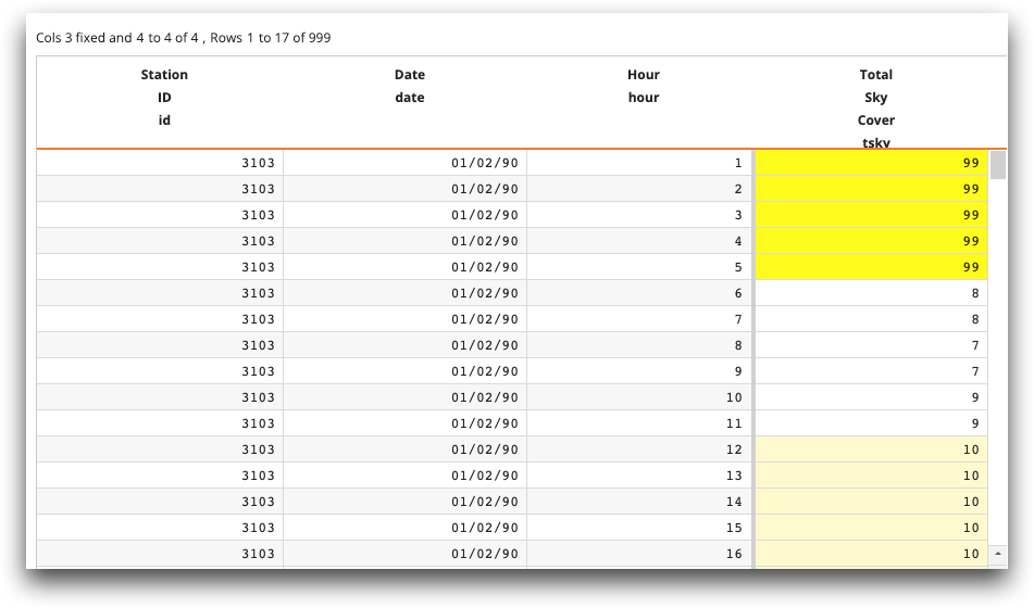
Example: Sort tracking
This example demonstrates how to use the sortable_,
sortcols_, and sortdirs_ attributes.
<base table="pub.doc.retail.store"/>
<dynamic sortcols="{lst()}" sortdirs="{lst()}">
  <layout>
    <widget class_="text" text_="sortcols: {@sortcols}"/>
    <widget class_="text" text_="sortdirs: {@sortdirs}"/>
    <widget class_="text" text_="{lst_len(@sortcols)}{lst_len(@sortdirs)}"/>
    <widget class_="grid" type_="scroll" border_="1" clickable_="hour"
     width_="600" height_="600" sortable_="*" sortcols_="@sortcols"
     sortdirs_="@sortdirs"/>
  </layout>
</dynamic>