class_="chart"
Using <widget class_="chart"> allows you to create client-side data
visualizations rendered by the Kendo UI ®charting engine.
(Available as of version 10.16)
Description
The chart widget allows you to select from a number of chart types,
including scatter, bar, line, area, pie, and bubble, to present your data in graphical
form.
The chart widget is typically used for plotting smaller quantities of data
points. By default, this is 10000 for scatter plots, 1000 otherwise. For data visualizations
of larger numbers of data points, use the graphics widget, which employs
server-side charting. (See graphics
for details.) Alternatively, the bokehchart widget employs server-side charting with added
interactive features such as zoom and pan. (See bokehchart for details.)
Syntax
<dynamic>
    <widget class_="chart" type_="CHART_TYPE">
        [1010data_QUERY]
    </widget>
</dynamic>
The [1010data_QUERY] may be specified between the
opening and closing tags of the <widget>. The results of the query
provide data for the <widget> to display.
You may also include a <graphspec> element between the opening and
closing tags of the <widget> (either before or after the
[1010data_QUERY]) to have more finer-grained control
over the appearance of the chart. See <graphspec> for details.
In addition, you can use one or more <layer> elements to specify
1010data queries that provides the data to be plotted. See <layer> for more information.
Attributes
The attributes in this list are specific to widgets with
class_="chart".
engine_- Engine to use for client-side charting
Valid values are:
kendo- Uses the Kendo charting engine
The default is
kendo.Note: Other engines may be available in the future. In general, different engines will have different capabilities. options, and<graphspec>syntax. type_- Type of chart in which to display the data
Valid values are:
scatter- Produces a chart in which each value is plotted as a separate data point
See
scatterfor details. scatterline- Produces a chart in which the values are plotted as separate data points with a
line joining them together
See
scatterlinefor details. bar- Produces a chart with bars whose lengths represent the values in the data
See
barfor details. column- Produces a chart with columns whose lengths represent values in the data
set
See
columnfor details. line- Produces a chart consisting of a line of interconnected points for each column
of numeric data
See
linefor details. area- Produces a line chart with the area between the plot points and the x-axis
filled with a color
See
areafor details. pie- Produces a chart that displays each value in the given data set as a section of
a circular pie, representing its percentage of the whole
See
piefor details. bubble- Produces a chart with bubbles whose size and positions on the x-axis and y-axis
represent values in the data set
See
bubblefor details. rangebar- Produces a chart that displays bars which represent ranges of values
(Available as of version 10.22)
See
rangebarfor details. rangecolumn- Produces a chart that displays columns which represent ranges of values
(Available as of version 10.22)
See
rangecolumnfor details. boxplot- Produces a chart that visually displays data distributions and provides
information about key indicators such as the highest value, lowest value, mean,
and median for the given set of columns
(Available as of version 10.22)
See
boxplotfor details.
Note: Other chart types may be added in the future. orientation_- For charts with
type_="bar"ortype_="column", this determines the direction in which the bars are displayed.horizontal- The bars in the chart are displayed horizontally.
vertical- The bars in the chart are displayed vertically.
breaks_- For charts with
type_="scatter",type_="scatterline", andtype_="bubble", accepts the name of column on which to groupThe data in rows that have the same value in the specified column are considered in the same group. The data points are colored according to group.
(Prior to version 10.26, this attribute was named
groupby_.) title_- Specifies a title for the chart
xlabel_- Specifies a label for the horizontal axis
You can set the value of this attribute to
""for no label on the horizontal axis.If this attribute is omitted, a default label may be provided.
ylabel_- Specifies a label for the vertical axis
You can set the value of this attribute to
""for no label on the vertical axis.If this attribute is omitted, a default label may be provided.
clabel_- For charts with
type_="bar"ortype_="column", this specifies the category labelFor horizontal charts, this specifies a label for the vertical axis (the same as
ylabel_).For vertical charts, this specifies a label for the horizontal axis (the same as
xlabel_). vlabel_- For charts with
type_="bar"ortype_="column", this specifies the value labelFor horizontal charts, this specifies a label for the horizontal axis (the same as
xlabel_).For vertical charts, this specifies a label for the vertical axis (the same as
ylabel_). legend_- Specifies the position of the legend
Valid values are:
topbottomleftrightnone
The default is
right. rowlimit_- Accepts an integer value that specifies the maximum number of rows in which the query
associated with the widget can result.
If the query associated with the widget results in a number of rows that exceeds the value specified to
rowlimit_, then the widget produces an error.The default limit is 10000 for scatter plots, 1000 otherwise.
hints_- Specifies whether to provide additional information via a tooltip when the mouse
points to a particular item in the widget.
Accepts 0, 1, or a column name.
If
hints_is set to 1, a default tooltip specific to the chart type is displayed. For instance, the default tooltip for a chart withtype_="rangecolumn"displays the minimum and maximum values in the range.If
hints_is set to a column name from the query results, the text from that column is used for the tooltips.If
hints_is set to 0, no tooltips are displayed.The default is 0.
(Available as of version 10.26)
The following drillable-related attributes available as of version 10.22:
drillable_- Accepts a comma-separated list of column names. Any data elements from those columns
are drillable in the widget.
This attribute is typically used to allow the user to drill down into hierarchies defined by the specified columns.
See the
drillvalue_,drillselector_, andpkgdrillvalue_attributes for additional information. drillvalue_- When a data element in a drillable column is clicked, the value of the data element is
appended to a comma-separated string stored in the dynamic variable associated with this
attribute.
The variable must be declared in the opening
<dynamic>tag of the QuickApp (e.g.,<dynamic var_name="">). drillselector_- When a data element in a drillable column is clicked, the name of the column is
appended to a comma-separated string stored in the dynamic variable associated with this
attribute.
The variable must be declared in the opening
<dynamic>tag of the QuickApp (e.g.,<dynamic var_name="">). pkgdrillvalue_- Accepts a dynamic variable that stores drillable-related information for the widget as
key/value pairs in a package. If you use
pkgdrillvalue_, you do not need to usedrillselector_ordrillvalue_.The variable must be declared as a package in the opening
<dynamic>tag of the QuickApp in which the widget exists. It should be initialized as<dynamic var_name="{pkg('sel' 'val';lst() lst())}">.The package contains the following keys and their associated values:sel- A list-value consisting of the drillable columns that have been
clicked.
When a data element in a drillable column is clicked, the name of the column is appended to this list-value.
val- A list-value consisting of the values in the drillable columns that have been
clicked.
When a data element in a drillable column is clicked, the value of the data element is appended to this list-value.
Note: It is highly encouraged to usepkgdrillvalue_instead ofdrillvalue_when cells in drillable columns contain commas. Otherwise, errors will occur when the item containing the comma is added to the comma-separated string stored indrillvalue_.
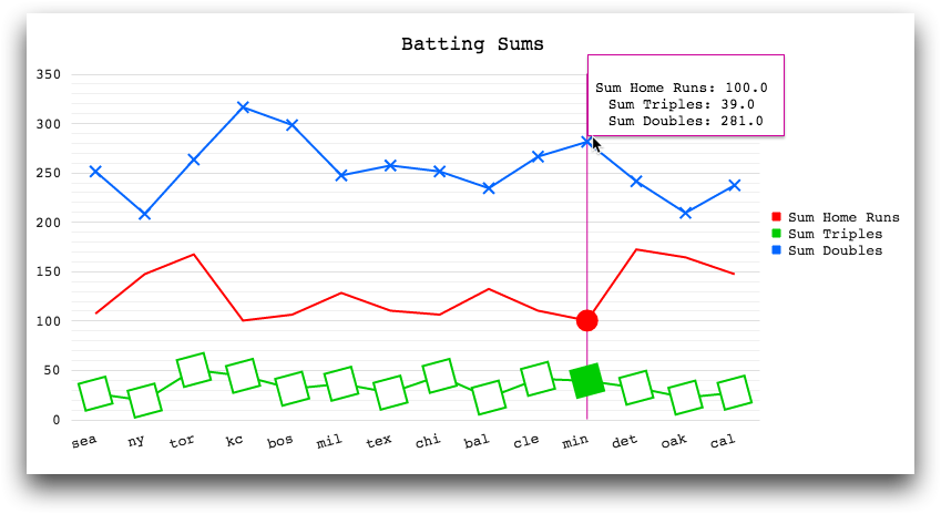
Example: Line chart with customized tooltips
<base table="pub.demo.baseball.batting"/>
<block name="query">
  <sel value="(year=1990)"/>
  <sel value="(lg='a')"/>
  <tabu breaks="team" label="Tabulation">
    <tcol fun="sum" name="hrs" source="hr" weight=""/>
    <tcol fun="sum" name="triples" source="c11" weight=""/>
    <tcol fun="sum" name="doubles" source="c10" weight=""/>
  </tabu>
</block>
<dynamic>
  <widget class_="chart" base_="pub.demo.baseball.batting">
    <layer tablevalue_="@data">
      <insert block="query"/>
    </layer>
    <graphspec>
      <chartarea width="800" height="400"/>
      <title text="Batting Sums" font="18px Monospace" color="black"/>
      <legend position="right">
        <labels font="13px Monospace"/>
      </legend>
      <seriesdefaults type="line" axis="all"/>
      <series name="Sum Home Runs" data="{@data.hrs}" color="#ff0000">
        <markers visible="false" size="20"/>
      </series>
      <series name="Sum Triples" data="{@data.triples}" color="#00cc00">
        <markers type="square" size="25" rotation="15"/>
      </series>
      <series name="Sum Doubles" data="{@data.doubles}" color="#0066ff">
        <markers type="cross" size="10"/>
      </series>
      <tooltip visible="true" shared="true" background="white"
       font="13px Monospace"
       sharedtemplate="
       <br/>
       #=points[0].series.name #:
       #=kendo.format( '{'\{0:n1\}'}',
                       kendo.parseFloat(points[0].value.toString()))#
       <br/>
       #=points[1].series.name #:
       #=kendo.format( '{'\{0:n1\}'}',
                       kendo.parseFloat(points[1].value.toString()))#
       <br/>
       #=points[2].series.name #:
       #=kendo.format( '{'\{0:n1\}'}',
                       kendo.parseFloat(points[2].value.toString()))#">
        <border color="#cc0099"/>
      </tooltip>
      <valueaxis name="all" narrowrange="true">
        <labels format="n0" font="13px Monospace"/>
        <line visible="false"/>
        <minorgridlines visible="true"/>
      </valueaxis>
      <categoryaxis categories="{@data.team}">
        <crosshair visible="ture" color="#cc0099"/>
        <labels rotation="-15" font="13px Monospace"/>
        <majorgridlines visible="false"/>
        <line visible="false"/>
      </categoryaxis>
    </graphspec>
  </widget>
</dynamic>
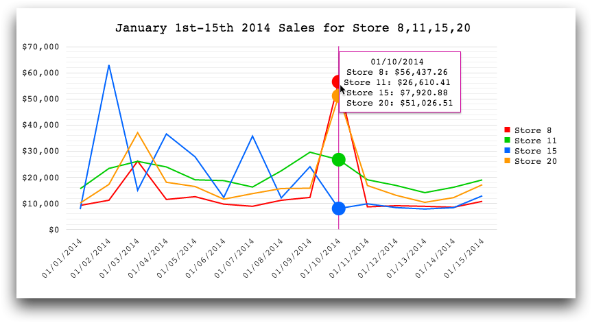
Example: Line chart with formatted dates
<base table="pub.doc.retail.salesdetail"/>
<defblock name="query">
  <sel value="between(trans_date;20140101;20140115)"/>
  <sel value="(store=11 15 20 8)"/>
  <tabu label="Sales Detail: Sum of Extended Sales" breaks="trans_date"
   cbreaks="store" clabels="short">
    <break col="trans_date" sort="up"/>
    <break col="store" sort="up"/>
    <tcol fun="sum" source="xsales" weight=""/>
  </tabu>
</defblock>
<dynamic>
  <widget class_="chart" base_="pub.doc.retail.salesdetail">
    <layer tablevalue_="@data">
      <insert block="query"/>
    </layer>
    <graphspec>
      <chartarea width="800" height="400"/>
      <title text="January 1st-15th 2014 Sales for Store 8,11,15,20"
       font="18px Monospace" color="black"/>
      <legend position="right">
        <labels font="13px Monospace"/>
      </legend>
      <seriesdefaults type="line" axis="all"/>
      <series name="Store 8" data="{@data.m0}" color="#ff0000">
        <markers visible="false" size="20"/>
      </series>
      <series name="Store 11" data="{@data.m1}" color="#00cc00">
        <markers visible="false" size="20"/>
      </series>
      <series name="Store 15" data="{@data.m2}" color="#0066ff">
        <markers visible="false" size="20"/>
      </series>
      <series name="Store 20" data="{@data.m3}" color="#ff9900">
        <markers visible="false" size="20"/>
      </series>
      <tooltip visible="true" background="white"
       font="13px Monospace" shared="true"
       sharedtemplate="
       #=kendo.format('{'\{0:MM/dd/yyyy\}'}',
                      kendo.parseDate(category.toString(),'yyyyMMdd'))#
       <br/>
       #=points[0].series.name #:
       #=kendo.format( '{'\{0:c2\}'}',
                      kendo.parseFloat(points[0].value.toString()))#
       <br/>
       #=points[1].series.name #:
       #=kendo.format( '{'\{0:c2\}'}',
                      kendo.parseFloat(points[1].value.toString()))#
       <br/>
       #=points[2].series.name #:
       #=kendo.format( '{'\{0:c2\}'}',
                      kendo.parseFloat(points[2].value.toString()))#
       <br/>
       #=points[3].series.name #:
       #=kendo.format( '{'\{0:c2\}'}',
                      kendo.parseFloat(points[3].value.toString()))#">
        <border color="#cc0099"/>
      </tooltip>
      <valueaxis name="all">
        <labels format="c0" font="13px Monospace"/>
        <line visible="false"/>
        <minorgridlines visible="true"/>
      </valueaxis>
      <categoryaxis categories="{@data.trans_date}">
        <labels rotation="auto" font="13px Monospace"
         template="
          #=kendo.format('{'\{0:MM/dd/yyyy\}'}',
                         kendo.parseDate(value.toString(),'yyyyMMdd'))#"/>
        <crosshair visible="true" color="#cc0099"/>
        <majorgridlines visible="false"/>
        <line visible="false"/>
      </categoryaxis>
    </graphspec>
  </widget>
</dynamic>
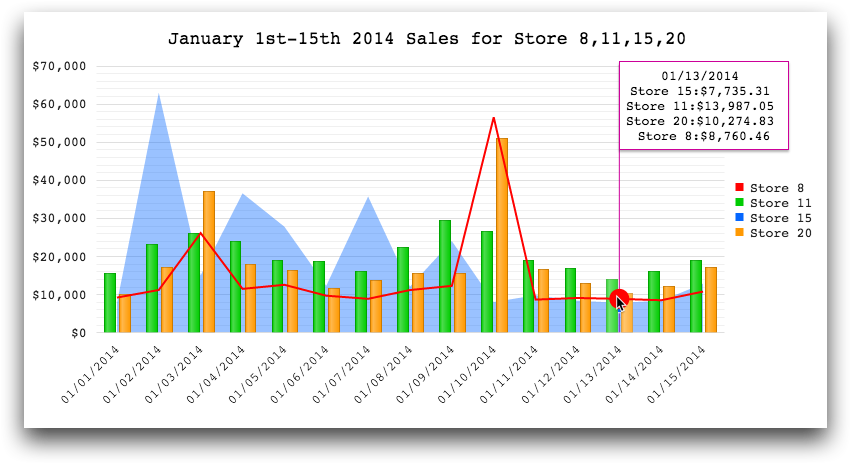
Example: Multiple chart types
<base table="pub.doc.retail.salesdetail"/>
<defblock name="query">
  <sel value="between(trans_date;20140101;20140115)"/>
  <sel value="(store=11 15 20 8)"/>
  <tabu label="Sales Detail: Sum of Extended Sales" breaks="trans_date"
   cbreaks="store" clabels="short">
    <break col="trans_date" sort="up"/>
    <break col="store" sort="up"/>
    <tcol fun="sum" source="xsales" weight=""/>
  </tabu>
</defblock>
<dynamic>
  <widget class_="chart" base_="pub.doc.retail.salesdetail">
    <layer tablevalue_="@data">
      <insert block="query"/>
    </layer>
    <graphspec>
      <chartarea width="800" height="400"/>
      <title text="January 1st-15th 2014 Sales for Store 8,11,15,20"
       font="18px Monospace" color="black"/>
      <legend position="right">
        <labels font="13px Monospace"/>
      </legend>
      <seriesdefaults axis="all"/>
      <series name="Store 8" data="{@data.m0}" color="#ff0000" type="line">
        <markers visible="false" size="20"/>
      </series>
      <series name="Store 11" data="{@data.m1}" color="#00cc00" type="column">
        <markers visible="false" size="20"/>
      </series>
      <series name="Store 15" data="{@data.m2}" color="#0066ff" type="area">
        <markers visible="false" size="20"/>
      </series>
      <series name="Store 20" data="{@data.m3}" color="#ff9900" type="column">
        <markers visible="false" size="20"/>
      </series>
      <tooltip visible="true" background="white"
       font="13px Monospace" shared="true"
       sharedtemplate="
       #=kendo.format('{'\{0:MM/dd/yyyy\}'}',
                      kendo.parseDate(category.toString(),'yyyyMMdd'))#
       <br/>
       #=points[0].series.name #:
       #=kendo.format( '{'\{0:c2\}'}',
                      kendo.parseFloat(points[0].value.toString()))#
       <br/>
       #=points[1].series.name #:
       #=kendo.format( '{'\{0:c2\}'}',
                      kendo.parseFloat(points[1].value.toString()))#
       <br/>
       #=points[2].series.name #:
       #=kendo.format( '{'\{0:c2\}'}',
                      kendo.parseFloat(points[2].value.toString()))#
       <br/>
       #=points[3].series.name #:
       #=kendo.format( '{'\{0:c2\}'}',
                      kendo.parseFloat(points[3].value.toString()))#">
        <border color="#cc0099"/>
      </tooltip>
      <valueaxis name="all">
        <labels format="c0" font="13px Monospace"/>
        <line visible="false"/>
        <minorgridlines visible="true"/>
      </valueaxis>
      <categoryaxis categories="{@data.trans_date}">
        <labels rotation="auto" font="13px Monospace"
         template="
         #=kendo.format('{'\{0:MM/dd/yyyy\}'}',
                        kendo.parseDate(value.toString(),'yyyyMMdd'))#"/>
        <crosshair visible="true" color="#cc0099"/>
        <majorgridlines visible="false"/>
        <line visible="false"/>
      </categoryaxis>
    </graphspec>
  </widget>
</dynamic>
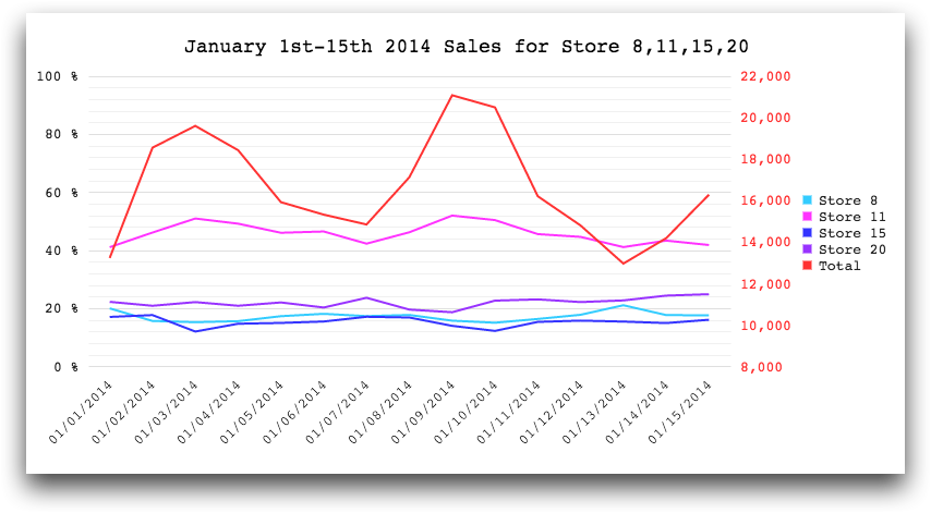
Example: Multiple axes
<base table="pub.doc.retail.salesdetail"/>
<defblock name="query">
  <sel value="between(trans_date;20140101;20140115)"/>
  <sel value="(store=11 15 20 8)"/>
  <tabu label="Batting: Count" breaks="trans_date"
   cbreaks="store" clabels="short">
    <tcol fun="cnt" source="xsales" weight=""/>
  </tabu>
  <willbe name="pct_15" value="m0/t0" format="type:pct"/>
  <willbe name="pct_11" value="m1/t0" format="type:pct"/>
  <willbe name="pct_20" value="m2/t0" format="type:pct"/>
  <willbe name="pct_8" value="m3/t0" format="type:pct"/>
</defblock>
<dynamic>
  <widget class_="chart" base_="pub.doc.retail.salesdetail">
    <layer tablevalue_="@data">
      <insert block="query"/>
    </layer>
    <graphspec>
      <chartarea width="800" height="400"/>
      <title text="January 1st-15th 2014 Sales for Store 8,11,15,20"
       font="18px Monospace" color="black"/>
      <legend position="right">
        <labels font="13px Monospace"/>
      </legend>
      <series name="Store 8" data="{@data.pct_8}" color="#33ccff"
       type="line" axis="percent">
        <markers visible="false" size="20"/>
      </series>
      <series name="Store 11" data="{@data.pct_11}" color="#ff33ff"
       type="line" axis="percent">
        <markers visible="false" size="20"/>
      </series>
      <series name="Store 15" data="{@data.pct_15}" color="#3333ff"
       type="line" axis="percent">
        <markers visible="false" size="20"/>
      </series>
      <series name="Store 20" data="{@data.pct_20}" color="#9933ff"
       type="line" axis="percent">
        <markers visible="false" size="20"/>
      </series>
      <series name="Total" data="{@data.t0}" color="#ff3333"
       type="line" axis="total">
        <markers visible="false" size="20"/>
      </series>
      <tooltip visible="true" background="white"
       font="13px Monospace" shared="true"
       sharedtemplate="
       #=kendo.format('{'\{0:MM/dd/yyyy\}'}',
       kendo.parseDate(category.toString(),'yyyyMMdd'))#
       <br/>
       #=points[0].series.name #:
       #=kendo.format( '{'\{0:p2\}'}',
       kendo.parseFloat(points[0].value.toString()))#
       <br/>
       #=points[1].series.name #:
       #=kendo.format( '{'\{0:p2\}'}',
       kendo.parseFloat(points[1].value.toString()))#
       <br/>
       #=points[2].series.name #:
       #=kendo.format( '{'\{0:p2\}'}',
       kendo.parseFloat(points[2].value.toString()))#
       <br/>
       #=points[3].series.name #:
       #=kendo.format( '{'\{0:p2\}'}',
       kendo.parseFloat(points[3].value.toString()))#">
        <border color="#3399ff"/>
      </tooltip>
      <valueaxis name="percent" narrowrange="true" max="1">
        <labels format="p0" font="13px Monospace"/>
        <line visible="false"/>
        <minorgridlines visible="true"/>
      </valueaxis>
      <valueaxis name="total" narrowrange="true">
        <labels format="n0" font="13px Monospace" color="#ff3333"/>
        <line visible="false"/>
        <minorgridlines visible="true"/>
      </valueaxis>
      <categoryaxis categories="{@data.trans_date}"
       axiscrossingvalues="{lst(0,32)}">
        <labels rotation="auto" font="13px Monospace"
         template="
         #=kendo.format('{'\{0:MM/dd/yyyy\}'}',
         kendo.parseDate(value.toString(),'yyyyMMdd'))#"/>
        <crosshair visible="true" color="#3399ff"/>
        <majorgridlines visible="false"/>
        <line visible="false"/>
      </categoryaxis>
    </graphspec>
  </widget>
</dynamic>