class_="field"
Using <widget class_="field"> creates a text input
field.
Description
The field manifestation of <widget> accepts text.
Optionally, it also offers autocomplete functionality using query data.
Syntax
<dynamic>
    <widget class_="field" type_="[OPTION]"
     label_="[LABEL_FOR_FIELD]">
        [1010data_QUERY]
    </widget>
</dynamic>
The [1010data_QUERY] may be specified between the
opening and closing tags of the <widget>. The results of the query
provide data for the <widget> to display.
Attributes
The attributes in this list are specific to widgets with class_="field".
casesensitive_- When
filter_is utilized,casesensitive_specifies whether the filter should be case-sensitive. changewhenselect_- Determines whether or not to change the value of the associated dynamic variable when
an item is selected from a
fieldwidget withtype_="auto"ortype_="combo". Accepts a1or0.When
changewhenselect_="1", the dynamic variable associated with thevalue_attribute is set as soon as the user selects an item from either the list of autocomplete suggestions or combo box.When
changewhenselect_="0", the field is populated with the value selected from the list of autocomplete suggestions or combo box, but the dynamic variable associated with thevalue_attribute is not set until the widget loses focus or the user initiates an action to send it (e.g., by pressing Enter or Tab). This allows the user to edit the value before sending it.The default is
1.(Available as of version 10.29)
color_- Accepts a string that specifies the background color of the widget.
The color can be specified as any valid HTML color name, an RGB value, or a hex value.
debounce_- Modifies
immediate_="1". The field is evaluated after the specified amount of time if there has been no additional interaction from the user (e.g., clicking away or pressing Enter). The amount of time is given in milliseconds.The maximum amount of time allowed for
debounce_is ten minutes (600000 milliseconds).Note: Thedebounce_cannot be used alone;immediate_="1"must be present. delay_- Accepts a decimal value between
0.0and100.0. Number passed todelay_specifies how long, in seconds, the auto-complete feature should wait after something is typed in the field before displaying auto-complete results. Only applicable whentype_="auto". dropdownheight_- Accepts an integer value specifying the height of the drop-down list that is displayed
when
type_="auto"ortype_="combo".The unit of measurement depends on the render target of the QuickApp. For example, for a web-based QuickApp, the measurement is in pixels.
If the number of items cannot fit in the specified height, a vertical scroll bar is added to the drop-down menu.
The default is
200. dropdownwidth_- Accepts an integer value specifying the width of the drop-down list that is displayed
when
type_="auto"ortype_="combo".The unit of measurement depends on the render target of the QuickApp. For example, for a web-based QuickApp, the measurement is in pixels.
If an item cannot fit in the specified width, the text will wrap over multiple lines.
If
dropdownwidth_is not specified, the drop-down menu is the same width as the input field (as specified by theinputwidth_attribute). emptytext_- Accepts a string that specifies the placeholder text that appears when the field is
empty.
The placeholder text will appear dimmed until the user enters something in the field.
(Available as of version 10.25)
filter_- When
type_="auto",filter_enables server-side filtering.Valid values are:
containsbeginswith
The default is
contains. format_- When
type_="numeric"theformat_attribute accepts a valid 1010data format string (i.e.,dec:2). historyvalue_- Specifies the name of a list-value variable that stores the history of values entered
into the input field.
Pressing the Up Arrow and Down Arrow keys within the field cycles through the history, accessing elements from that variable's value and copying them into the field. From that point, they can be further edited and then entered in the usual way.
Entering a new value automatically appends it to the history.Note: Thevalue_attribute must also be specified for this to work correctly.The
historyvalue_attribute is only valid whentype_is not specified.The variable must be declared as a list-value in the opening
<dynamic>tag of the QuickApp (e.g.,<dynamic var_name="{lst()}">).(Available as of version 11.25)
immediate_- Specifies whether or not to update the value of the dynamic variable specified in the
value_attribute without requiring the user to either click outside thefieldwidget or press Enter. Accepts a1or0.This applies to
fieldwidgets created withtype_="numeric". As of version 11.20, this also applies tofieldwidgets that do not specify thetype_attribute. inputwidth_- Accepts an integer value that specifies the width of the input field.
The unit of measurement depends on the render target of the QuickApp. For example, for a web-based QuickApp, the measurement is in pixels.
initlist_- Accepts a list-value that is used to initialize the
fieldwidget whentype_="auto"ortype_="combo".When the
initlist_attribute is specified, the widget is populated with the items in the list-value, not the query associated with the widget.The list-value specified to
initlist_is a list of elements.Each element can be any of the following:- a scalar value, which is used for the value in the widget and the corresponding
label that is displayed (no tooltip)
1 - a one-element list, which is used for the value in the widget and the
corresponding label that is displayed (no tooltip)
{2} - a two-element list, which consists of the value of the item in the widget and
the label that is displayed (no tooltip)
{3 'Three'} - a three-element list, which consists of the value of the item in the widget, the
label that is displayed, and the corresponding
tooltip
{4 'Four' 'This is the fourth item'} - a package with any combination of the following keys:
'value','label'and'hint'pkg('value' 'label' 'hint'; 5 'Five' 'This is the fifth item')
(Available as of version 10.29)
- a scalar value, which is used for the value in the widget and the corresponding
label that is displayed (no tooltip)
label_- Accepts text. Provides a label for the input field.
labelwidth_- Accepts a positive integer value that specifies the width of the input field. The units for the width specified will be the smallest individual unit for the given target of the QuickApp.
listvalue_- Allows you to edit a real list (made with
lst()) as if it were a comma-separated string.The variable must be declared in the opening
<dynamic>tag of the QuickApp (e.g.,<dynamic var_name="">).(Available as of version 14.21)
Note: In many cases, thetaglistwidget is a better tool for manually editing a list. See class_="taglist" for more information. max_- For
type_="numeric"specifies the maximum value that can be selected. maxlength_Accepts an integer value, greater than or equal to
0, that specifies the maximum number of characters the user may type into a field.It is still possible for the field to contain or display more than the number of characters in
maxlength_, such as a<do>clause setting the value of the bound variable independent of thefieldwidget.maxlength_does not apply whentype_="numeric". Usemin_ormax_instead.type_="combo".
When
The default value is no length restriction.maxlength_is used withtype_="auto", it will not prevent a selected autocomplete suggestion from exceeding the maximum length.(Available as of version 13.34)
maxrows_- Accepts an integer value that specifies the maximum number of rows in which the query
associated with the widget can result.
If the query associated with the widget results in a number of rows that exceeds the value specified to
maxrows_, then the widget produces an error.The default value is
1000. min_- For
type_="numeric", specifies the minimum value that can be selected. numhints_- Accepts an integer value that specifies the maximum number of items that can match the
text entered by the user before the drop-down list associated with the widget displays
the results.
If the number of results that match the text entered is greater than the value of
numhints_, the drop-down list associated with the widget will remain unpopulated. Once enough text has been entered into the input field that the matching results are less than or equal to the value ofnumhints_, the drop-down list will display those matching items.The default value s
200. step_- For
type_="numeric", accepts a numeric value denoting the interval applied when the up or down arrow is clicked. textcolor_- Accepts a string that specifies the color of the text in the widget.
The color can be specified as any valid HTML color name, an RGB value, or a hex value.
textstyle_- Accepts a string that specifies the styling of the text for the widget.
Consists of a set of CSS key/value pairs (e.g.,
font-family:arial;font-weight:bold;font-size:14pt;). type_- Specifies the type of input field for the widget.
Valid values are:
auto- Creates an input field that provides autocomplete suggestions when text is
entered.
The autocomplete suggestions are based on either the results of the query associated with the widget or the value of the
initlist_attribute, if specified. numeric- Creates a numeric input field with up and down arrows to increase or decrease
the value by a specified step amount.
Only numeric values are permitted in this field.
combo- Creates a combo box for selecting multiple values at the same time.
The items in the combo box are derived from either the results of the query associated with the widget or the value of the
initlist_attribute, if specified. password- Creates a field that obfuscates the user's input.
This is typically used for fields that take passwords or other content that should be concealed from view.
(Available as of version 10.13)
If
type_is not specified, a plain text field is created. value_- Specifies the name of the variable to which input entered in the field widget is
stored.
The variable must be declared in the opening
<dynamic>tag of the QuickApp (e.g.,<dynamic var_name="">). locale_- Specifies an optional culture code when the
type_of the field widget isnumeric. In this case,locale_respects the culture's conventions for thousands and decimal separators. Iflocale_is omitted, the date widget uses the English, USA date format. Iftype_is something other thannumeric,locale_has no effect.Valid values are:en_US(English, USA--the default value)en-CA(English, Canada)fr-CA(French, Canada)
Example: Combo box
The following example creates a combobox field whose contents are populated by the results
of the [1010data_QUERY] between the opening and closing tags of the
<widget> with class_="field". This
[1010data_QUERY] consists of a tabulation that results in a single
column that contains all of the accounts in the base table
(pub.demo.retail.item), sorted in ascending order. This column is
then used by the field widget to populate its combobox.
<dynamic input_value="">
  <widget base_="pub.demo.retail.item" class_="field" inputwidth_="100"
   label_="Input field" labelwidth_="150"
   type_="combo" value_="@input_value">
    <tabu label="Tabulation on Sales Item Detail" breaks="account">
      <break col="account" sort="up"/>
      <tcol source="account" fun="cnt" label="Count"/>
    </tabu>
    <colord cols="account"/>
    <sort col="account" dir="up"/>
  </widget>
  <widget class_="text" base_="pub.demo.retail.item"
   text_="Input value: {@input_value}"/>
</dynamic>
Example: Auto-complete
The example creates an auto-complete field that uses the results from the
[1010data_QUERY] between the opening and closing tags of the
<widget> with class_="field". This
[1010data_QUERY] consists of a tabulation that results in a single
column that contains all of the departments in the base table
(pub.demo.retail.prod), sorted in ascending order. This column is
then used by the field widget to determine the autocomplete values.
<dynamic input_value="">
  <widget base_="pub.demo.retail.prod" class_="field" inputwidth_="150"
   label_="Input field" labelwidth_="150"
   type_="auto" delay_=".7" value_="@input_value">
    <tabu label="Tabulation on Product Master" breaks="deptdesc">
      <tcol source="deptdesc" fun="cnt" label="Count"/>
    </tabu>
    <colord cols="deptdesc"/>
    <sort col="deptdesc" dir="up"/>
  </widget>
  <widget class_="text" base_="pub.demo.retail.prod"
   text_="Input value: {@input_value}"/>
</dynamic>
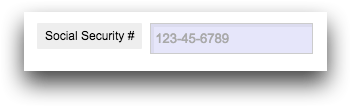
Example: Specify input
This example creates a field that accepts a social security number in the form of a string,
which is stored in the dynamic variable ssn. The
emptytext_ attribute provides placeholder text that will appear dimmed
until the user begins typing in the field. Because the type_ attribute has
been set to password, the content entered in the field will be masked so it
cannot be seen.
<dynamic ssn="">
  <widget class_="field" value_="@ssn" type_="password"
   color_="lavender" label_="Social Security #"
   emptytext_="123-45-6789"/>
</dynamic>
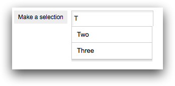
Example: Initializing the field widget using initlist_
The following example uses the initlist_ attribute to initialize the
field widget. The type_ attribute is set to
auto, which allows the widget to provide autocomplete suggestions as the
user types in the field. Since the initlist_ attribute is specified, the
autocomplete suggestions are derived from the items in the given list-value.
In this example, the initlist_ attribute is set to a list of two-element
lists. The first element is the value associated with the item in the field
widget, and the second element is the label that is displayed for that item in the
field widget.
<dynamic var="">
  <widget class_="field" type_="auto" width_="250"
   label_="Make a selection" value_="@var"
   initlist_="{{1 'One'} {2 'Two'} {3 'Three'} {4 'Four'} {5 'Five'}}"/>
</dynamic>