class_="list"
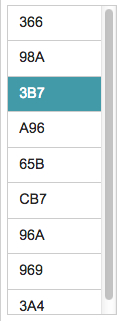
Using <widget class_="list"> creates a scrollable box with a list
of values that can be selected by clicking or lassoing.
Syntax
<dynamic variable="">
    <widget class_="list" value_="@variable">
        [1010data_QUERY]
    </widget>
</dynamic>
The [1010data_QUERY] may be specified between the
opening and closing tags of the <widget>. The results of the query
provide data for the <widget> to display.
Attributes
The attributes in this list are specific to widgets with class_="list".
label_- Accepts text that is used as a label for the widget.
labelpos_- Accepts a string that specifies the position of the label for the widget.
Valid values are:
leftrighttopbottom
The default is
top. labelwidth_- Accepts an integer that specifies the width of the label for the widget.
If the length of the string specified by the
label_attribute is greater than the value specified forlabelwidth_, the text will wrap over multiple lines.If the
labelwidth_attribute is not specified, the default width is the length of the string specified by thelabel_attribute. value_- Accepts a variable defined in the containing
<dynamic>element. The value or values selected from thelistwidget is stored in the variable provided. listvalue_- Accepts a dynamic variable to which multiple values can be saved in a list-value. Each
value is saved as a single list element of the variable.
The variable must be declared as a list-value in the opening
<dynamic>tag of the QuickApp (e.g.,<dynamic var_name="{lst()}">). initlist_- Accepts a list-value that is used to initialize the
listwidget.When the
initlist_attribute is specified, the widget is populated with the items in the list-value, not the query associated with the widget.The list-value specified to
initlist_is a list of elements.Each element can be any of the following:- a scalar value, which is used for the value in the widget and the corresponding
label that is displayed (no tooltip)
1 - a one-element list, which is used for the value in the widget and the
corresponding label that is displayed (no tooltip)
{2} - a two-element list, which consists of the value of the item in the widget and
the label that is displayed (no tooltip)
{3 'Three'} - a three-element list, which consists of the value of the item in the widget, the
label that is displayed, and the corresponding
tooltip
{4 'Four' 'This is the fourth item'} - a package with any combination of the following keys:
'value','label'and'hint'pkg('value' 'label' 'hint'; 5 'Five' 'This is the fifth item')
- a scalar value, which is used for the value in the widget and the corresponding
label that is displayed (no tooltip)
listheight_- Accepts an integer value that specifies the height of the
listwidget.Setting
listheight_to0creates alistwidget the correct height to accommodate all the items in the list.The default is
280. listwidth_- Accepts an integer value that specifies the width of the
listwidget.The default is
0. immediate_- Accepts an integer value of
1or0that specifies whether or not changes to thelistwidget are immediately sent to the server.The default is
0.(Available as of prod-9)
delay_- Accepts a float value between
0and10. The unit is seconds. Specifies how long to wait between when the widget is updated and when the update is sent to the server.(Available as of prod-9)
color_- Accepts a string that specifies the background color of the widget.
The color can be specified as any valid HTML color name, an RGB value, or a hex value.
textcolor_- Accepts a string that specifies the color of the text in the widget.
The color can be specified as any valid HTML color name, an RGB value, or a hex value.
textstyle_- Accepts a string that specifies the styling of the text for the widget.
Consists of a set of CSS key/value pairs (e.g.,
font-family:arial;font-weight:bold;font-size:14pt;). hints_- Specifies whether to provide additional information via a tooltip when the mouse
points to a particular item in the widget.
Accepts
0,1, or a column name.If
hints_is set to1, the third column from the results of the query associated with the widget is used as the text for the tooltips. Ifhints_is set to a column name from the query results, the text from that column is used for the tooltips. Ifhints_is set to0, no tooltips are displayed.The default value is
0. hintdelay_- Accepts a decimal value that specifies the number of seconds to wait before displaying
the tooltip (as provided by the
hints_attribute).The default value is 0.5 seconds.
hintheight_- Accepts an integer value that specifies the maximum height of the pop-up window used
to display the tooltip.
If the amount of text for the tooltip does not fit in the specified space, a vertical scroll bar is added to the pop-up window.
The default value is 355.
(Available as of version 10.03)
hinticon_- Specifies whether or not to display an information icon when the mouse points to a
particular item in the widget.
Accepts a 0 or 1 (or an expression that evaluates to one of those values).
When
hinticon_is set to 1, the Info icon ( ) is displayed in the widget when the mouse points to an
item. When the mouse points to the icon, the tooltip (as specified by the
hints_attribute) is displayed in a pop-up window.The default value is
0.(Available as of version 10.03)
hintpos_- Specifies the position of the pop-up window that displays the tooltip when the mouse
points to a particular item in the widget.
Valid values are:
leftrighttopbottom
The default is
bottom.(Available as of version 10.03)
hintwidth_- Accepts an integer value that specifies the maximum width of the pop-up window used to
display the tooltip.
The default value is 300.
(Available as of version 10.03)
maxrows_- Accepts an integer value that specifies the maximum number of rows in which the query
associated with the widget can result.
If the query associated with the widget results in a number of rows that exceeds the value specified to
maxrows_, then the widget produces an error.The default value is
1000. maxselected_- Accepts an integer value that specifies the maximum number of items that may be selected at one time in the widget.
Example for class_="list"
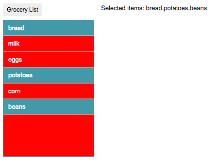
This example creates a simple list of selectable values. The list of items in the list widget is generated from the query associated with the widget.
<dynamic choices="">
  <widget class_="list" base_="pub.demo.retail.item"
   width_="100" value_="@choices">
    <willbe name="selection" value="g_first1(sku;;)"/>
    <sel value="selection=1"/>
    <colord cols="sku"/>
  </widget>
</dynamic>

Example: Specifying a list of values with the initlist_
attribute
This example creates a simple list of selectable values using the
initlist_ attribute. The value of the initlist_ is a
list containing six scalar values.
<dynamic choices="">
  <widget class_="list" base_="pub.demo.retail.item"
   label_="Grocery List" color_="red" textcolor_="white"
   value_="@choices" maxselected_="5" width_="200"
   initlist_="{lst('bread' 'milk' 'eggs' 'potatoes' 'corn' 'beans')}"/>
  <widget class_="text" text_="Selected items: {@choices}"/>
</dynamic>

Example: Specifying a list of values and labels with the initlist_
attribute
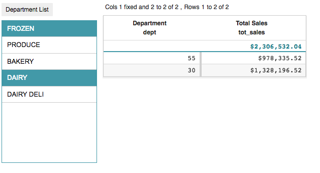
This example creates a list of selectable values using the initlist_
attribute. The value of the initlist_ is a list-value containing five
list-values. Each of those list-values contains a value and label that will correspond to an
item in the list widget. The list widget will display the labels. When the user selects one
or more items from the list widget, the dynamic variable choices will be
set to the corresponding values. These values will be used in the <sel>
operation in the query associated with the grid widget. (The grid widget
uses the require_ attribute to require that choices have been made in the
list widget first; otherwise, it will display the message specified by the
invmsg_ attribute.)
<dynamic choices="">
  <widget class_="list" label_="Department List"
   width_="200" value_="@choices"
   initlist_="{lst({lst(30 'FROZEN')}
                   {lst(36 'PRODUCE')}
                   {lst(13 'BAKERY')}
                   {lst(55 'DAIRY')}
                   {lst(20 'DAIRY DELI')})}"/>
  <widget class_="grid" base_="pub.doc.retail.salesdetail"
   width_="400" require_="{@choices <> ''}"
   invmsg_="Select one or more departments from the list">
    <sel value="dept={@choices}"/>
    <tabu breaks="dept">
      <tcol source="xsales" name="tot_sales" label="Total Sales"
       fun="sum" format="type:currency;dec:2"/>
    </tabu>
  </widget>
</dynamic>

Example: Specifying a list of values, labels, and tooltips with the
initlist_ attribute
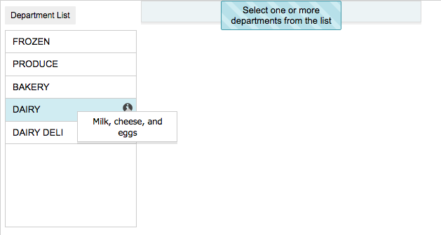
This example creates a list of selectable values using the initlist_
attribute. The value of the initlist_ is a list-value containing five
list-values. Each of those list-values contains a value, label, and tooltip that will
correspond to an item in the list widget. The list widget will display the labels. When the
user selects one or more items from the list widget, the dynamic variable
choices will be set to the corresponding values. These values will be
used in the <sel> operation in the query associated with the
grid widget. The list widget also uses the hints_ and
hinticon_ attributes to specify that tooltips are provided, and that the
list widget should display an info icon when the user points to a specific list item. If the
user points to the hint icon, the tooltip is displayed.
<dynamic choices="">
  <widget class_="list" label_="Department List"
   width_="200" value_="@choices"
   hints_="1" hinticon_="1"
   initlist_="{lst({lst(30 'FROZEN' 'Frozen veggies')}
                   {lst(36 'PRODUCE' 'Fresh veggies')}
                   {lst(13 'BAKERY' 'Bread and rolls')}
                   {lst(55 'DAIRY' 'Milk, cheese, and eggs')}
                   {lst(20 'DAIRY DELI' 'Yogurt and puddings')})}"/>
  <widget class_="grid" base_="pub.doc.retail.salesdetail"
   width_="400" require_="{@choices <> ''}"
   invmsg_="Select one or more departments from the list">
    <sel value="dept={@choices}"/>
    <tabu breaks="dept">
      <tcol source="xsales" name="tot_sales" label="Total Sales"
       fun="sum" format="type:currency;dec:2"/>
    </tabu>
  </widget>
</dynamic>

