
class_="date"
Using <widget class_="date"> creates an input field with an
accompanying calendar widget for easier date selection.
Syntax
<dynamic datevar="">
    <widget class_="date" value_="@datevar"
     label_="[LABEL_FOR_WIDGET]">
      [1010data_QUERY]
    </widget>
</dynamic>
The [1010data_QUERY] may be specified between the
opening and closing tags of the <widget>. The results of the query
provide data for the <widget> to display.
Attributes
The attributes in this list are specific to widgets with class_="date".
value_- Specifies the variable, among those declared in the containing
<dynamic>element, where information sent from the input field will be stored. inputwidth_- Accepts an integer that specifies the width of the input field associated with the date widget.
label_- Accepts text that is used as a label for the widget.
labelpos_- Accepts a string that specifies the position of the label for the widget.
Valid values are:
leftrighttopbottom
The default is
left. labelwidth_- Accepts an integer that specifies the width of the label for the widget.
If the length of the string specified by the
label_attribute is greater than the value specified forlabelwidth_, the text will wrap over multiple lines.If the
labelwidth_attribute is not specified, the default width is the length of the string specified by thelabel_attribute. tovalue_- If specified, accepts a variable, among those declared in the containing
<dynamic>element. Specifying this value creates a limited range of dates from which the end-user may choose. The earliest date in the range is the value provide to thevalue_attributes. The latest available date is the value oftovalue_. tolabel_- Accepts a string that specifies the label for the ending date field.
tolabelpos_- Accepts a string that specifies the position of the label for the ending date
field.
Valid values are:
leftrighttopbottom
The default is
left. tolabelwidth_- Accepts an integer that specifies the width of the label for the ending date
field.
If the length of the string specified by the
tolabel_attribute is greater than the value specified fortolabelwidth_, the text will wrap over multiple lines.If the
tolabelwidth_attribute is not specified, the default width is the length of the string specified by thetolabel_attribute. arrange_- Accepts a string that specifies whether to arrange the two date pickers for a date
range either horizontally or vertically. Note: This attribute is only valid when the
tovalue_attribute is specified.Valid values are:
h- Arrange the two date pickers for a date range horizontally.
v- Arrange the two date pickers for a date range vertically.
earliest_- Accepts an integer in the form of YYYYMMDD that specifies the earliest selectable date.
latest_- Accepts an integer in the form of YYYYMMDD that specifies the latest selectable date.
format_- Accepts a string specifying the format for displaying the date in the input field
after an item is selected from the date picker.
Example strings for use are:
mm/dd/yyandmm-dd-yy. autoselect_- Accepts a 1 to activate and 0 to
deactivate (default).
When active,
autoselect_will automatically reveal the date picker when the QuickApp user clicks in the date input field. When active,autoselect_will also automatically assign a value to the variable specified in thevalue_attribute when the date format entered matches the format specified in theformat_attribute (e.g., ifformat_="mm/dd/yy"thenautocomplete_will auto-update the variable if someone types 01/01/14).(Available as of prod-9)
parseformats_parseformats_accepts a comma-separated list of valid 1010data date formats.When a user types in a date picker widget's field,
parseformats_will be used to convert what the user types into a valid date value. It will also force the appearance of the date in the field into the format specified by theformat_attribute.The default comma-separated list for
parseformats_is as follows:yyyy-mm-dd, mm/dd/yyyy, mm/dd/yy, yyyymmdd.parseformats_will use the first successful format it encounters in the comma-separated list. So, when usingparseformats_, order matters, and incorrect conversions may occur if order is not considered. The correct way to provide formats is to list the formats from least strict to most strict.For example, if
parseformats_="mm/dd/yy,mm/dd/yyyy"and a user types 05/15/2012, thenparseformats_will convert it to: 05-15-20, because 05/15/2012 can be parsed withmm/dd/yy. To correct this, use:parseformats_="mm/dd/yyyy,mm/dd/yy". This also applies if using different delimiters. For instance, to account for both slash (/) and dash (-) delimiters, use:parseformats_="mm/dd/yyyy,mm-dd-yyyy,mm/dd/yy,mm-dd-yy".(Available as of prod-9)
locale_- Accepts an optional culture code. The date widget will then use the culture's
appropriate date format. If
locale_is omitted, the date widget uses the English, USA date format.Valid values are:en_US(English, USA--the default value)en-CA(English, Canada)fr-CA(French, Canada)
(Available as of version 15.24)
color_- Accepts a string that specifies the background color of the widget.
The color can be specified as any valid HTML color name, an RGB value, or a hex value.
textcolor_- Accepts a string that specifies the color of the text in the widget.
The color can be specified as any valid HTML color name, an RGB value, or a hex value.
textstyle_- Accepts a string that specifies the styling of the text for the widget.
Consists of a set of CSS key/value pairs (e.g.,
font-family:arial;font-weight:bold;font-size:14pt;). maxrows_- Accepts an integer value that specifies the maximum number of rows in which the query
associated with the widget can result.
If the query associated with the widget results in a number of rows that exceeds the value specified to
maxrows_, then the widget produces an error.The default value is
1000.
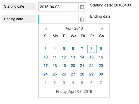
Example: Start date and end date
This example creates a date widget that provides two vertically arranged date pickers to select a date range. When a date is selected from the date picker, it is formatted as yyyy-mm-dd in the input field.
<dynamic fromvar="" tovar="">
  <widget class_="date" value_="@fromvar" tovalue_="@tovar"
   label_="Starting date" labelwidth_="100"
   tolabel_="Ending date" tolabelwidth_="100"
   arrange_="v" format_="yyyy-mm-dd"/>
  <layout>
    <widget class_="text" text_="Starting date: {@fromvar}"/>
    <widget class_="text" text_="Ending date: {@tovar}"/>
  </layout>
</dynamic>
Example: French Canadian calendar
This example shows how to use the optional locale_ attribute to create a
French Canadian date picker.
<dynamic d="20191215">
<widget class_="date" locale_="fr-CA" value_="@d"/>
</dynamic>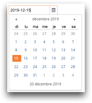
Example: Using grid for data selection
<dynamic base_="pub.demo.weather.hourly90" selecteddate="19900101"
      begindate="19900101" enddate="19901231">
    <layout>
        <widget class_="date" margin_="10" label_="Select a date:"
         format_="yymmdd" color_="white" textcolor_="#222"
         textstyle_="font-weight:bold;" months_="1" fill_="none"
         earliest_="19900101" latest_="19901231"
         value_="@selecteddate" source_="0 0 0 0 0"/>
        <widget class_="text" margin_="10" type_="html"
         text_="<div style='font:14px/20px sans-serif;'>Date selected: {@selecteddate}</div>"
         source_="0 0 0 0 1"/>
        <widget class_="grid" width_="480" height_="320" source_="0 0 0 0 2">
            <sel value="(date={@selecteddate})"/>
        </widget>
        <widget class_="date" margin_="10" label_="Select a date range from:"
         tolabel_="to:" color_="white" textcolor_="#222"
         textstyle_="font-weight:bold;" earliest_="19900101" latest_="19901231"
         months_="1" format_="yymmdd" value_="@begindate"
         tovalue_="@enddate" source_="0 0 0 0 3"/>
        <widget class_="text" margin_="10" type_="html"
         text_="<div style='font:14px/20px sans-serif;'>Date range selected: from  {@begindate} to {@enddate}</div>"
         source_="0 0 0 0 4"/>
        <widget class_="grid" width_="480" height_="320" type_="native"
         source_="0 0 0 0 5">
            <sel value="(date>={@begindate})"/>
            <sel value="(date<={@enddate})"/>
        </widget>
    </layout>
</dynamic>