class_="color"
Using <widget class_="color"> creates a widget that allows the
end-user to select a color value.
Syntax
<dynamic colorvar="">
    <widget class_="color" value_="@colorvar"/>
</dynamic>
Attributes
label_- Accepts text that is used as a label for the widget.
labelpos_- Accepts a string that specifies the position of the label for the widget.
Valid values are:
leftrighttopbottom
The default is
left. labelwidth_- Accepts an integer that specifies the width of the label for the widget.
If the length of the string specified by the
label_attribute is greater than the value specified forlabelwidth_, the text will wrap over multiple lines.If the
labelwidth_attribute is not specified, the default width is the length of the string specified by thelabel_attribute. value_- Accepts a variable that is declared in the containing
<dynamic>element. The color value selected is stored in the variable provided.
buttons_- Specifies whether to show Apply and
Cancel buttons on the color picker.
Accepts
1to show the buttons and0to hide them. If omitted the option defaults to0. labelapply_- Specifies the label of the Apply button.
Accepts a string: (i.e.,
labelapply_="This"). labelcancel_- Specifies the label of the Cancel button.
Accepts a string: (i.e.,
labelcancel_="Not This"). opacity_- Specifies whether to show an opacity slider to control the opacity of the color
applied.
Accepts
1to show the slider and0to hide it. Defaults to0. preview_- When
mode_="flat",preview_specifies whether to show a preview square for the currently selected color.Accepts
1to show and0to hide. Defaults to1. enable_- Specifies whether to enable or disable the widget.
Accepts
1to enable and0to disable. Defaults to1. autoupdate_- Specifies whether the color selected in the color picker should update its values
automatically or wait for a manual input to update.
Valid values are
1for updating the color selection when the selection changes, and0, which tells the color picker to hold its current value until a user clicks the Apply button that appears whenbuttons_="1". mode_- Specifies whether to use a gradient color picker or a tiled color picker.
Valid values are:
flat- Gradient version
palette- Tiled mode
Defaults to
flat. tilesize_- When
mode_="palette", usetilesize_to specify the size of the tiles in the color palette. Accepts an integer (i.e.,tilesize_="10". columns_- When
mode_="palette",columns_specifies the number of columns to show in the color palette. Accepts an integer value (i.e.,columns_="5". Defaults to10. palettevalue_- This attribute specifies a dynamic variable whose value determines the colors to show
in the palette. This attribute only applies when
mode_="palette".The dynamic variable associated with the
palettevalue_attribute can be set to any of the following valid values:basicwebsafeofficeapexaustinclarityslipstreammetroflowhardcovertrekvervemonochrome
You may also set the dynamic variable to a custom list of color hex values (e.g.,
{'#ff0000', '#ff00ff'}).
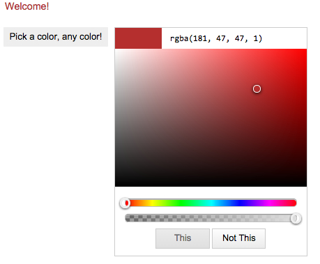
Example for class_="color"
<dynamic colorvar="red" my_palette="trek">
  <layout>
    <layout>
      <widget class_="text" color_="{@colorvar}" text_="Welcome!"
       update_="auto" invmode_="hide"/>
    </layout>
    <widget class_="color" label_="Pick a color, any color!"
      value_="@colorvar" buttons_="1" opacity_="1" autoupdate_="0"
      mode_="flat" labelapply_="This" labelcancel_="Not This"/>
  </layout>
</dynamic>