class_="gauge"
Using <widget class_="gauge"> creates a linear or radial gauge that
displays scalar data on a specified range of values. (Available as of
prod-9)
Syntax
<dynamic>
  <widget class_="gauge" type_="radial|linear" reading_="[VALUE]"/>
</dynamic>
Attributes
label_- Accepts text that is used as a label for the widget.
labelpos_- Accepts a string that specifies the position of the label for the widget.
Valid values are:
leftrighttopbottom
The default is
left. labelwidth_- Accepts an integer that specifies the width of the label for the widget.
If the length of the string specified by the
label_attribute is greater than the value specified forlabelwidth_, the text will wrap over multiple lines.If the
labelwidth_attribute is not specified, the default width is the length of the string specified by thelabel_attribute. reading_- Specifies the values that should be displayed by the indicators on the gauge. This attribute accepts either:
- A numeric value to display a single indicator at that particular value on the gauge
- A comma-separated list of values to display multiple indicators on the gauge
Each value provided toreading_may be specified as:- A scalar value
- An expression that resolves to a scalar value
- A column nameNote: If a column name is present in the
reading_attribute,<layer name="reading">must be used. See <layer name="reading"> for more information.
If the
reading_attribute is omitted, a<layer name="reading">must be provided. type_- Specifies the type of gauge to display.
Valid values are:
radial- Displays a radial gauge.
linear- Displays a linear gauge.
The default is
radial. colors_- Accepts a comma-separated string of values specifying the colors of the indicators on
the gauge widget. Each value in this list corresponds to an indicator defined by the
reading_attribute.Note: If the number of values specified in this attribute is not the same as the number of indicators specified by thereading_attribute, an error is returned.Each color can be specified as:
- Any valid HTML color name (e.g., red, blue, cyan)
- A hex value (e.g., #d12345)
For example, if
reading_="25,75"is specified,colors_="red,blue"will specify that the indicator that points to the first value is red and the indicator that points to the second value is blue. indicators_- Accepts a comma-separated string of values specifying the types of indicators on a
gauge widget when
type_="linear". Each value in this list corresponds to an indicator defined by thereading_attribute.Note: If the number of values specified in this attribute is not the same as the number of indicators specified by thereading_attribute, an error is returned.Valid values are:
arrow- Use an arrow to point to the value on the gauge widget.
fill- Draw a fill line to indicate the value on the gauge widget.
For example, if
reading_="25,75"is specified,indicators_="fill,arrow"will specify that the indicator associated with the first value is a fill line and the indicator that points to the second value is an arrow.If this attribute is omitted, arrows are used by default.
electric_- Specifies whether to animate the gauge indicators to their initial position or when
their associated values change.
When
electric_is set to1, the indicators are animated. Whenelectric_is set to0, the animation is disabled.The default is
1. min_- Accepts an integer value that will displayed as the lowest possible value on the gauge.
max_- Accepts an integer value that will be displayed as the highest possible value on the gauge.
minorticks_- Specifies whether the gauge shows minor tick marks.
If
minorticks_="1", the gauge shows minor tick marks.If
minorticks_="0", the gauge omits minor tick marks.The default value is
0. majorticks_- Specifies whether the gauge shows major tick marks.
If
majorticks_="1", the gauge shows major tick marks.If
majorticks_="0", the gauge omits major tick marks.The default value is
0. minor_- The
minor_attribute accepts an integer value that specifies the spacing between the minor ticks on the gauge.If you set
minorticks_=1but do not specify the spacing withminor_, the gauge widget will provide appropriate default values for the minor ticks. major_- The
major_attribute accepts an integer value that specifies the spacing between the major ticks on the gauge.If you set
majorticks_=1but do not specify the spacing withmajor_, the gauge widget will provide appropriate default values for the major ticks. arcbeg_- Accepts an integer value between -180 and
180. The value provided specifies the position of the beginning
of the scale in degrees from
-180(the bottom of the radial gauge).Note: This attribute is only valid whentype_="radial". arcend_- Accepts an integer value between -180 and
180. The value provided specifies the position of the end of
the scale in degrees from
180(the top of the radial gauge).Note: This attribute is only valid whentype_="radial". orientation_- Specifies the orientation of the gauge widget.Note: The
orientation_attribute is only applicable whentype_="linear".Valid values are:
horizontalvertical
The default is
horizontal. labels_- Accepts a string that specifies where to display labels of values for the gauge when
type_="radial".Valid values are:
outsideinsidenone
The default is
inside. maxcols_- Accepts an integer that specifies the maximum number of columns in which the query
associated with a
<layer name="reading">can result.Note: This is only applicable when thereading_attribute is omitted.The default is
10. minorticks_- Specifies whether the gauge shows minor tick marks.
If
minorticks_="1", the gauge shows minor tick marks.If
minorticks_="0", the gauge omits minor tick marks.The default value is
0. majorticks_- Specifies whether the gauge shows major tick marks.
If
majorticks_="1", the gauge shows major tick marks.If
majorticks_="0", the gauge omits major tick marks.The default value is
0.
Example
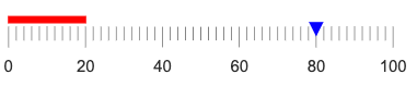
The following example displays a linear gauge that ranges from a minimum value of 0 to a
maximum value of 100. There are major ticks on the gauge at an interval value of 20 and
minor ticks at an interval value of 2. (If you do not specify the value of
minor_ or major_, the gauge widget
determines appropriate tick spacing.) There are two indicators on the gauge. The first is at
position 20 and is a fill indicator that is colored red; the second is at position 80 and is
an arrow indicator that is colored blue.
<dynamic>
  <widget class_="gauge" type_="linear" width_="300"
   min_="0" max_="100" minorticks_="1" majorticks_="1"
   reading_="20,80" colors_="red,blue"
   indicators_="fill,arrow"/>
</dynamic>
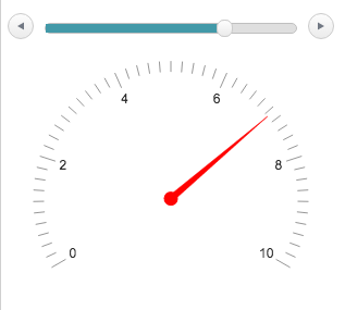
Example: Gauge with slider
The following example uses a slider widget to determine the setting of the gauge widget.
The initial value is set to 5. As the value of the slider widget changes, the gauge widget
changes accordingly, since the reading_attribute is set to the value of the
dynamic variable associated with the slider widget (slidervar). Because the
electric_ attribute is set to 1, the indicator on the
gauge widget moves smoothly from one value to the next as the slider widget is changed.
<dynamic slidervar="5">
  <layout arrange_="v">
    <widget class_="slider" min_="0" max_="10"
     sliderwidth_="300" value_="@slidervar"/>
    <widget class_="gauge" min_="0" max_="10" width_="300"
     colors_="red" reading_="{@slidervar}" electric_="1"/>
  </layout>
</dynamic>