class_="bokehchart"
<widget class_="bokehchart"> allows you to create data
visualizations. (Available as of version 13.30)
Description
The bokehchart widget allows you to select from a number of chart types,
including scatter, bar, line, pie, and histogram, to present your data in graphical
form.
The bokehchart widget employs server-side charting similar to the
graphics widget, with added interactive features such as zoom, pan, and
tooltips. With the scatter chart (type_="scatter"), it is possible to plot
large data sets; however, you will not be able to view tooltips. You can zoom in on the data
to perform adaptive resampling without loss of detail.
Syntax
<dynamic>
    <widget class_="bokehchart"
    type_="bar|hbar|geograph|histogram|line|lineplot|
       percentbar|hpercentbar|pie|scatter|stackedbar|hstackedbar"
    title_="[CHART_TITLE]"
    height_="[HEIGHT]"
    width_="[WIDTH]"
    x1_="[X_AXIS_COLUMN]"
    y1_="[Y_AXIS_COLUMN]"
    xlabel1_="[X_AXIS_LABEL]"
    ylabel1_="[Y_AXIS_LABEL]"
    legend_="1|0"
    colabel_="[COLUMN_NAME]"
    toolbar_="1"|"0"
    tooltips_="1"|"0"
    </widget>
</dynamic>
Later developments to the bokehchart widget will include support for
<graphspec> for more finely-grained control over the appearance of the
bokeh charts.
Attributes
The attributes in this list are specific to widgets with
class_="bokehchart".
type_- Type of chart in which to display the data.
Valid values are:
bar- Produces a vertical chart with bars whose lengths represent the values in the data.
hbar- Produces a horizontal bar chart. (Available as of version 18.12)
geograph- Produces state and county polygons for the continental U.S. and Mexico.
See
type_="geograph"for details. histogram- Produces a chart that displays the frequency distribution of numerical data as bars.
line- Produces a chart consisting of a line of interconnected points for each column of numeric data.
lineplot- Produces a combined line/scatter chart.
percentbar- Produces a vertical percentage bar chart. (Available as of version 18.12)
hpercentbar- Produces a horizontal percentage bar chart. (Available as of version 18.12)
pie- Produces a chart that displays each value in the given data set as a section of a circular pie, representing its percentage of the whole.
scatter- Produces a chart in which each value is plotted as a separate data point.
stackedbar- Produces a vertical stacked bar chart. (Available as of version 18.12)
hstackedbar- Produces a horizontal stacked bar chart. (Available as of version 18.12)
Note: Other chart types may be added in the future. title_- The title for the bokeh chart
The default value is the title of the table.
height_- The height of the bokeh chart
width_- The width of the bokeh chart
x1_- The column to be used for the horizontal axis
y1_- The column(s) to be used for the vertical axis
xlabel1_- The label for the horizontal axis
You can set the value of this attribute to
""for no label on the horizontal axis.If this attribute is omitted, the default label is
x1_. ylabel1_- The label for the vertical axis
You can set the value of this attribute to
""for no label on the vertical axis.If this attribute is omitted, the default label is
y1_. legend_- A boolean value that turns on/off the table legend. The default value is
1(turn on the table legend). (Available as of version 18.06) yscale_Whether you want to display values on a linear or logarithmic scale
At the present time,yscale_applies only totype_="line".Possible values are
linearandlog.colabel_- The column to be added to tooltips labels
At the present time,
colabel_is available in line and scatter charts only.The default value is to show tooltips for the
x1_andy1_columns only.You will not be able to view tooltips for large data sets (over 50,000 rows). Available as of version 15.07
toolbar_- A boolean value that turns on/off the toolbar to the right of the chart title. The
default value is
1(display the toolbar). (Available as of version 18.12) tooltips_- A boolean value that turns on/off tooltips. The default value is
1(display tooltips). (Available as of version 18.12)
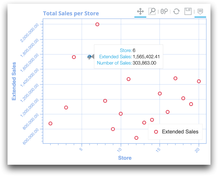
Example: Scatter chart with sales totals per store
In the following example, a scatter chart plots the sales totals per store from the table
pub.doc.retail.salesdetail. The horizontal axis, x1_, is
the store column, and the vertical axis, y1_, is the
tabulation column t0. The tabulation column t1 is added as
a tooltip with the colabel_ attribute. <tabu> is used
to tabulate the sum of sales by store. The column t0 represents the sum of
the xsales column per store and the column t1 represents
the number of transid per store.
<dynamic>
 <widget class_="bokehchart" type_="scatter"
   title_="Total Sales per Store"
   height_="400" width_="509"
   x1_="store" y1_="t0" xlabel1_="Store"
   ylabel1_="Extended Sales" colabel_="t1">
  <base table="pub.doc.retail.salesdetail"/>
  <tabu breaks="store">
   <tcol source="xsales" fun="sum" label="Extended Sales"/>
   <tcol source="transid" fun="cnt" label="Number of Sales"/>
  </tabu>
 <sort cols="store"/>
 </widget>
</dynamic>
In the resulting table, note that the tooltip displays the values of x1_,
y1_, and colabel_.
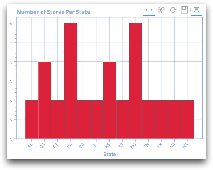
Example: Histogram with number of stores per state
The following simple histogram shows the number of stores per state in
pub.doc.retail.store:
<dynamic>
 <widget class_="bokehchart" type_="histogram"
    title_= "Number of Stores Per State"
    height_="400" width_="509" x1_="state" xlabel1_="State">
   <base table="pub.doc.retail.store"/>
   <sort col="state"/>
 </widget>
</dynamic>
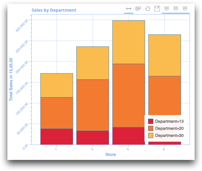
Example: Stacked bar chart with sales by department
The following stacked bar chart shows the sales for three departments of stores 1, 3, 4, and 6.
<dynamic>
   <widget class_="bokehchart" type_="stackedbar" title_="Sales by Department"
      height_="500" width_="600" x1_="store" y1_="m0,m1,m2"
      xlabel1_="Store" ylabel1_="Total Sales in 13,20,30">
      <base table="pub.doc.retail.salesdetail"/>
      <sel value="(dept=30) | (dept=13) | (dept=20)"/>
      <sel value="(store=1) | (store=3) | (store=4) | (store=6)"/>
      <tabu breaks="store" cbreaks="dept" cmlabel="Aggregation" rolledup="xsales">
          <break col="store" sort="up"/>
          <break col="dept" sort="up"/>
          <tcol source="xsales" fun="sum" label="Extended Sales"/>
      </tabu>
   </widget>
</dynamic>