class_="button"
Using <widget class_="button"> creates a button that can be
configured to perform many actions and initiate interactions.
Description
The button widget can take on a wide range of responsibilities. How
exactly a button behaves is controlled by the type_
attribute. Much like the class_ attribute of a
<widget>, the value provided for type_ "unlocks"
specific attributes that only apply to that specific value. This article contains
sub-articles for each type_ value.
Syntax
<dynamic>
    <widget class_="button" type_="[TYPE_OPTION]"
     text_="[TEXT_OF_BUTTON]">
        [1010data_QUERY]
    </widget>
</dynamic>
The [1010data_QUERY] may be specified between the
opening and closing tags of the <widget>. The results of the query
provide data for the <widget> to display.
Attributes
text_- Accepts text that is used for the label on the button.
color_- Specifies the color of the button.
The color can be specified as any valid HTML color name, an RGB value, or a hex value.
textcolor_- Specifies the color of the text on the button.
The color can be specified as any valid HTML color name, an RGB value, or a hex value.
textstyle_- Specifies the styling of the text on the button.
Consists of a set of CSS key/value pairs (e.g.,
font-family:arial;font-weight:bold;font-size:14pt;). alttext_- Specifies different text to be displayed on the button when the user points to it.
(Available as of version 11.08)
alttextstyle_- Specifies the styling for the text on the button when the user points to it. Accepts
CSS (e.g.,
font-family:courier;font-weight:bold;font-size:26pt;).This attribute is only valid when
type_="plain".(Available as of version 11.08)
guise_- Specifies the appearance of the
buttonwidget.Valid values are:
button- Appears as a button.
image- Appears as an image that behaves like a button.
When
guise_="image", all the attributes and functionality of<widget class_="image">are supported. For details, seeclass_="image". text- Appears as a span of text that behaves like a button.
When
guise_="text", all the attributes and functionality of<widget class_="text">are supported. However, theclass_="text"attributescolor_,style_, andtype_must be replaced bytextcolor_,textstyle_, andtexttype_, respectively, to avoid conflict with theclass_="button"attributes of the same name. For details, seeclass_="text".
The default is
button.(Available as of version 10.40)
type_- Specifies the type of button to create.
Valid values are:
config- Creates a button that sets the values of dynamic variables from the results of a
query.
See type_="config" for details.
dummy- Creates a button that doesn't do anything useful, but can send a message.
See type_="dummy" for details.
dump- Creates a button that saves the current dynamic state of the QuickApp into a
table consisting of a single row with one column per dynamic variable name.
See type_="dump" for details.
export- Creates a button that sends the contents of the widget to various targets,
including files and tables.
See type_="export" (deprecated) for details.
render- Creates a button that exports the table and chart widgets of a QuickApp to a
valid output type, such as an Excel workbook.
See type_="render" for details.
set- Creates a button that sets the value of one or more variables defined by the
containing
<dynamic>tag.See type_="set" for details.
submit- Creates a button that triggers a refresh of waiting (invalidated) widgets.
See type_="submit" for details.
See sub-articles for the functionality provided by each value as well as any additional attributes specifically applicable to that value.
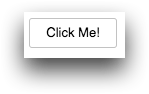
Example for type_="dummy"
Below is a basic button that doesn't do anything particularly useful.
<dynamic col="" val="">
    <widget class_="button" type_="dummy" width_="100" height_="150"
     text_="Click Me!"/>
</dynamic>
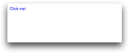
Example: Using guise_="text" with alttext_ and
altcolor_
<dynamic msg="Click me!" altmsg="Do it now!">
  <do onsubmit_="click">
    <set msg="Thank you!"/>
    <set altmsg="Once is enough!"/>
  </do>
  <widget class_="button" submit_="click"
   guise_="text" text_="{@msg}"
   altcolor_="orange" alttext_="{@altmsg}"/>
</dynamic>