type_="geograph"
Using <widget class_="bokehchart" type_="geograph"> produces state
and county polygons for the continental U.S. and Mexico. (Available as of version
17.00)
Syntax
<dynamic>
    <widget class_="bokehchart"
    type_="geograph"
    title_="[CHART_TITLE]"
    height_="[HEIGHT]"
    width_="[WIDTH]"
    x1_="[STATES_OR_COUNTIES_COLUMN]"
    y1_="[Y_AXIS_COLUMN]"
    xlabel1_="[X_AXIS_LABEL]"
    ylabel1_="[Y_AXIS_LABEL]"
    colabel_="[COLUMN_NAME]"
    country_="USA"|"MX"
    layer_="states"|"counties"
    color_="[COLOR_COLUMN]"|"[HTML_COLOR]"|"[HTML_COLOR_LIST]"
    opacity_="[OPACITY_COLUMN]"
    statecol_="[COUNTY_STATE_COLUMN]"
    allpolys_="1|0"
</widget>
</dynamic>
Later developments to the bokehchart widget will include support for
<graphspec> for more finely-grained control over the appearance of the
bokeh charts.
Attributes
The attributes in this list are specific to widgets with class_="bokehchart"
type_="geograph".
type_="geograph"- U.S. state polygons (the current version is Continental U.S. only) and Mexico state polygons.
title_- The title for the bokeh chart
The default value is the title of the table.
height_- The height of the bokeh chart
width_- The width of the bokeh chart
x1_- The states or counties column of the table
y1_- The column(s) to be used for the y axis
xlabel1_- The label for the x1 column
If this attribute is omitted, the default label is
x1_. ylabel1_- The label for the y axis
You can set the value of this attribute to
""for no label on the vertical axis.If this attribute is omitted, the default label is
y1_. colabel_- The column to be added to tooltips labels
The default value is to show tooltips for the
x1_andy1_columns only. country_- Valid countries are
"USA"and"MEX"."USA"is the default value. layer_-
states- U.S. or Mexico state polygons. Valid state name or fips codes are expected.
Valid entries include:
Illinois,texas,CA,fl,18. This is the default value. counties- U.S. county polygons. Valid county names or county FIPS codes are expected.
Valid entries include:
"Wood, OH",39173, and"OH-Wood".
color_- Specifies the color column, single color, or list of colors used to create the color
palette.
Valid value types include:
"yellow","#FFFF00","rgb(255,255,0)","white;black","col1;col2;...;coln" opacity_- Specifies the opacity of the colors in the geograph. This should be a column with
numeric values in the 0<=opacity<=1 range. If a number is outside this range, the
color will be
"#D3D3D3"(light gray). statecol_- If
layer_="counties", the counties are computed as"[statecol_]-[x1_]". For example, ifx1_is"Wood", the county would be computed as"OH-Wood". allpolys_- Whether to return all polygons for states or counties. For states, 1 is the default
value. For counties, 0 is the default value. Note: If you set
allpolys_to 1 for counties, it will slow down the rendering of your chart, as there are normally more counties than states.
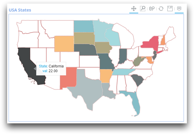
Example: Geograph for U.S. state data
In the following example, the geograph shows data for selected states in the continental
U.S. The country_ and layer_ attributes are unnecessary
because USA and states are the default values. You can
hover over a state in the map to view the tooltip displaying x1_
(state) and y1_ (val) data.
<dynamic>
<widget class_="bokehchart" type_="geograph"
  title_="USA States" height_="400"
  width_="600" x1_="state" y1_="val">
      <table cols="state, val">
             Arkansas,     -47; California,    22;
		Florida,       99; Indiana,       -1;
		Iowa,         -22; Louisiana,     40;
		Maryland,     -61; Minnesota,     64;
		Missouri,      -5; Nebraska,       6;
		NewHampshire, -64; NewMexico,    -77;
		NewYork,      -89; NorthDakota,   97;
		SouthCarolina,  9; SouthDakota,  -24;
		Tennessee,     79; WestVirginia, -18;
		Wisconsin,     70; Wyoming,      -45;
             TX,            42; New Jersey,    20
      </table>
  </widget>
</dynamic>
Without specifying the color_ attribute, the resulting geograph displays
colors from the 1010data color palette. The cursor is hovering over California, displaying
its value.
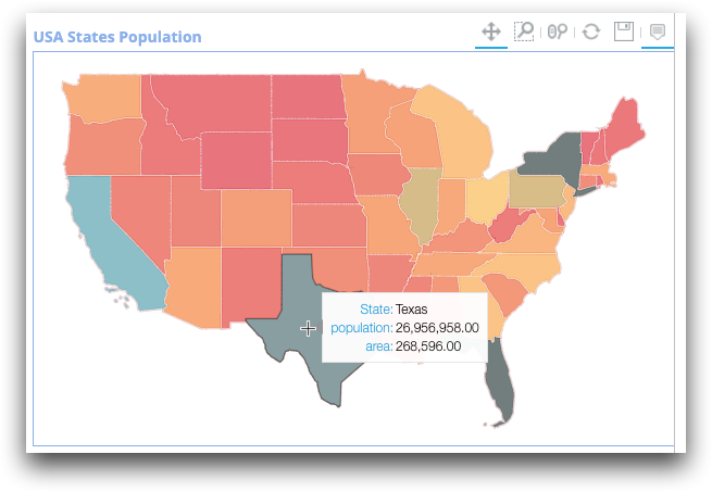
Example: Using the states sample table
In the following example, we use the system table
pub.doc.samples.geograph.states for the U.S. geograph data.
<dynamic>
  <widget class_="bokehchart" type_="geograph" title_="USA States Population"
   height_="400" width_="600" x1_="names" y1_="population" colabel_="area"
   layer_="states" >
<base table="pub.doc.samples.geograph.states"/>
  </widget>
</dynamic>
Again, the resulting geograph displays colors from the 1010data color palette, since the
color_ attribute is not specified. The tooltip displays the data in the
x1_
(names), y1_
(population), and colabel_
(area) columns.
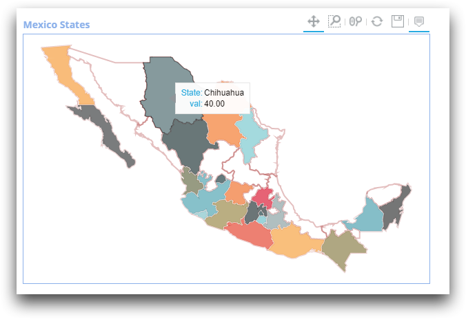
Example: Geograph for Mexico state data
In the following example, the geograph shows data for selected states in Mexico. You can hover over a state in the map to view the state name and the corresponding data.
<dynamic>
  <widget class_="bokehchart" type_="geograph" title_="Mexico States"
   height_="400" width_="600" x1_="state" y1_="val" country_="MEX">
    <table cols="state, val">
		BajaCalifornia,     -47; Baja California Sur,    22;
		Campeche,            99; Aguascalientes,         -1;
		Chiapas,            -22; Chihuahua,              40;
		Coahuila,           -61; Colima,                 64;
		DistritoFederal,     -5; Durango,                 6;
		Guanajuato,         -64; Guerrero,              -77;
		Hidalgo,            -89; JA,                     97;
		Mexico,               9; Michoacan,             -24;
		Morelos,             79; Nayarit,               -18;
		NuevoLeon,           70; Oaxaca,                -45;
             Puebla,              42; QuintanaRoo,            20
    </table>
  </widget>
</dynamic>
The resulting geograph looks like the following (the cursor is hovering over Chihuahua):
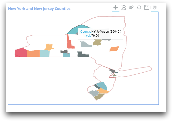
Example: New York and New Jersey counties by FIPS code
In the following example, the geograph shows data for selected counties in New York and New Jersey. You can hover over a county in the map to view the county name and the corresponding data.
<dynamic>
  <widget class_="bokehchart" type_="geograph"
  title_="New York and New Jersey Counties"
  height_="400" width_="600" x1_="county" y1_="val" layer_="counties">
    <table cols="county, val">
		34001,     -47; 34003,    22;
		34005,      99; 34007,    -1;
		34009,     -22; 34011,    40;
		36001,     -61; 36003,    64;
		36005,      -5; 36007,     6;
		36009,     -64; 36011,   -77;
		36013,     -89; 36015,    97;
		36041,       9; 36043,   -24;
		36045,      79; 36047,   -18;
		36049,      70; 36051,   -45;
             36053,      42; 36097,    20
    </table>
  </widget>
</dynamic>
The resulting geograph looks like the following. Note that not all counties are drawn,
because allpolys_ is omitted and is set to the default value for counties
(0). The cursor is hovering over Jefferson County in New York:
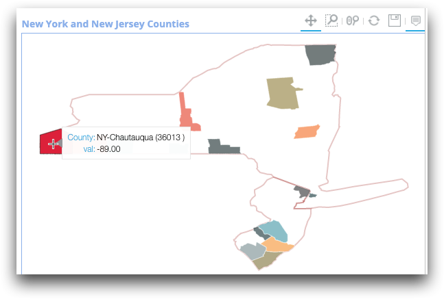
Example: Computed county labels
In the following example, statecol_="state" computes the label for the
county as "[statecol_]-[x1_]".
<dynamic>
  <widget class_="bokehchart" type_="geograph"
   title_="New York and New Jersey Counties"
   height_="400" width_="600" layer_="counties" x1_="name"
   y1_="val" statecol_="state">
    <table cols="name, val, state">
		Atlantic,     -47, NJ; Bergen,     22, NJ;
		Burlington,    99, NJ; Camden,     -1, NJ;
		Cape May,     -22, NJ; Cumberland, 40, NJ;
		Albany,       -61, NY; Allegany,   64, NY;
		Bronx,         -5, NY; Broome,      6, NY;
		Cattaraugus,  -64, NY; Cayuga,    -77, NY;
		Chautauqua,   -89, NY; Chemung,    97, NY;
		Clinton,        9, NY; Hamilton,  -24, NY
    </table>
  </widget>
</dynamic>
Note that in the resulting geograph, NY-Chautauqua is computed
from [state]-[name] in the table.
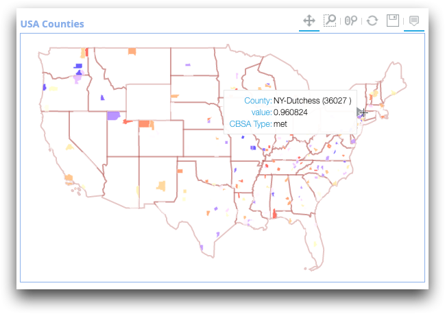
Example: A U.S. map with county data
You can highlight county data in a map of the entire continental U.S., as follows.
<dynamic>
  <widget class_="bokehchart" type_="geograph" title_="USA Counties"
   height_="400" width_="600" x1_="county" y1_="value" colabel_="cbsa_type"
   statecol_="state_code" color_="red;blue" layer_="counties">
  <base table="pub.geo.fips_cbsa_changes"/>
  <willbe name="value" value="draw(4892;0)"/>
  </widget>
</dynamic>
Since the table pub.geo.fips_cbsa_changes table includes counties from all
over the U.S., the resulting geograph renders a map of the entire continental U.S. with the
included counties highlighted.
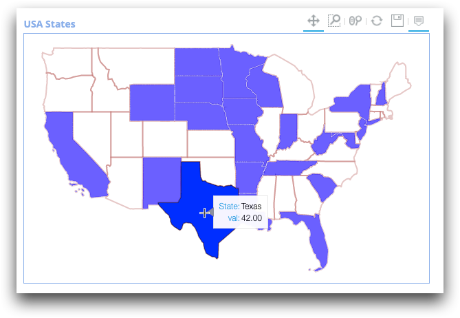
Example: A geograph with a single color
You can identify the states included in your analysis by assigning them a single color, as follows.
<dynamic>
  <widget class_="bokehchart" type_="geograph" title_="USA States"
   height_="400" width_="600" x1_="state" y1_="val" color_="blue">
      <table cols="state,val">
              Arkansas,     -47; California, 22;
              Florida,       99; Indiana, -1;
              Iowa,         -22; Louisiana, 40;
              Maryland,     -61; Minnesota, 64;
              Missouri,      -5; Nebraska, 6;
              NewHampshire, -64; NewMexico, -77;
              NewYork, -     89; NorthDakota, 97;
              SouthCarolina,  9; SouthDakota, -24;
              Tennessee,     79; WestVirginia, -18;
              Wisconsin,     70; Wyoming, -45;
              TX,            42; New Jersey, 20
    </table>
 </widget>
</dynamic>
The resulting geograph looks like the following, with all included states highlighted in blue:
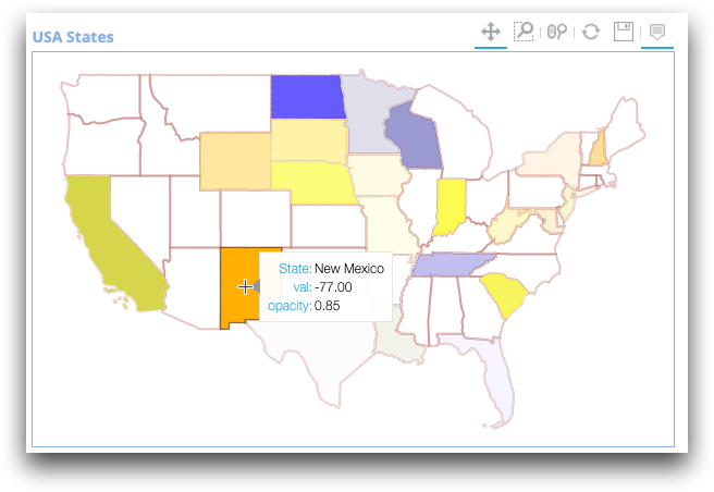
Example: A geograph with a color palette and opacity
You can also assign multiple colors to a geograph with a color list. In the following code, the color palette is orange, yellow, and blue. The table contains a third column containing the opacity of the color for each state.
<dynamic>
  <widget class_="bokehchart" type_="geograph" title_="USA States"
   height_="400" width_="600" x1_="state" y1_="val"
   color_="orange;yellow;blue" opacity_="opacity" colabel_="opacity">
    <table cols="state, val, opacity">
		Arkansas,     -47, 0.01; California,    22, 0.90;
		Florida,       99, 0.05; Indiana,       -1, 0.83;
		Iowa,         -22, 0.15; Louisiana,     40, 0.15;
		Maryland,     -61, 0.21; Minnesota,     64, 0.21;
		Missouri,      -5, 0.13; Nebraska,       6, 0.67;
		NewHampshire, -64, 0.50; NewMexico,    -77, 0.85;
		NewYork,      -89, 0.13; NorthDakota,   97, 0.72;
		SouthCarolina,  9, 0.80; SouthDakota,  -24, 0.45;
		Tennessee,     79, 0.34; WestVirginia, -18, 0.29;
		Wisconsin,     70, 0.60; Wyoming,      -45, 0.49;
             TX,            42, 0.03; New Jersey,    20, 0.23
    </table>
  </widget>
</dynamic>
The resulting geograph looks like the following:
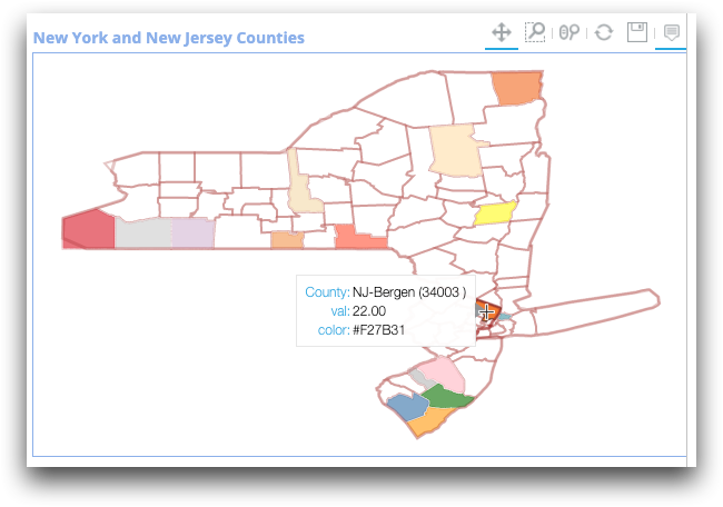
Example: A geograph with a color column
Instead of a general color palette for your geograph, you can assign a color for each polygon within the table. Colors can use hexidecimal, rgb, or name format.
<dynamic>
  <widget class_="bokehchart" type_="geograph"
   title_="New York and New Jersey Counties" height_="400"
   width_="600" x1_="county" y1_="val" layer_="counties" color_="color"
   colabel_="color" allpolys_="1">
    <table cols="county, val, color">
      NJ-Atlantic,     -47,   green;   NJ-Bergen,     22, #F27B31;
	NJ-Burlington,    99,    pink;   NJ-Camden,     -1, silver;
	NJ-Cape May,     -22,  orange;   NJ-Cumberland, 40, steelblue;
	NY-Albany,       -61, #FFFF00;   NY-Allegany,   64, thistle;
	NY-Bronx,         -5, #51A2B0;   NY-Broome,      6, tomato;
	NY-Cattaraugus,  -64, lightgray; NY-Cayuga,    -77, wheat;
	NY-Chautauqua,   -89, #DC213A;   NY-Chemung,    97, sandybrown;
	NY-Clinton,        9, #F27B31;   NY-Hamilton,  -24, moccasin
    </table>
  </widget>
</dynamic>
The resulting geograph looks like the following. Note that in this example,
allpolys_="1", so all county polygons are rendered.