type_="native"
Using <widget class_="grid" type_="native"> creates a
grid widget that traverses through the rows of data in discrete
increments.
Syntax
<dynamic>
    <widget class_="grid" type_="native">
        [1010data_QUERY]
    </widget>
</dynamic>
The [1010data_QUERY] may be specified between the
opening and closing tags of the <widget>. The results of the query
provide data for the <widget> to display.
Attributes for type_="native"
The following attributes in this list are specific to <widget class_="grid"
type_="native">. See class_="grid" for attributes common to all
grid widgets.
initview_- Specifies how the grid widget renders when initialized.
Valid values are:
multirows- Display multiple rows when initially rendered
onerow- Only display the first row when initially rendered
The default is
multirows.(Available as of prod-9)
allowswitchview_- Accepts an integer value of
1or0that specifies whether or not to provide an item in the right-click context menu that allows the user to switch to a one row view.The default is
1.(Available as of prod-9)
onerowviewwithcontrol_- Accepts an integer value of
1or0that specifies whether or not to show a set of control buttons to the right of the data when in the one row view.The buttons let you go to the previous row, go to the next row, or return to the multiple row view.
This attribute only works when
initview_="onerow". theme_- Accepts a string that specifies a set of predefined style-related properties to apply
to the grid.Valid values are:
lightgray
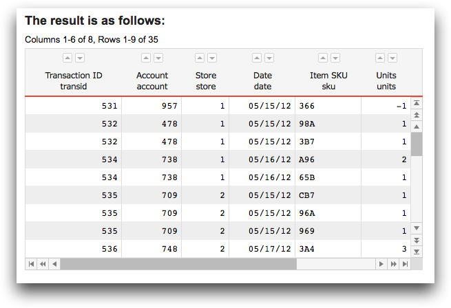
Example: Fully customized native grid
The following example uses a number of the style attributes to customize a native grid that displays the contents of pub.demo.retail.item.
<dynamic>
  <widget
   class_="grid" type_="native" base_="pub.demo.retail.item"
   width_="600" height_="400" border_="0" ditto_="value"
   label_="The result is as follows:"
   headerbgcolor_="#4d6273"
   sortbgcolor_="whitesmoke"
   sortarrowcolor_="#4d6273"
   dividercolor_="#cccccc"
   evencellbgcolor_="#E2E9EE"
   oddcellbgcolor_="#ffffff"
   labelfontsize_="18"
   labelfontfamily_="'Open Sans',sans-serif;"
   labelfontcolor_="#4d4e53"
   headerfontsize_="14"
   headerfontfamily_="'Open Sans',sans-serif;"
   headerfontcolor_="whitesmoke"
   cellfontsize_="14"
   cellfontfamily_=""
   cellfontcolor_="#4d4e53"
   scrollbarcolor_="whitesmoke"
   scrollbarbgcolor_="#4d6273"
   scrollbarbuttoncolor_="#4d6273"
   scrollbarbuttonbordercolor_="#4d6273"
   scrollbarbuttonbgcolor_="whitesmoke"/>
</dynamic>
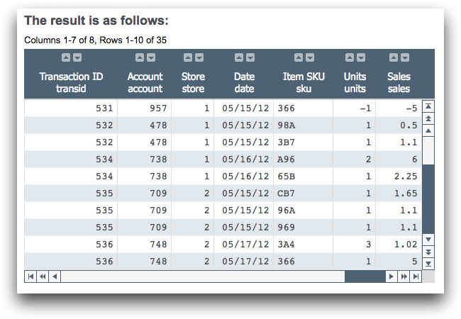
Example: Using a predefined theme
The following example uses the theme_ attribute to apply a predefined set
of style-related attributes to the grid widget.
<dynamic>
  <widget class_="grid" type_="native" base_="pub.demo.retail.item"
   width_="600" height_="400" label_="The result is as follows:"
   theme_="lightgray"/>
</dynamic>