
<graphspec>
The <graphspec> element is contained within a <widget
class_="chart">. <graphspec> allows you to specify any of the
Kendo chart-related properties, such as tick rotation or axis label color. (Available as of version 10.16)
Syntax
<dynamic>
    <widget class_="chart" engine_="ENGINE_TYPE"
      type_="CHART_TYPE">
      [1010data_QUERY]
      <graphspec
        theme="[THEME_NAME]">
      [CUSTOMIZATIONS]
      </graphspec>
    </widget>
</dynamic>
Attributes
theme- For a simple way to change the colors of your chart, specify a predefined Kendo theme.
Available themes are:
- Black
- BlueOpal
- Bootstrap
- Default
- Flat
- HighContrast
- Material
- MaterialBlack
- Metro
- MetroBlack
- Moonlight
- Office 365
- Silver
- Uniform
- Fiori
- Nova
To view the colors that make up each theme, refer to the following Kendo documentation: https://docs.telerik.com/kendo-ui/styles-and-layout/appearance-styling.
Usage
<graphspec>
element inside a <widget class_="chart">. For the Kendo charting engine,
the contents of <graphspec> should be XML that specifies chart
properties. The XML syntax is essentially isomorphic to the JavaScript object containing
chart properties as described in the Kendo UI documentation on chart configuration, with a
few important caveats:- It is not necessary to use camelCase keywords.
- No distinction is made between the true/false boolean values and the strings "true"/"false". The meaning is determined by context.
- Context also determines whether a numeral is treated as a string or a number.
See the Kendo UI documentation on chart configuration for a complete listing of the JavaScript objects and associated properties.
Object keys are mapped onto XML attributes, except that keys whose values are themselves objects are mapped onto XML tag contents.
For example, to set the color of the major grid lines on the axes to blue, you could use
the Kendo chart property axisDefaults.majorGridLines.color.
This would be represented within the <graphspec> element as:
<graphspec>
  <axisdefaults>
    <majorgridlines color="blue"/>
  </axisdefaults>
</graphspec>
Consider the following JavaScript, which uses the Kendo API to set the tooltip border color:
<div id="chart"></div>
<script>
$("#chart").kendoChart({
  tooltip:{
    visible:true,
    border:{
      width:2,
      color:"green"
    }
  },
  series:[
    { data:[1,2,3]}
  ]
});
</script>
This would be represented within the <graphspec> element as:
<graphspec>
  <tooltip visible="true">
    <border width="2" color="green"/>
  </tooltip>
  <series data="{lst(1,2,3)}"/>
</graphspec>
<graphspec> may be used in conjunction with the chart types and
attributes specified to a <widget class_="chart"> to override defaults
and specify additional properties. See Example: Customizing the chart for an
example.
Furthermore, <graphspec> may be used in a <widget
class_="chart"> without a type_ attribute. In this case, the
1010data query contained in the <widget> is ignored. This
means that <graphspec> must contain both the plot type specification and
the data itself. Data may be "injected" into the <graphspec> using block
code. Arrays may be inserted as standard 1010data list-values, for example with constructs
like {lst()}. See Example:
Specifying <series> data using list-values below for an
example.
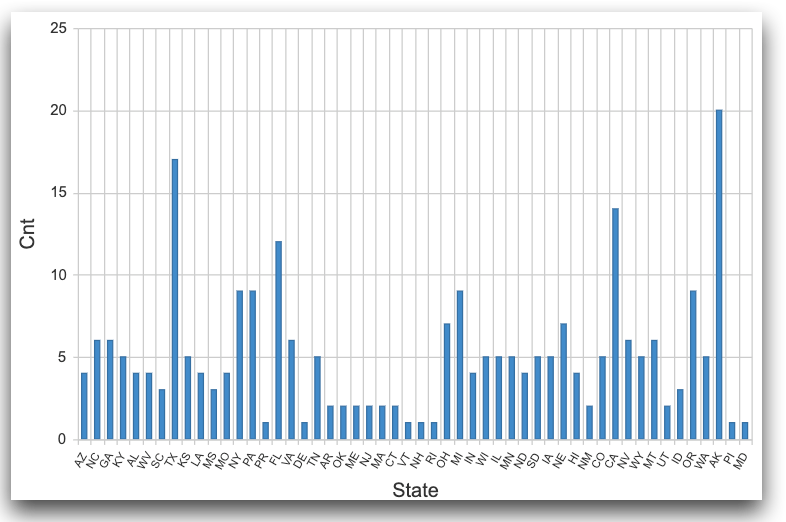
Example: Customizing the chart
The following example uses <graphspec> to change the properties of
labels on the category axis in a column chart. It also changes the Kendo theme to
"Bootstrap".
<dynamic>
  <widget class_="chart" type_="column"
   base_="pub.demo.weather.stations">
    <tabu breaks="state">
      <tcol source="state" fun="cnt"/>
    </tabu>
    <graphspec theme="bootstrap">
      <categoryaxis>
        <labels rotation="-60" font="9px Arial"/>
      </categoryaxis>
    </graphspec>
  </widget>
</dynamic>
Example:
Specifying <series> data using list-values
The tag <series>, which is used to specify plot data, atypically
represents a list of objects and may appear more than once; the actual JS object
value of the series: key will be a list with one member for each appearance of the XML tag.
(The tag <valueaxes> behaves the same way.)
So, for example, the plot documented at https://demos.telerik.com/kendo-ui/line-charts/multiple-axes may be represented as follows.
<dynamic> <widget class_="chart" width_="800" height_="400"> <pack into_="data" day="{lst(1, 2, 3, 4, 5, 6, 7, 8, 9, 10, 11, 12, 13, 14, 15, 16, 17, 18, 19, 20, 21, 22, 23, 24, 25, 26, 27, 28, 29, 30, 31)}" maxtemp="{lst(6, 10, 10, 10, 10, 9, 5, 5, 10, 8, 8, 5, 8, 11, 9, 15, 20, 23, 24, 21, 21, 20, 22, 22, 20, 18, 16, 15, 20, 13.2, 18)}" mintemp="{lst(-5, -6, 0, -4, -3, -5.2, -5, -1.7, -1, 0, -0.4, -2, -2, -5, 4, -2, -4, -1, -1, 2, 4, -1, 1, 1, 4, 0, -1, 1, -2, 5.7, 5)}" windspeed="{lst(16.4, 21.7, 35.4, 19, 10.9, 13.6, 10.9, 10.9, 10.9, 16.4, 16.4, 13.6, 13.6, 29.9, 27.1, 16.4, 13.6, 10.9, 16.4, 10.9, 24.5, 10.9, 8.1, 19, 21.7, 27.1, 24.5, 16.4, 27.1, 29.9, 27.1)}" rainfall="{lst(5.4, 2, 5.4, 3, 2, 1, 3.2, 7.4, 0, 8.2, 0, 1.8, 0.3, 0, 0, 2.3, 0, 3.7, 5.2, 6.5, 0, 7.1, 0, 4.7, 0, 1.8, 0, 0, 0, 1.5, 0.8)}"> <graphspec> <title text="March Weather Report"/> <legend position="bottom"/> <series type="line" name="Max. Temperature [°C]" color="#ff1c1c" axis="temp" data="{@data.maxtemp}"/> <series type="line" name="Min. Temperature [°C]" color="#ffae00" axis="temp" data="{@data.mintemp}"/> <series type="area" name="Wind Speed [km/h]" color="#73c100" axis="wind" data="{@data.windspeed}"/> <series type="area" name="Rainfall [mm]" color="#007eff" axis="rain" data="{@data.rainfall}"/> <valueaxes name="rain" color="#007eff" min="0" max="60"/> <valueaxes name="wind" color="#73c100" min="0" max="60"/> <valueaxes name="temp" min="-30" max="30"/> <categoryaxis categories="{@data.day}" axiscrossingvalues="{lst(32, 32, 0)}" justified="true"/> <tooltip visible="true" format="{0}%" template="#= category #/03: #= value #"/> </graphspec> </pack> </widget> </dynamic>
<graphspec>; no query data is used in this example, and
type_ may be omitted because the plot type is specified in the
XML.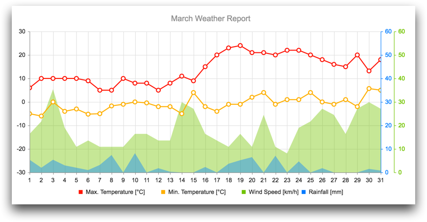
It should be immediately evident that the mechanism in this example allows for query (or
block-code-derived) data to be used in plots, which is more useful than a self-contained
plot as in the example. One must merely ensure that environment variables (e.g., the package
data in the above example) are populated with the appropriate values. This can, of course,
be done outside of the widget using, for example, a <do> clause.
However, the chart widget offers a convenient mechanism using the
<layer> element. See <layer> for an example.