type_="pie"
Using <widget class_="chart" type_="pie"> produces a chart that
displays each value in the given data set as a section of a circular pie, representing its
percentage of the whole. (Available as of version 10.16)
Syntax
<dynamic>
    <widget class_="chart" type_="pie">
      [1010data_QUERY]
    </widget>
</dynamic>
The [1010data_QUERY] associated with the widget should result in either a single numeric column or else a column of any type followed by one numeric column.
If the query results in a single numeric column, the row number is used as the category.
If the query results in a column of any type followed by one numeric column, the first column specifies the categories.
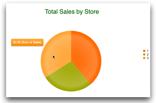
Example: type_="pie"
The following example creates a chart widget that displays a pie chart.
The pie chart is a graphical representation of the total sales by store in the table
pub.demo.retail.item. A <graphspec> element is
used to specify a title and its appearance as well as activating a tooltip when the mouse
points to a slice of the pie.
<dynamic>
  <widget class_="chart" type_="pie" base_="pub.demo.retail.item" hints_="1">
    <tabu label="Tabulation on Sales Item Detail" breaks="store">
      <tcol fun="sum" source="sales" label="Sum of`Sales"/>
    </tabu>
    <graphspec>
      <title text="Total Sales by Store"
       color="darkgreen" font="24px sans-serif">
        <margin left="-30"/>
      </title>
      <tooltip visible="true"/>
    </graphspec>
  </widget>
</dynamic>