type_="scatterline"
Using <widget class_="chart" type_="scatterline"> produces a chart
in which the values are plotted as separate data points with a line joining them together. (Available as of version 10.16)
Syntax
<dynamic>
    <widget class_="chart" type_="scatterline">
      [1010data_QUERY]
    </widget>
</dynamic>
The [1010data_QUERY] associated with the widget should result in one or two numeric columns.
If the query results in one column, then the row number is represented on the X axis, and the values in the column are represented on the Y axis.
If the query results in two columns, the values in the first column are represented on the X axis, and the values in the second column are represented on the Y axis.
Attributes for type_="scatterline"
breaks_- Accepts the name of a column that is used to color the scatterline plot according to
group.
(Prior to version 10.26, this attribute was named
groupby_.)
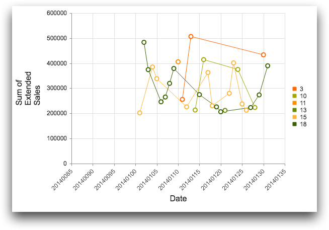
Example: type_="scatterline"
The following example creates a chart widget that displays a scatterline
plot, which has lines connecting the various data points in each series. The chart shows the
total sales by date for transactions occurring between 01/01/2014 and 01/31/2014 in the
table pub.doc.retail.salesdetail. It uses the breaks_
attribute to set off items based on the value in the store column with
different colors in the chart.
<dynamic>
  <widget class_="chart" type_="scatterline" breaks_="store"
   base_="pub.doc.retail.salesdetail">
    <sel value="between(trans_date;20140101;20140131)"/>
    <tabu label="Tabulation on Sales Detail" breaks="trans_date">
      <tcol fun="sum" source="xsales" label="Sum of`Extended`Sales"
       name="sumsales"/>
      <tcol fun="first" source="store" name="store"/>
    </tabu>
    <sort col="store" dir="up"/>
  </widget>
</dynamic>