type_="line"
Using <widget class_="chart" type_="line"> produces a chart
consisting of a line of interconnected points for each column of numeric data.
(Available as of version 10.16)
Syntax
<dynamic>
    <widget class_="chart" type_="line">
      [1010data_QUERY]
    </widget>
</dynamic>
The [1010data_QUERY] associated with the widget should result in either a single numeric column or else a column of any type followed by one or more numeric columns.
If the query results in a single numeric column, the row number is used as the category.
If the query results in a column of any type followed by one or more numeric columns, the first column specifies the categories and the remaining ones specify separate series which are plotted as different-colored lines.
Example: Simple line chart
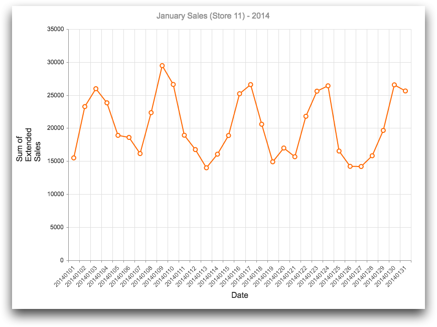
The following example uses the table pub.doc.retail.salesdetail to create a line chart that shows the total sales in January 2014 for store 11.
<dynamic>
  <widget class_="chart" type_="line"
   base_="pub.doc.retail.salesdetail"
   width_="800" height_="600"
   title_="January Sales (Store 11) - 2014">
    <sel value="yrmo(trans_date)=201401"/>
    <sel value="(store=11)"/>
    <tabu label="Tabulation on Sales Detail"
     breaks="trans_date">
      <break col="store" sort="up"/>
      <break col="trans_date" sort="up"/>
      <tcol fun="sum" source="xsales"
       label="Sum of`Extended`Sales" name="sumsales"/>
    </tabu>
    <colord cols="trans_date,sumsales"/>
  </widget>
</dynamic>
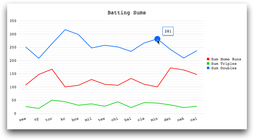
Example: Line chart with multiple series
<base table="pub.demo.baseball.batting"/>
<block name="query">
  <sel value="(year=1990)"/>
  <sel value="(lg='a')"/>
  <tabu breaks="team" label="Tabulation">
    <tcol fun="sum" name="hrs" source="hr" weight=""/>
    <tcol fun="sum" name="triples" source="c11" weight=""/>
    <tcol fun="sum" name="doubles" source="c10" weight=""/>
  </tabu>
</block>
<dynamic>
  <widget class_="chart" base_="pub.demo.baseball.batting">
    <layer tablevalue_="data">
      <insert block="query"/>
    </layer>
    <graphspec>
      <chartarea width="800" height="400"/>
      <title text="Batting Sums" font="18px Monospace" color="black"/>
      <legend position="right">
        <labels font="13px Monospace"/>
      </legend>
      <seriesdefaults type="line" axis="all"/>
      <series name="Sum Home Runs" data="{@data.hrs}" color="#ff0000">
        <markers visible="false" size="20"/>
      </series>
      <series name="Sum Triples" data="{@data.triples}" color="#00cc00">
        <markers visible="false" size="20"/>
      </series>
      <series name="Sum Doubles" data="{@data.doubles}" color="#0066ff">
        <markers visible="false" size="20"/>
      </series>
      <tooltip visible="true" background="white" font="13px Monospace"/>
      <valueaxis name="all" narrowrange="true">
        <labels format="n0" font="13px Monospace"/>
        <line visible="false"/>
        <minorgridlines visible="true"/>
      </valueaxis>
      <categoryaxis categories="{@data.team}">
        <labels rotation="-15" font="13px Monospace"/>
        <majorgridlines visible="false"/>
        <line visible="false"/>
      </categoryaxis>
    </graphspec>
  </widget>
</dynamic>