type_="rangebar"
Using <widget class_="chart" type_="rangebar"> produces a chart
that displays bars which represent ranges of values. (Available as of version
10.22)
Syntax
<dynamic>
    <widget class_="chart" type_="rangebar" orientation_="horizontal|vertical">
      [1010data_QUERY]
    </widget>
</dynamic>
The [1010data_QUERY] associated with the widget should result in either one or more pairs of numeric columns, or a column of any type followed by one or more pairs of numeric columns.
If the query results in one or more pairs of numeric columns, the row number is used as the category, and the columns specify the minimum and maximum values for separate series that are plotted as different-colored bars.
If the query results in a column of any type followed by one or more pairs of numeric columns, the first column specifies the categories, and the remaining columns specify the minimum and maximum values for separate series that are plotted as different-colored bars.
Attributes for type_="rangebar"
orientation_- Determines the direction in which the bars in the chart are displayed.
horizontal- The bars in the chart are displayed horizontally.
vertical- The bars in the chart are displayed vertically.
The default is
horizontal.
Example: type_="rangebar"
The following example uses the table pub.demo.weather.wunderground.forecast to create a chart with bars that display the range of temperatures in both Celsius and Fahrenheit forecast for July 2016 in the zip code 01001.
<dynamic>
  <widget class_="chart" type_="rangebar"
   base_="pub.demo.weather.wunderground.forecast"
   clabel_="Date" ylabel_="Temperature" title_="Temperature Range">
    <sel value="(year(datefor)=2016)"/>
    <sel value="(month(datefor)=7)"/>
    <sel value="zipcode = 01001"/>
    <tabu label="Tabulation on Forecast" breaks="datefor">
      <tcol fun="avg" source="temphighi"
       name="avgtemphighi" label="Average`High`Temp`(F)"/>
      <tcol fun="avg" source="templowi"
       name="avgtemplowi" label="Average`Low`Temp`(F)"/>
      <tcol fun="avg" source="temphighm"
       name="avgtemphighm" label="Average`High`Temp`(C)"/>
      <tcol fun="avg" source="templowm"
       name="avgtemplowm" label="Average`Low`Temp`(C)"/>
    </tabu>
    <sort col="datefor" dir="up"/>
    <colord cols="datefor,avgtemplowi,avgtemphighi,avgtemplowm,avgtemphighm"/>
  </widget>
</dynamic>
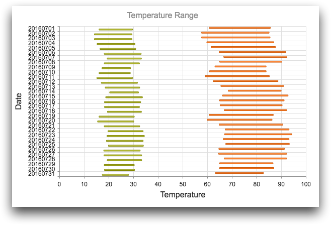
In the above image, the green bars represent the range of Celsius temperatures over the given set of dates, and the orange bars represent the range of Fahrenheit temperatures. The y-axis shows the date for each temperature range.
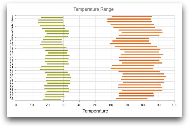
If the first column is omitted from the <colord>:
<colord cols="avgtemplowi,avgtemphighi,avgtemplowm,avgtemphighm"/>then the row number from the resultant table would be used for the values on the y-axis.
clabel_ attribute should also be omitted (or its
value changed) to properly reflect the values on the y-axis.