type_="column"
Using <widget class_="chart" type_="column"> produces a chart with
columns whose lengths represent values in the data. (Available as of version
10.16)
Syntax
<dynamic>
    <widget class_="chart" type_="column" orientation_="vertical|horizontal">
      [1010data_QUERY]
    </widget>
</dynamic>
The [1010data_QUERY] associated with the widget should result in either a single numeric column or else a column of any type followed by one or more numeric columns.
If the query results in a single numeric column, the row number is used as the category.
If the query results in a column of any type followed by one or more numeric columns, the first column specifies the categories, and the remaining ones specify separate series that are plotted as different-colored bars.
Attributes for type_="column"
orientation_- Determines the direction in which the bars are displayed.
horizontal- The bars in the chart are displayed horizontally.
vertical- The bars in the chart are displayed vertically.
The default is
vertical.
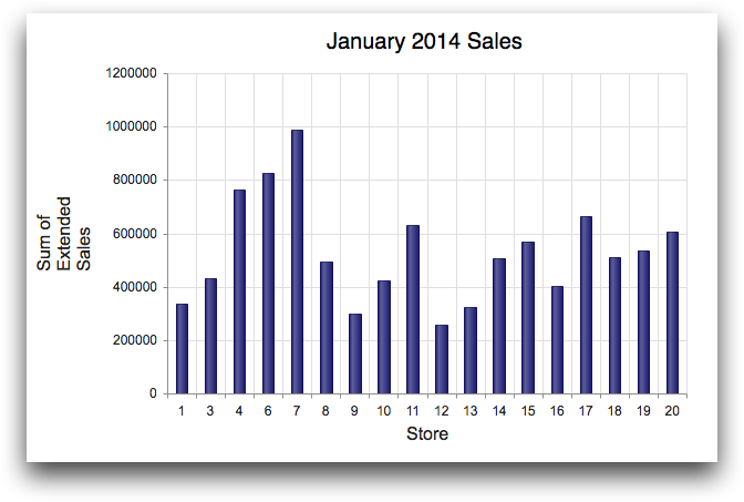
Example: type_="column"
The following example uses the table pub.doc.retail.salesdetail to
create a chart that displays a series of columns representing the total sales in January
2014 for each of the stores. The <graphspec> specifies that the default
color for the series is midnightblue. It also styles and positions the
title of the chart.
<dynamic>
  <widget class_="chart" type_="column"
   base_="pub.doc.retail.salesdetail"
   title_="January 2014 Sales">
    <sel value="yrmo(trans_date)=201401"/>
    <tabu label="Tabulation on Sales Detail"
     breaks="store">
      <break col="store" sort="up"/>
      <tcol fun="sum" source="xsales"
       label="Sum of`Extended`Sales" name="sumsales"/>
    </tabu>
    <colord cols="store,sumsales"/>
    <graphspec>
      <title font="20px sans-serif" color="black">
        <margin left="120"/>
      </title>
      <seriesdefaults color="midnightblue"/>
    </graphspec>
  </widget>
</dynamic>